(Delete this grid)
Elite International Soccer Training Brand Guidelines

Thanks for checking out these guidelines! Whether you found them via the YouTube video or Bravemarks discovery feature, I'm glad you're here. If you like what you see, please support on your preferred channel, and get connected!
Best,
Kaleb
Brand Colors
Color is one of the most immediate expressions of a brand's personality — it communicates energy, trust, and intent before a single word is read. This palette has been carefully selected to reflect Elite International Soccer Training's competitive spirit and professional identity.
Primary Colors
Elite Red
hex: #EC1D24
rgb: 236 / 29 / 36
Black
hex: #000000
rgb: 0 / 0 / 0
White
hex: #FFFFFF
rgb: 255 / 255 / 255
Secondary Colors
Drill Orange
hex: #F05023
rgb: 240 / 80 / 35
Medium Grey
hex: #DDDDDD
rgb: 221 / 221 / 221
Light Grey
hex: #F3F3F3
rgb: 243 / 243 / 243
Typography
Typography gives the brand its voice on the page. The selected typefaces work together to balance authority with approachability — headlines command attention while body copy remains clean and readable across both print and digital applications.
Displays & Headings
Antonio
Aa Bb Cc Dd Ee Ff Gg Hh Ii Jj Kk Ll Mm Nn Oo Pp Qq Rr Ss Tt Uu Vv Ww Xx Yy Zz
0123456789@#%^&*()?+
Body Font
Aktiv Grotesk
Aa Bb Cc Dd Ee Ff Gg Hh Ii Jj Kk Ll Mm Nn Oo Pp Qq Rr Ss Tt Uu Vv Ww Xx Yy Zz
0123456789@#%^&*()?+
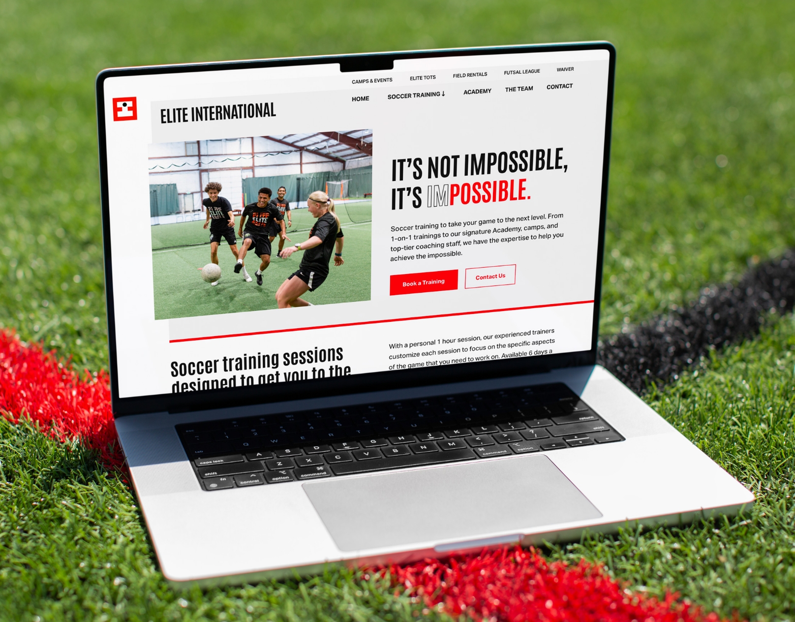
Logos
The logo is the brand's most recognizable asset and should always be used with intention. Each variation provided here is suited for specific use cases — refer to the usage guidelines below to ensure the logo always appears clear, proportional, and on-brand.


More from Bravemark
Additional brand modules are available to expand these guidelines as the brand evolves — including social media mockups, video embeds, and downloadable asset blocks. These can be added and updated at any time to keep the guidelines current and comprehensive.
EliteInternationalSoccerTraining
EliteInternationalSoccerTraining
EliteInternationalSoccerTraining
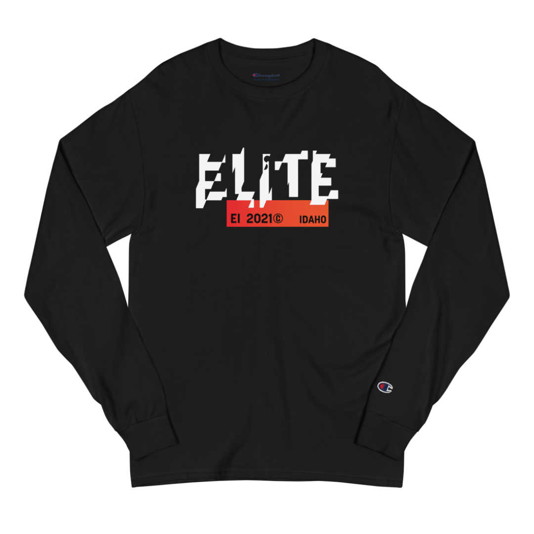
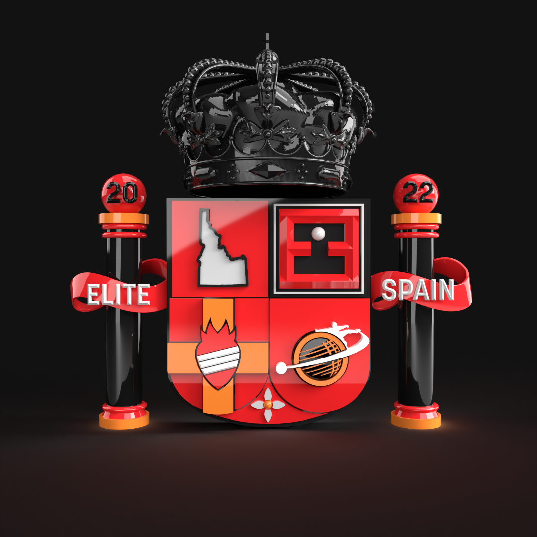
Additional Assets
This section houses supplemental brand materials including campaign graphics, apparel, print collateral, and event-specific assets. As new materials are produced, this section will be updated to reflect the most current approved versions.