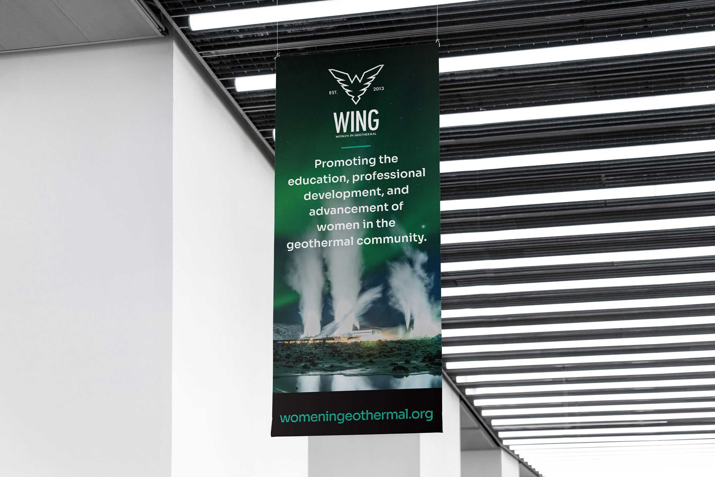
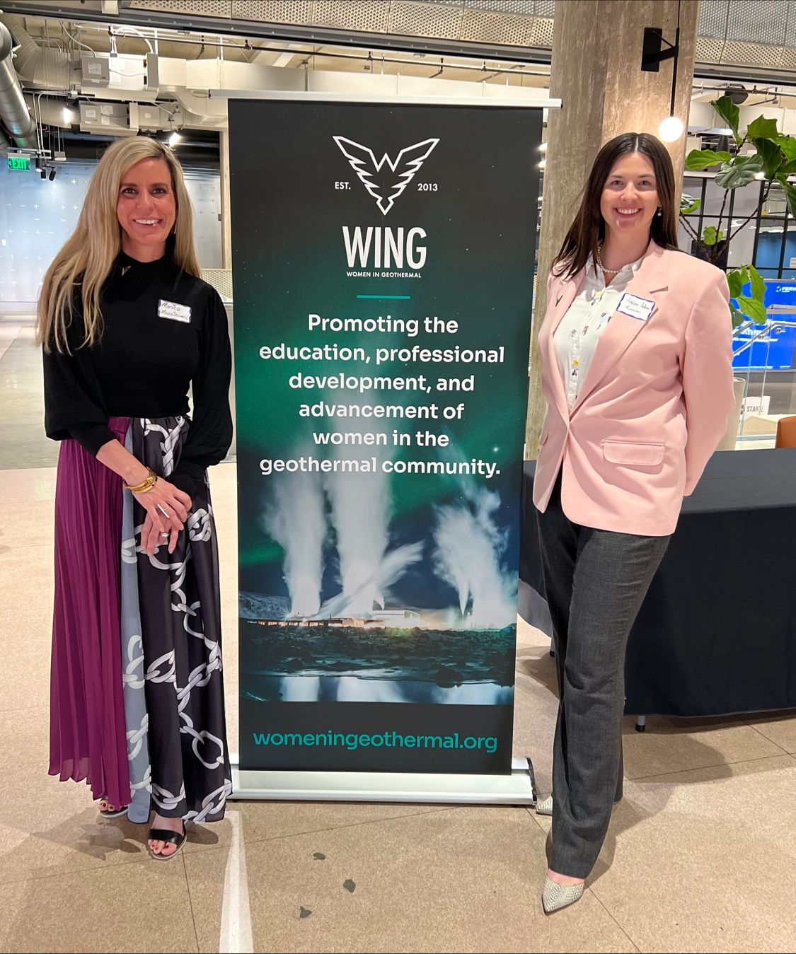
Women in Geothermal (WING) is a volunteer, not-for-profit organization whose aim is to promote the education, professional development, and advancement of women in the geothermal community.
Women In Geothermal
Drop Image
Drop Image
Women In Geothermal (WING)
Women in Geothermal (WING) is a global network that aims to promote the education, professional development, and advancement of women in the geothermal community.
Mission
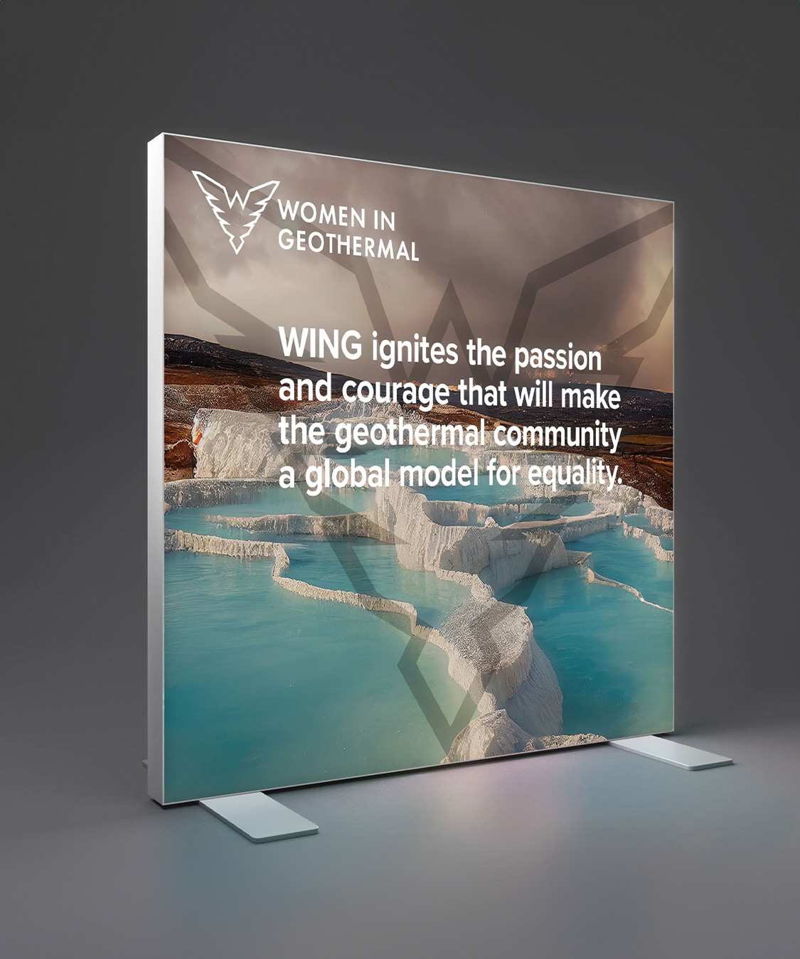
Vision
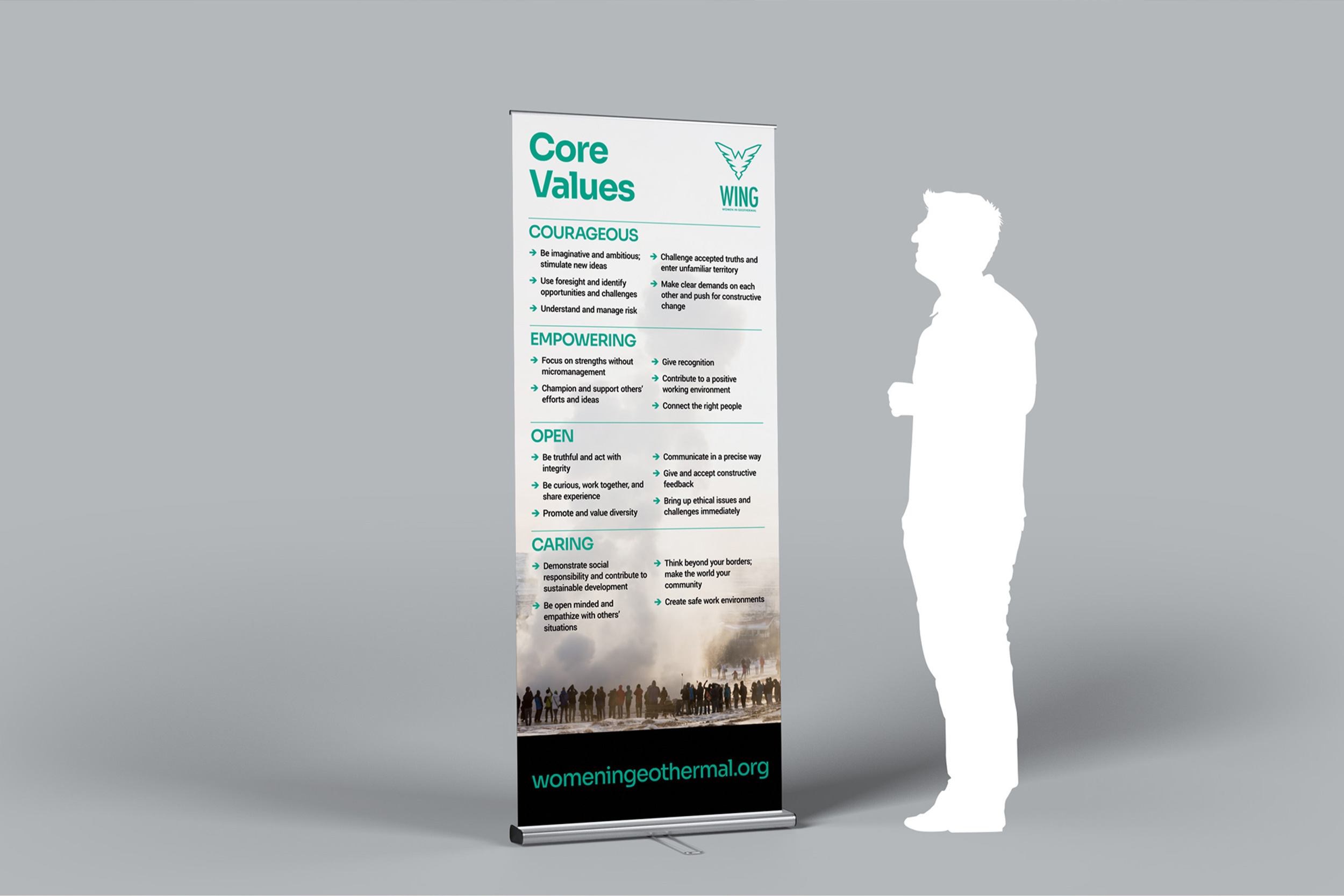
WING ignites the passion and courage that will make the geothermal community a global model for equality. WING is actively breaking down barriers so that everyone in the geothermal sector can realize their full potential. The aim is to one day become redundant, where no group needs to advocate for gender equality.
History
Founded in October 2013 at the Geothermal Resources Council (GRC) Annual Meeting in Las Vegas, Nevada, WING is now represented in over 89 countries world wide, with 34 dedicated Country Teams. WING members represent a wide group of professional disciplines and every facet of the geothermal industry. They come from science, engineering, legal, regulatory, business, financial and government roles.
Drop Image
LOGOMARK
Primary
The Primary logomark serves as the central visual representation of the brand, encapsulating its essence and values. The primary logomark is the most recognizable graphic element associated with the brand, used extensively across various platforms and materials. It is designed to convey who the brand is and what it stands for at a glance. The Primary logomark is a vital component of a brand's identity, serving not only as a visual anchor but also as a strategic tool for communication. Its thoughtful design and consistent application are essential for fostering strong brand recognition and loyalty among consumers.

Reversed

Design Rationale
Drop Image
Simple Logomark
Small Scale Applications: Simplified logomarks are ideal for use in small formats where detailed logos may not be legible, such as social media profile pictures, favicons, or watermarks on images.
Cluttered Environments: In contexts where the logo appears alongside other elements, a simplified version helps maintain clarity and avoids visual clutter, making it suitable for marketing materials or digital interfaces.
Quick Recognition: When immediate brand recognition is crucial, simplified logomarks can effectively convey the brand identity without overwhelming the viewer with details.
Simple

Simple Reversed

Simple Black

Alternative Orientations
Space Constraints: Alternative orientations (such as horizontal and badge layouts) should be used when the primary logomark does not fit well in the available space. For example, a stacked version may be more appropriate for social graphics, while a horizontal layout works better on business cards or presentations.
Different Mediums: Depending on the medium (print vs. digital), using an alternative orientation can enhance legibility and aesthetic appeal. For instance, a vertical logo might be better suited for hangtags or narrow spaces.
Branding Flexibility: Having multiple orientations allows brands to adapt their identity across various platforms and formats without compromising visual integrity. This flexibility is essential for maintaining consistency across diverse marketing channels
Horizontal

Horizontal Reverse

Horizontal Black

Horizontal Extended

Horizontal Extended Reversed

Horizontal Extended Black

Badge

Badge - Reverse

Badge - Black

Badge - Metal

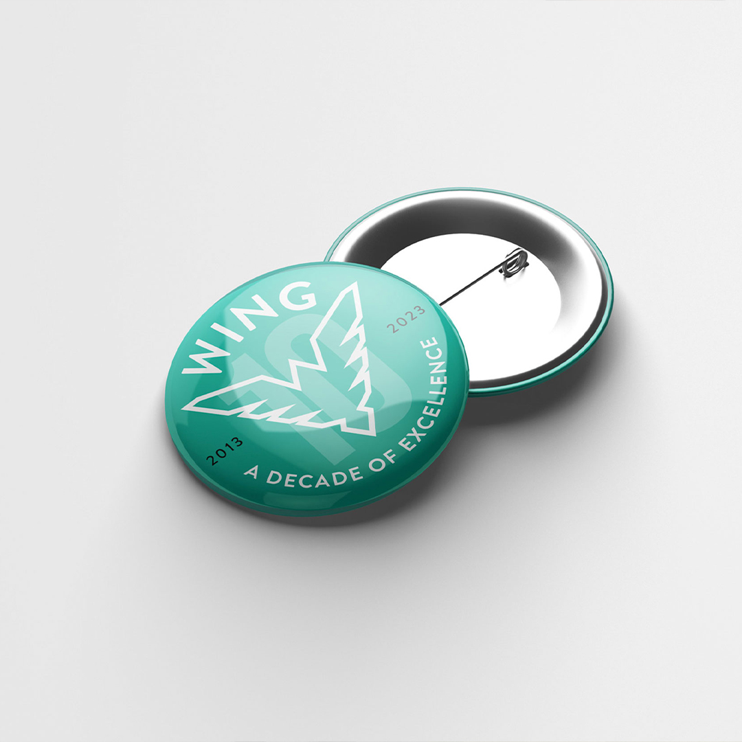
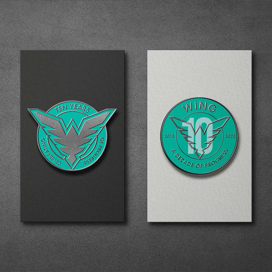
Anniversary Special
The Anniversary Special logomarks were primarily utilized throughout 2023, the year in which the 10th anniversary was celebrated. Moving forward, the Anniversary Established logo is preferred for use, as it emphasizes the year of origin, ensuring its continued relevance.
Anniversary Established

Anniversary Established - Reverse

Anniversary Established - Black

Anniversary Special - Badge

Anniversary Special - Vertical

Logo Clear Space
Clear space is the area surrounding our logo that must be kept free of any text or graphic elements. By leaving space around the logo, we make sure it stands out on all our communications.
To ensure legibility and avoid crowding, keep a minimum amount of clear space around the logo. This exclusion zone isolates the logo from any competing elements such as other. logos, body copy and page overcrowd and lessen the impact of the logo.
The minimum distance of the exclusion zone is measured with the horizontal width of the uppercase letter ‘N’ of WING.

Drop Image
SYMBOL
Symbol Usage
The symbol should be used strategically and consistently to reinforce brand recognition and protect intellectual property.
- Logo usage: Use the symbol with the most prominent or first instance of the logo on marketing materials, products, websites, and other branded items. For multi-page documents, include the symbol at least once per page where the logo appears.
- Digital Media: On websites and mobile apps, place the symbol at least once per page where the brand mark is used, typically in headers, footers, or prominent locations.
- Print materials: For short documents (1-2 pages), use the symbol with the first or most prominent appearance of the mark. For longer materials, include it at least once per page
- Social media: Usage is generally more relaxed. Typically, the symbol is used in the username/bio section rather than in every post or tweet
- Consistency: Ensure the symbol is used consistently across all brand touchpoints to maintain a cohesive brand identity
Symbol

Reversed Symbol

Black Symbol

Primary vs Solid Symbol
The Primary symbol should be used in most situations. The Solid symbol should be considered when the areas or background make the Primary symbol difficult to see.
Solid Symbol

Solid Reversed

Solid Black

Social Media
For Social Media avatars and profile pictures, the Avatars and Enhanced Symbol are ideal options. The Avatars are set on a square and will fit within circular avatar frames. The Enhanced Symbol features a bolder stroke. For small areas and situations when the symbol will be resized to areas less than 150 px in width, the Enhanced Symbol may provide better visibility and clarity.
Avatar Solid - Green on White

Avatar Solid - White on Green

Avatar Solid - Green on Black

Avatar - Green on White

Avatar - White on Green

Avatar - Green on Black

womeningeothermal
womeningeothermal
womeningeothermal
Symbol Clear Space
Clear space is the area surrounding our logo symbol that must be kept free of any text or graphic elements. By leaving space around the logo, we make sure it stands out on all our communications. The minimum clear space is 25% of the height of the entire logo symbol.
It is sometimes necessary to increase and decrease the element depending on the print area. Always keep in proportion.

Minimum Print Size
Minimum print sizes will only use the Simple Logo-mark. The Simple Logo-mark does not feature the ‘WOMEN IN GEOTHERMAL’ bi-line.

Logo Misuse
Any changes to our logo diminish its integrity and the equity of our brand. The examples shown here are some specific “do nots” for our logo:
- Do not vary the colour of individual logo elements
- Do not alter the orientation of the logo components
- Do not alter the logo’s shape in anyway
- Do not add graphic effects
- Do not outline the logo
- Do not lock-up text too close to the logo
- Do not change the relationship of the logo’s components
- Do not use non-approved colours

Drop Image
COLOUR PALETTE
Primary Colour
WING Green is our primary colour. Keeping colour consistent is a vital element to our branding. Colour is the way we differentiate and identify our brand in a crowded marketplace. To help achieve greater brand recognition it is important that our colour palette is applied accurately and consistently. The correct colour values are specified below. Make sure to use them.

Primary
WING Green
hex: #03AA92
rgb: 3 / 170 / 146
cmyk: 79 / 7 / 53 / 0
pantone: 3268/3275 C
Secondary Colours
Tiffany Blue
hex: #95D4D0
rgb: 149 / 212 / 208
cmyk: 40 / 0 / 21 / 0
pantone: 11-4800 TCX
Night
hex: #151515
rgb: 21 / 21 / 21
cmyk: 73 / 67 / 65 / 80
pantone: P 179-16 C
Accent Colours
White
hex: #FFFFFF
rgb: 255 / 255 / 255
Amber Glow
hex: #FFA427
rgb: 255 / 164 / 39
Four Colours
If there is an occasion when you need to create contrast without adding extra colours, you can use incremental tints. Our tints are to be applied in increments of 20%. From 80%, 60%, 40% and 20%. Avoid using any other tints.

Colour Contrast
Contrast plays a crucial role in ensuring brand identity assets remain visible and effective across various backgrounds. When applying brand assets like logos, typography, and other visual elements, it's essential to maintain sufficient contrast for clarity and readability. When designing brand identity collateral, the strategic use of high and low contrast can significantly impact the effectiveness and accessibility of brand assets.
While high contrast is crucial for accessibility and readability, a balance between high and low contrast can create visually appealing and effective brand collateral. Always consider the target audience, brand personality, and the specific context in which the collateral will be used when making contrast decisions.
High Contrast

Low Contrast

AVOID: WING Green and Amber Gold Together
- Do not place WING Green (#03aa92) and Gold Amber (#FFA427) directly against or on top of each other. This combination can feel visually noisy and reduces clarity in both digital and print applications.
- Use these colours sparingly and separately: WING Green is the primary accent, while Amber Gold is reserved for occasional emphasis (key stats, calls-to-action, event highlights).
- When both colours appear in the same layout, separate them with White #FFFFFF or Near Black #151515, and ensure they occupy distinct elements rather than touching edges.
AVOID : Amber Glow on WING Green
Sora
The quick brown fox jumps over the lazy dog
AVOID: WING Green on Amber Glow
Sora
The quick brown fox jumps over the lazy dog
PREFERRED
Sora
The quick brown fox jumps over the lazy dog
PREFERRED
Sora
The quick brown fox jumps over the lazy dog
Drop Image
TYPOGRAPHY
Display Typeface
Sora
Google Fonts by Jonathan Barnbrook, Julián Moncada
ABCDEFGHIJKLMNOPQRSTUVWXYZ
abcdefghijklmnopqrstuvwxyz
0123456789!@#$%^&*()?+
Sora
Google Fonts by Jonathan Barnbrook, Julián Moncada
ABCDEFGHIJKLMNOPQRSTUVWXYZ
abcdefghijklmnopqrstuvwxyz
0123456789!@#$%^&*()?+
Meaning sky in Japanese, Sora is a typeface family commissioned for the Sora decentralized autonomous economy focused on empowering projects that benefit society. Soramitsu, the developer of Sora, is a Japanese technology company specializing in blockchain development and well-known for creating the first central bank digital currency.
Sora typeface should be used for all display text, heading text, large paragraphs and quotes.
Roboto
Google Fonts by Christian Robertson, ParaType, Font Bureau
ABCDEFGHIJKLMNOPQRSTUVWXYZ
abcdefghijklmnopqrstuvwxyz
0123456789!@#$%^&*()?+
Secondary Typeface
Roboto
Google Fonts by Christian Robertson, Paratype, Font Bureau
ABCDEFGHIJKLMNOPQRSTUVWXYZ
abcdefghijklmnopqrstuvwxyz
0123456789!@#$%^&*()?+
Roboto has a dual nature. It has a mechanical skeleton and the forms are largely geometric. At the same time, the font features friendly and open curves. While some grotesks distort their letterforms to force a rigid rhythm, Roboto doesn’t compromise, allowing letters to be settled into their natural width. This makes for a more natural reading rhythm more commonly found in humanist and serif types.
Roboto should be used for Body text only.
Drop Image
PHOTOGRAPHY
Importance of Photography
Visual Consistency: Photography plays a crucial role in maintaining a consistent visual identity across all platforms, ensuring that images reflect the brand's values, tone, and aesthetic. This consistency helps in building brand recognition and trust among its audience.
Emotional Connection: Effective photography can evoke emotions and convey messages that resonate with the target audience. The style and composition of images can influence how the brand is perceived, making it vital to align photography with the desired emotional impact.
Differentiation: High-quality, distinctive photography helps differentiate a brand from the noise It showcases the brand in a way that highlights its unique features and benefits, contributing to a strong brand presence in the market.
The areas of photography that should be focussed on are:
- Natural Geothermal Features
- Industrial Experiences
- On-Site Operations and Workforce
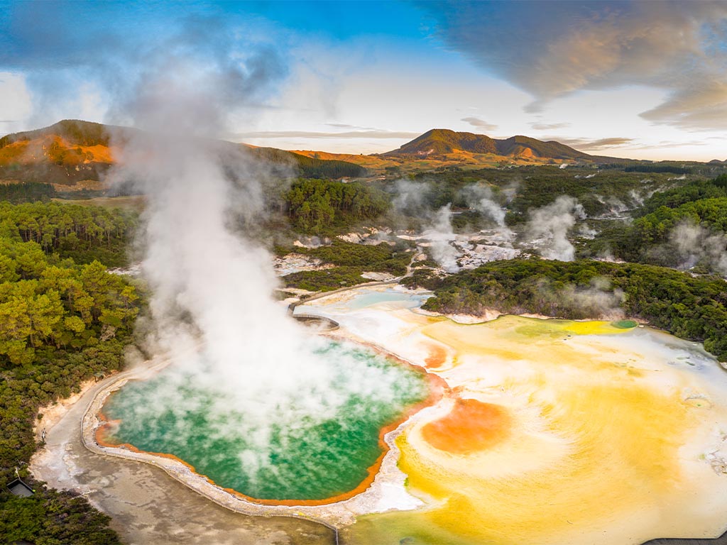
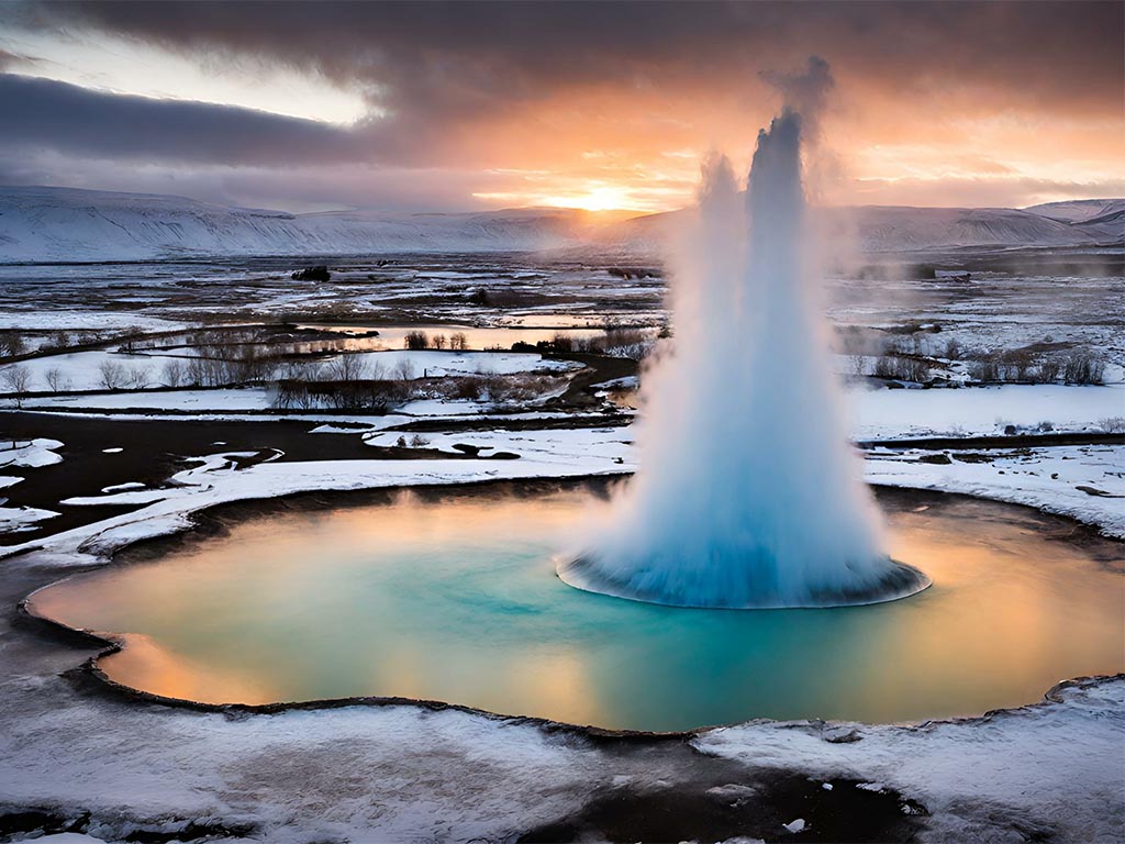
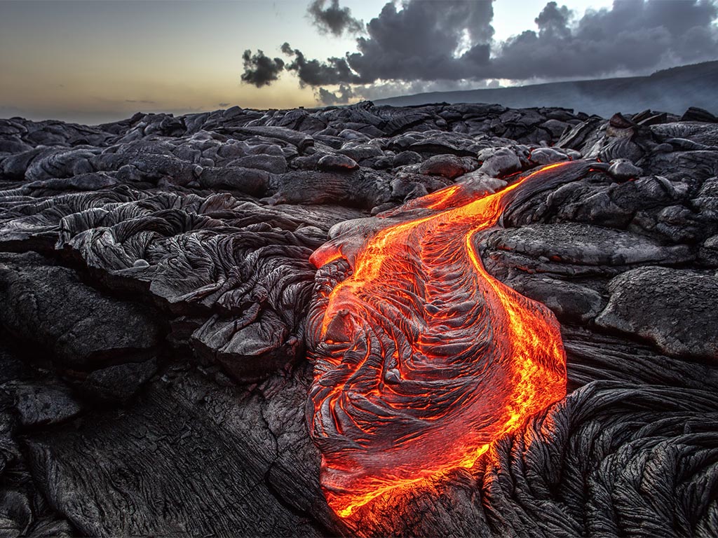
Natural Geothermal Features
Highlighting natural geothermal features, such as hot springs, geysers, and volcanic landscapes, can create a compelling narrative around the potential of geothermal energy. These images not only showcase the beauty of geothermal sites but also educate audiences about the natural processes that make geothermal energy viable. By capturing stunning landscapes that reflect both the power and serenity of geothermal resources, marketers can evoke emotional connections with viewers, fostering a deeper appreciation for this renewable energy source and its environmental benefits.
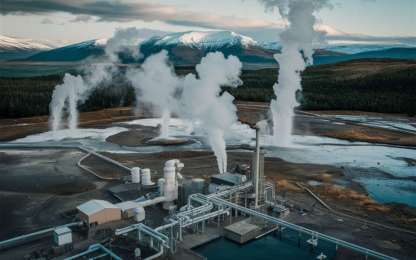
Industrial Landscapes
Capturing the industrial landscapes associated with geothermal energy production can highlight the unique architecture and infrastructure of geothermal plants. Photographers can focus on the juxtaposition of industrial elements, such as drilling rigs and power stations, against natural backdrops, showcasing how these facilities integrate into their environments. This subject matter not only emphasises the technological advancements in renewable energy but also conveys a sense of beauty in industrial design.


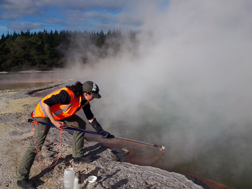
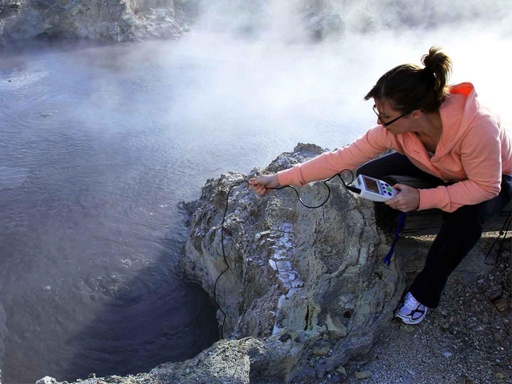
On-Site Operations and Workforce
Images that depict on-site operations and the workforce involved in geothermal energy production are essential for humanizing the industry. Photographers should capture technicians and engineers at work, showcasing their expertise and dedication to sustainable energy solutions. These images can include action shots of drilling processes, maintenance activities, and team collaborations, emphasizing the skilled labor force driving innovation in the geothermal sector. Such visuals help to inspire interest in careers within the industry while reinforcing the message of teamwork and commitment to environmental sustainability.

Drop Image
APPLICATIONS
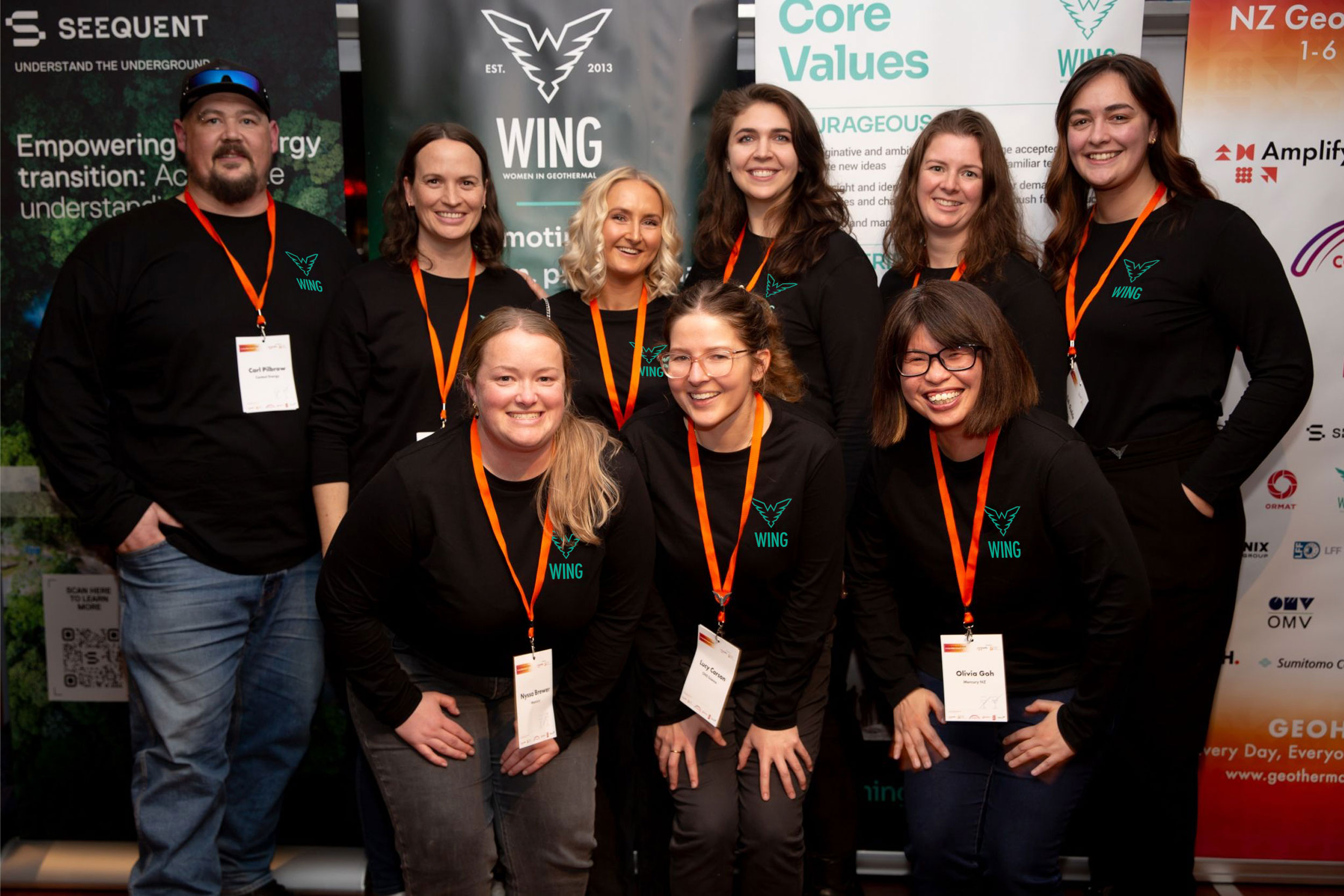
Purpose of Application Examples
Consistency: Application examples help maintain uniformity in how the brand is presented, reinforcing its identity across different touchpoints such as marketing materials, digital platforms, and packaging.
Visual Reference: They provide visual representations of the brand in action, showcasing the correct usage of logos, colors, typography, and imagery.
Inspiration: By seeing the brand guidelines applied in real-world scenarios, teams can draw inspiration for creating new materials that align with the established brand identity.
Women In Geothermal
by Darren DCruz for WING Global
