The Antarctic Sea-Ice Switch (ASIS) Programme addresses the urgent issue of declining sea ice in the Ross Sea, which impacts New Zealand and global climate stability.
Discovery
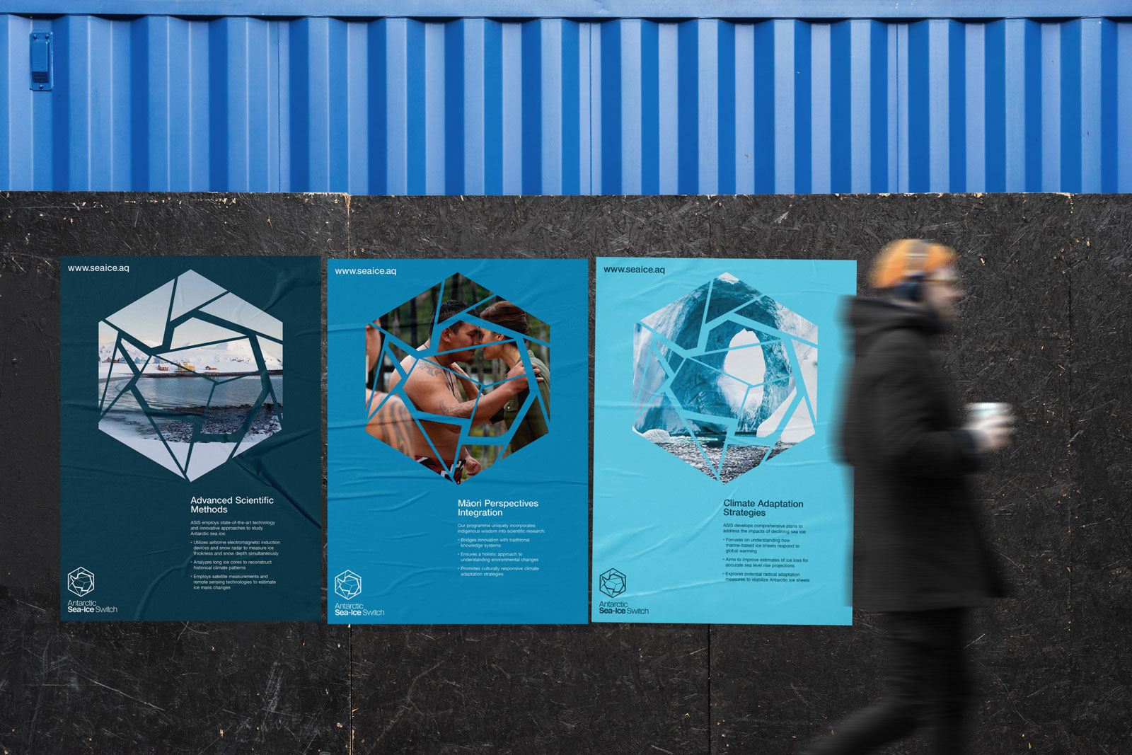
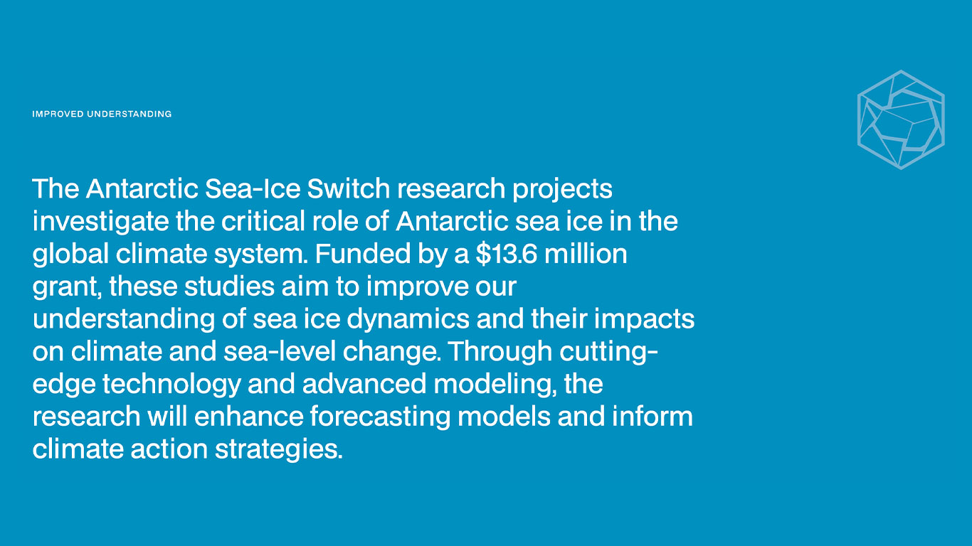
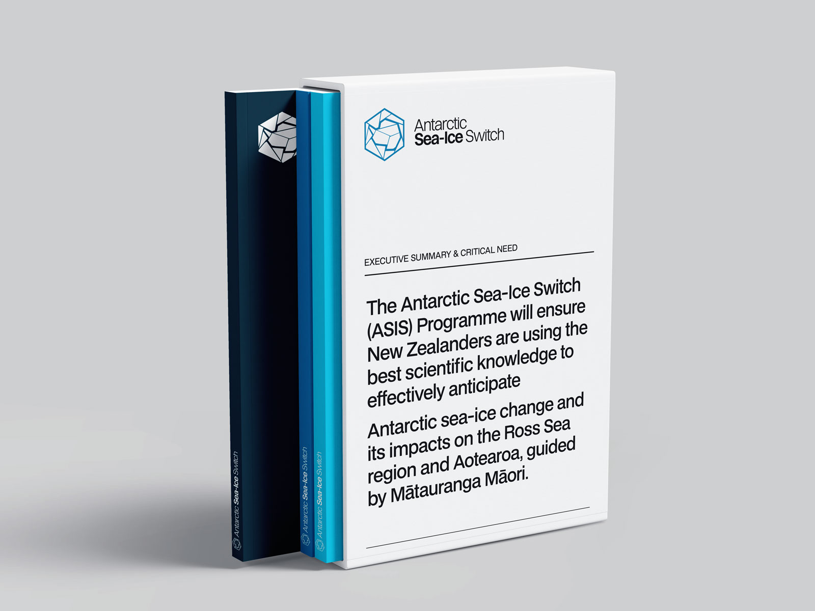
ASIS combines advanced scientific methods with Māori perspectives to understand sea-ice dynamics and inform climate adaptation strategies. The programme aims to position New Zealand as a leader in Antarctic research and policy-making.
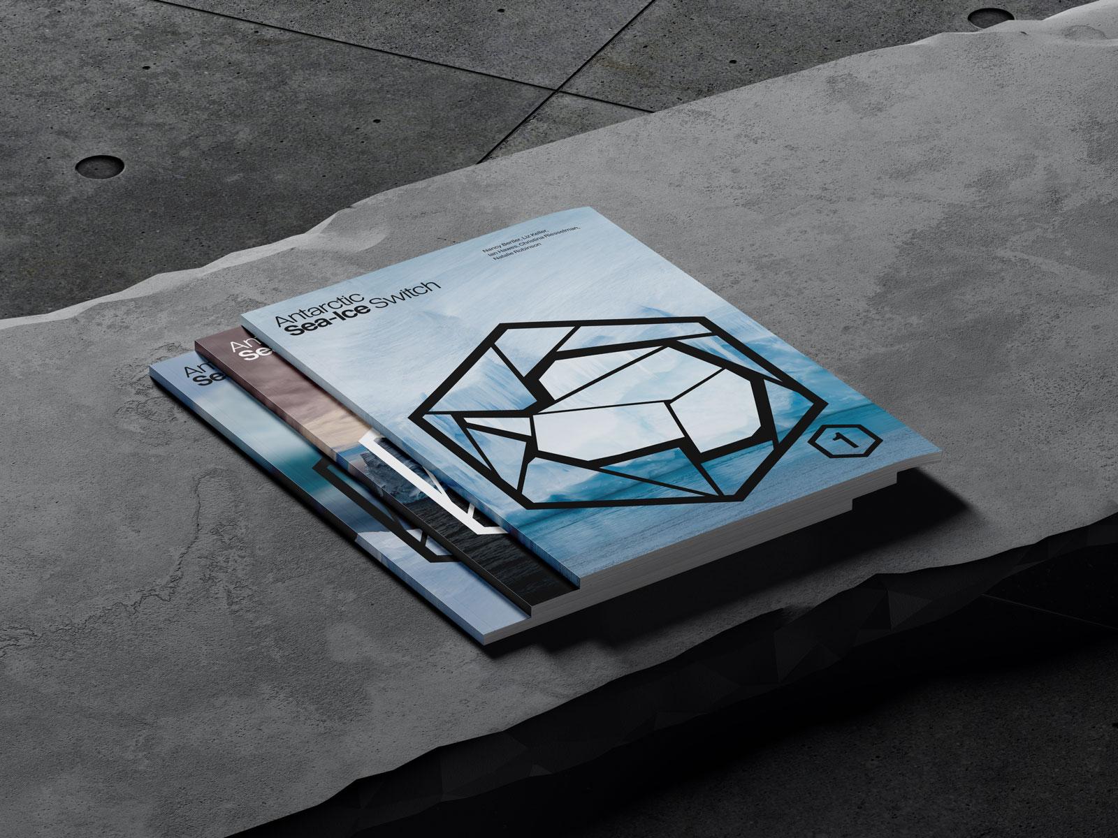
A visual brand identity and website design project has been initiated for ASIS to create an informational portal and repository for the programme's findings and discoveries. This project will facilitate the dissemination of critical insights, enabling adaptation to unavoidable changes and identifying potential impacts of carbon emissions.
Perception
Clean, professional, interesting, scientific, international and doing something important for our planet and humanity.
Audience
Scientists, Policymakers, Public including Maori (we will have material in Te Reo).
Personality
Scientific, trustworthy, high tech (not dusty lab coats) - doing important work.
Connection
Ross Sea Marine Protected Area - the last ocean; pristine and yet hugely vulnerable.
Connection with the rest of the world - what happens in Antarctica doesn't stay in Antarctica.
Connection with Maori and their interests in Antarctica.
An abstract map of Antarctica has been integrated into the symbol and serves several purposes:
Geographical Context: An abstract map of Antarctica provides immediate geographical context, clearly linking the logo to the region it represents. This can help viewers quickly understand the focus of the logo without needing additional information.
Visual Distinction: The abstract representations make the symbol visually distinct and memorable. This can differentiate the logo from more generic ice or sea-related symbols, ensuring it stands out in various contexts.
Emotional Connection: Incorporating elements of Antarctica's unique landscape can evoke feelings of vastness, coldness, and natural beauty, which are closely associated with sea ice. This emotional connection can enhance the logo's impact and engagement.
Polygon shapes effectively symbolize sea ice, capturing key aspects of its structure and behavior in the polar regions. Satellite imagery and scientific models frequently represent sea ice floes as polygonal shapes, reflecting their natural formation and fragmentation patterns.
A hexagon can effectively represent scientific research in the Antarctic in several ways:
Geometric representation: The hexagon's six-sided shape can symbolize the multifaceted nature of Antarctic research, encompassing various disciplines such as glaciology, oceanography, and climate science.
Ice crystal structure: Hexagons are reminiscent of the molecular structure of ice crystals, directly relating to the study of sea ice.
Mapping symbolism: The hexagonal shape is used in some mapping systems, which could represent the geographical aspect of Antarctic research
A scalable system allows the logomark to adapt to different situations, applications, areas and mediums. This has significant importance when developing marketing collateral, promotional assets and event signage.
BDO Grotesk is a versatile and modern neo-grotesk typeface designed by Deni Anggara. It features a minimalist aesthetic inspired by monospace fonts, offering a clean and sophisticated style suitable for various design applications, including websites, apps, and presentations. The font family includes multiple weights, providing flexibility for different design needs and ensuring clarity and focus on the content presented.
Helvetica Neue is a 1983 revision of the original Helvetica typeface. This reworking aimed to unify the structure, weights, and widths of Helvetica, enhancing its legibility and aesthetic consistency. and features improvements such as refined character shapes, heavier punctuation, and better numerical spacing. It has been widely used in various applications, including digital systems like iOS, and remains a popular choice for its clean, modern design and versatility.