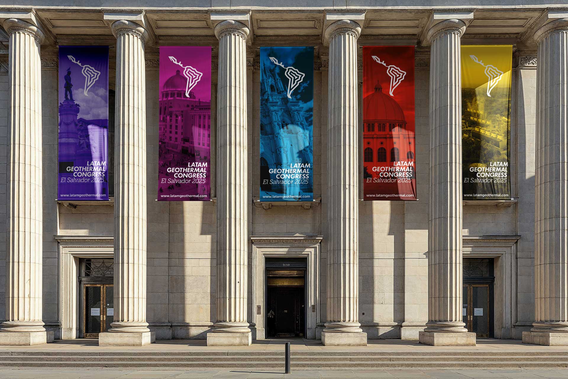
In September 2025 the first Latin American Geothermal Congress will be held in El Salvador. This will be a technical meeting where participants will share knowledge and connect to support the uptake and utilisation of geothermal resources in Latin America. Participants will include professional staff from geothermal organisations, students from universities and research orgnaisations, government officials, indigenous communities, and public.
LATAM Geothermal Congress

LOGO
Primary

Reverse

One Colour

Reverse One Colour


Host Country + Year

Year


Symbol Meaning
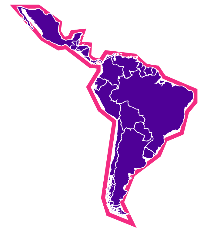
Latin America
The symbol is a polygonal, geometric abstraction of the Latin American region, drawing inspiration from the rich tradition of geometric abstraction in Latin American art. This design choice cleverly combines the region's artistic heritage with its geological and energy-focused future.
The polygonal shape simplifies the complex coastlines and borders of Latin America into angular, straight-edged forms. This abstraction serves multiple purposes:
- It creates a modern, sleek aesthetic that reflects the forward-thinking nature of geothermal energy development.
- The angular forms subtly evoke the tectonic plates and geological formations crucial to geothermal energy production.
- The simplified shape makes the logo easily recognizable and memorable
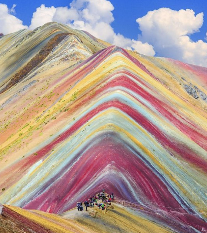
Rainbow Mountains
The symbol's design cleverly integrates multiple layers of meaning through its colour palette and structure. The internal forms and colours draw inspiration from the Cusco region of Peru, reinforcing the Latin American identity. Simultaneously, these hues echo the vibrant colors often observed in geothermic natural wonders, creating a visual link to the congress's focus. The specific use of blue and red is particularly significant, as these colors represent the heating and cooling processes associated with geothermal heat pumps and heating systems. This thoughtful color selection not only captures the essence of the region but also symbolizes the core principles of geothermal energy, effectively combining cultural, geographical, and technological elements in a single, cohesive design.
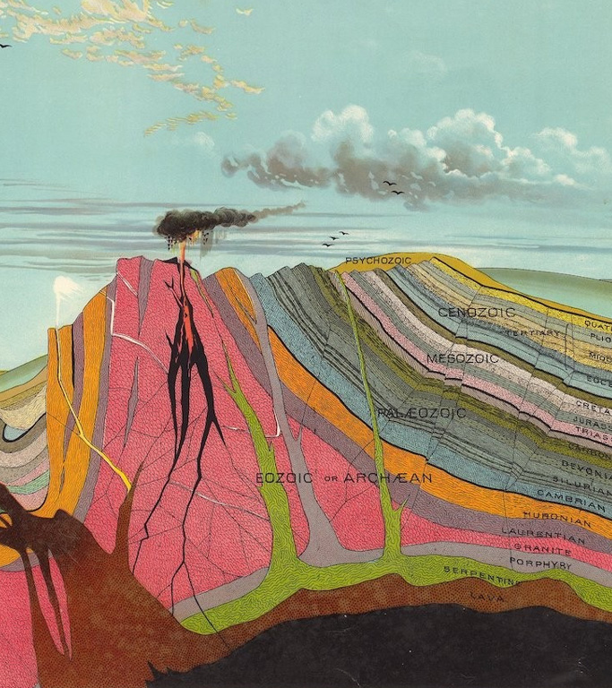
Layered Earth
The offset paths of the symbol are a visual representation of the Earth's layers, which is highly relevant to geothermal energy. They represent:
- Geological Representation: mimicking the stratified layers of the Earth's crust, mantle, and core. This is particularly significant for geothermal energy, as it relies on harnessing heat from deep within the Earth.
- Energy Flow Visualization: symbolising the movement of heat from the Earth's core towards the surface, a fundamental principle behind geothermal energy extraction.
- Depth and Dimension: creating a sense of depth emphasises the idea of drilling or reaching into the Earth to access geothermal resources.
- Technological Process: The layered design represents the various stages involved in geothermal energy production, from heat extraction to power generation.
Symbol

Reversed Symbol

Reverse in Square

One Colour

Solid

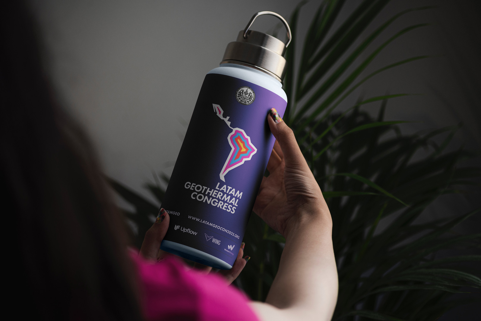
SCALABLE SYSTEM
A scalable system allows the logomark to adapt to different situations, applications, areas and mediums. This has significant importance when developing marketing collateral, promotional assets and event signage.
Vertical

Reverse Vertical

Vertical One Colour

Logotype + Emphasis - One Line

Reverse Logotype + Emphasis - One Line

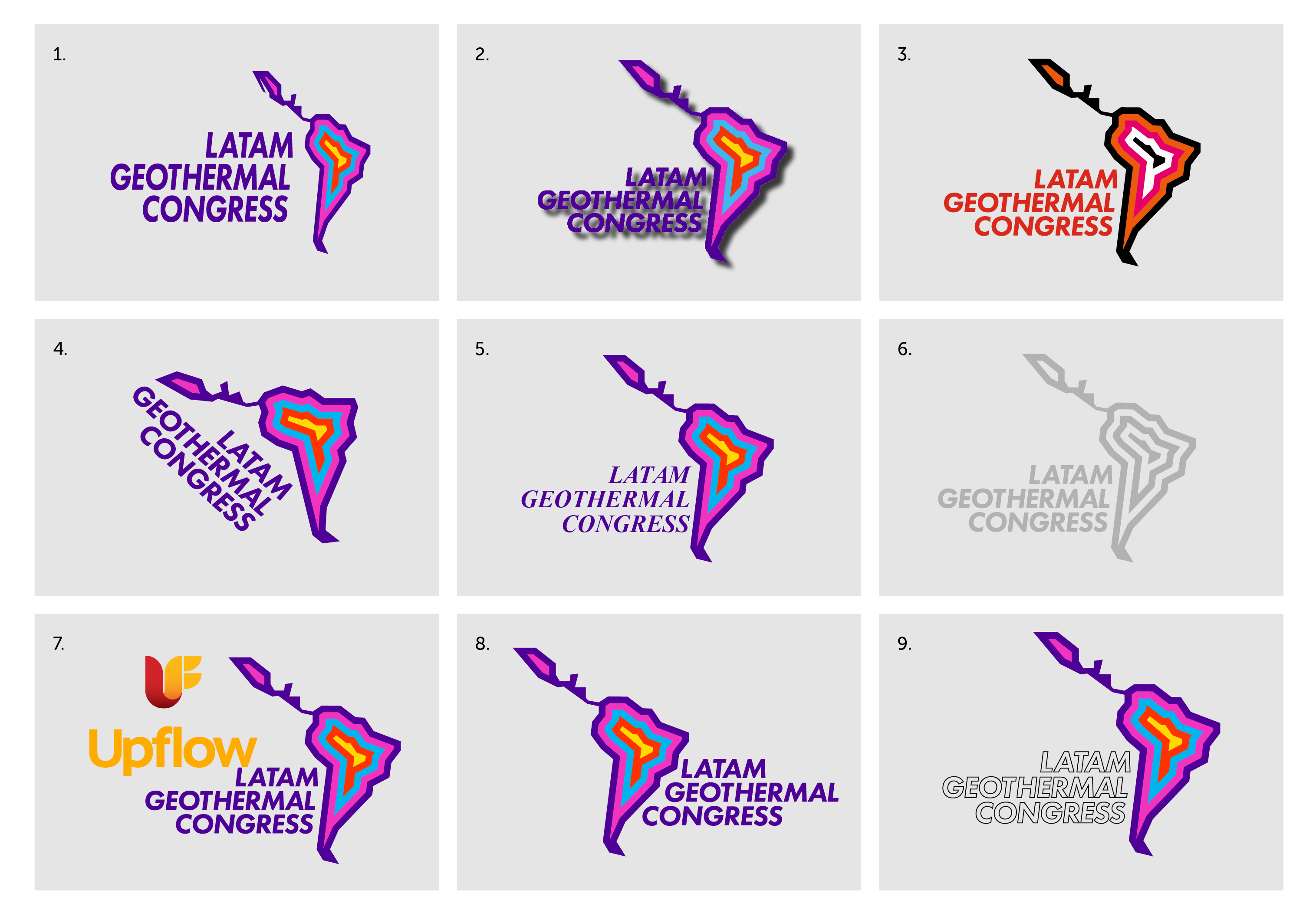
Incorrect Usage
Consistent use of our logo is key to accurately representing our brand and upholding visual coherence across all
brand applications.
Here are some examples of what you
should avoid when using our logo.
Do Not:
1. Squash, stretch or distort
2. Apply effects
3. Re-color
4. Rotate to irregular angles
5. Change the typeface
6. Use weak contrast
7. Place too close to other logos
8. Switch the alignment
9. Add a stroke
COLOUR PALETTE
Purple
hex: #4F0097
rgb: 79 / 0 / 151
cmyk: 75 / 100 / 0 / 0
Pink
hex: #F232C0
rgb: 242 / 50 / 192
cmyk: 0 / 100 / 0 / 0
Blue
hex: #00B6ED
rgb: 0 / 182 / 237
cmyk: 75 / 0 / 0 / 0
Red
hex: #FF3400
rgb: 255 / 52 / 0
cmyk: 0 / 100 / 100 / 0
Yellow
hex: #FFD803
rgb: 255 / 216 / 3
cmyk: 0 / 0 / 100 / 0
White
hex: #FFFFFF
rgb: 255 / 255 / 255
TYPOGRAPHY
Display/Heading Typeface
Aa Bb
FUTURA PT- HEAVY
By Paul Renner,Vladimir Yefimov, Isabella Chaeva
ABCDEFGHIJKLMNOPQRSTUVWXYZ
abcdefghijklmnopqrstuvwxyz
0123456789!@#$%^&*()?+
Alternative
Aa Bb
LEAGUE SPARTAN - BOLD
Google Fonts by Matt Bailey, Tyler Finck
ABCDEFGHIJKLMNOPQRSTUVWXYZ
abcdefghijklmnopqrstuvwxyz
0123456789!@#$%^&*()?+
Body Typeface
Aa Bb
Museo Slab - 300
By Jos Buivenga
ABCDEFGHIJKLMNOPQRSTUVWXYZ
abcdefghijklmnopqrstuvwxyz
0123456789!@#$%^&*()?+
Body Typface - Emphasis
Aa Bb
Museo Slab - 500
By Jos Buivenga
ABCDEFGHIJKLMNOPQRSTUVWXYZ
abcdefghijklmnopqrstuvwxyz
0123456789!@#$%^&*()?+
Alternative
Aa Bb
Roboto Slab
Designed by Christian Robertson
ABCDEFGHIJKLMNOPQRSTUVWXYZ
abcdefghijklmnopqrstuvwxyz
0123456789!@#$%^&*()?+
Alternative - Emphasis
Aa Bb
Roboto Slab
Designed by Christian Robertson
ABCDEFGHIJKLMNOPQRSTUVWXYZ
abcdefghijklmnopqrstuvwxyz
0123456789!@#$%^&*()?+
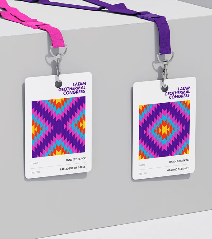
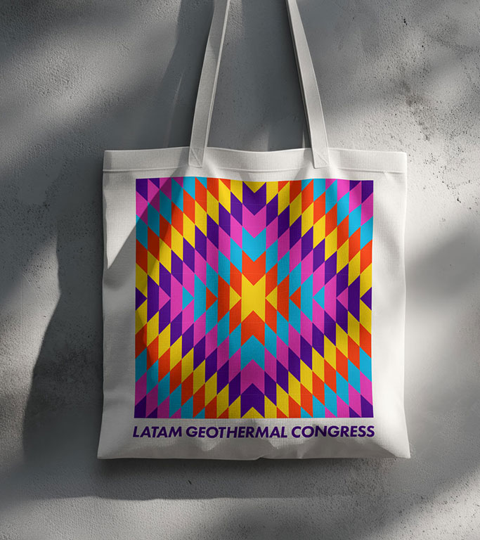
APPLICATIONS
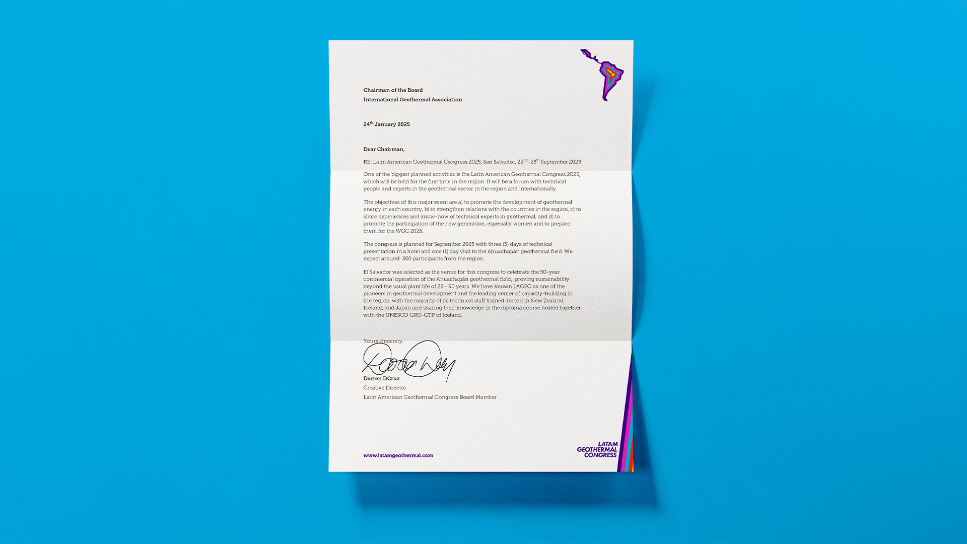
Letterhead
Social Media Posts
LATAM Geothermal Congress
LATAM Geothermal Congress
LATAM Geothermal Congress