The Auditory Processing Institute is a private organization led by audiologist Dr. Angela Alexander, focused on professional development for audiologists and speech-language pathologists. It offers online master courses and training programs designed to help hearing professionals diagnose and treat Auditory Processing Disorder (APD), a condition that affects how the brain processes auditory information, impacting listening and communication abilities. The institute uses established diagnostic models like the Buffalo Model's Central Test Battery and provides therapeutic training including programs like the Phonemic Training Program and Words in Noise Training to improve auditory processing skills. The mission of the Institute is to increase the number of qualified professionals providing effective APD services, thereby improving diagnosis and treatment options for individuals affected by this disorder

The Auditory Processing Institute speaks with a voice that is fun, approachable, and easy-going, creating a welcoming atmosphere where complex ideas are made accessible without being overly serious. We combine warmth and empathy with sharp intelligence and innovation, reflecting our commitment to evidence-based practice and progressive thinking.
Our communication is authentic and practical, grounded in kindness and understanding, yet bold enough to challenge conventions. We embrace a rebellious spirit, fearlessly thinking outside the box and advocating for change, while always maintaining humility and respect. We are passionate change-makers who strive to inspire and empower, never to alienate or boast.
In all we say and do, we ensure our voice invites connection, sparks curiosity, and drives progress with integrity and heart.


The foundation element of the symbol is a simplified version of the jelly bean.
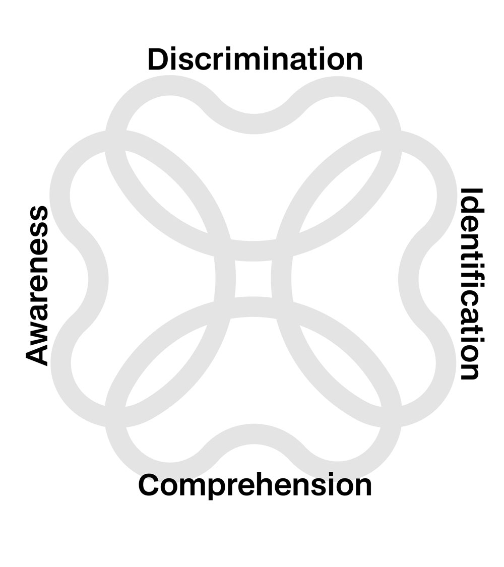
The jelly beans concept in the Buffalo Model of APD assessments is a visual metaphor used to explain the areas of auditory processing affected.
Each color of jelly bean represents one of the four Buffalo Model categories: Decoding, Tolerance-Fading Memory (TFM), Integration, and Organization.
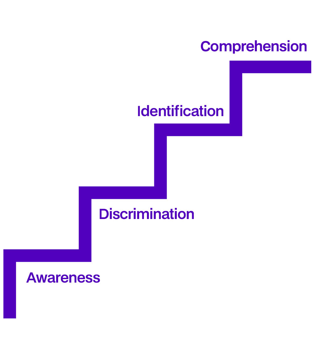
The four stages of the auditory process—Awareness, Discrimination, Identification, and Comprehension—represent the essential steps in how we hear and understand sounds, which inspired the four jelly bean shapes in the Auditory Processing Institute’s logo.
A neuron in the brain is a specialized nerve cell that transmits information using electrical impulses and chemical signals, made up of a cell body, dendrites for receiving messages, and an axon for sending messages to other neurons.
The central overlapping area creates an abstract connection to a neuron and a neural network. This ties into the idea that Auditory Processing Disorder is rooted in brain processing, not the ear.
It is appropriate to use alternative logomarks in situations where the primary logo may not be practical or visually effective, such as on small-scale applications, restricted spaces, or backgrounds that reduce legibility. Alternative logomarks help maintain brand recognition while ensuring clarity and consistency across diverse contexts. They are especially useful where the full logo may be too detailed or difficult to distinguish. Using approved alternative logomarks strategically preserves the integrity and flexibility of the brand identity across all touchpoints.


To maintain optimal clarity and visual impact, it is essential to keep an adequate amount of clear space around the logomark. This clear space acts as a protective buffer zone, ensuring that no other design elements, text, or images encroach too close and interfere with the logo's visibility and legibility. The minimum clear space is defined by the width of the capital letter 'N' used in the logotype, which serves as a consistent unit of measurement derived directly from the brand’s typography.
By using a proportional element of the logo itself as a reference, this rule guarantees that the required space scales appropriately across different applications and sizes. Maintaining this clear space enhances the logo’s presence, prevents visual clutter, and preserves brand integrity across diverse media and layouts. Consistent application of these clear space guidelines allows the logo to stand out as intended and strengthens overall brand recognition.


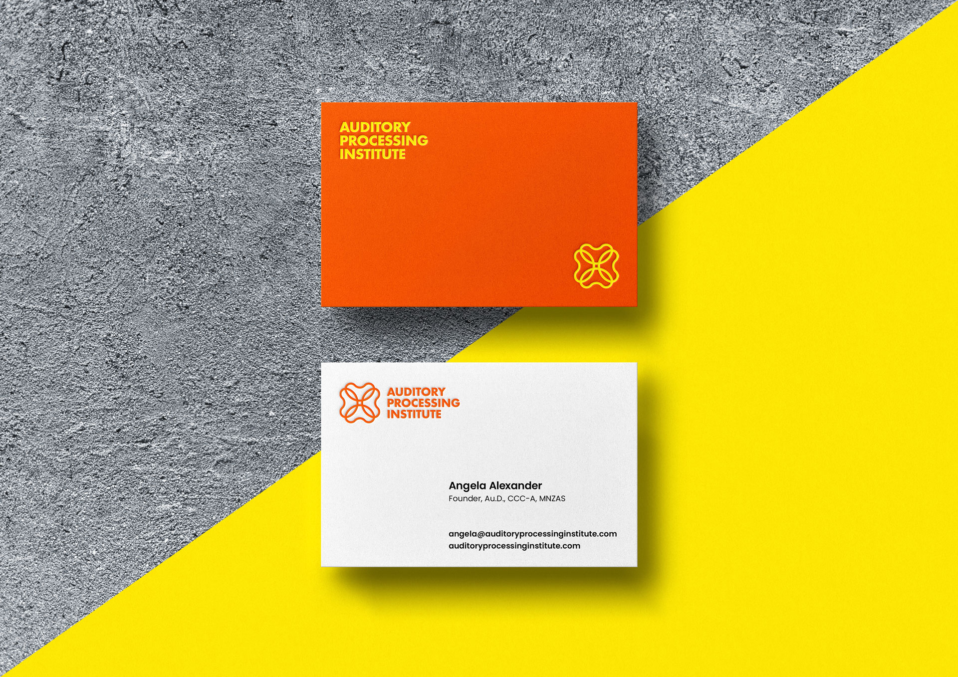
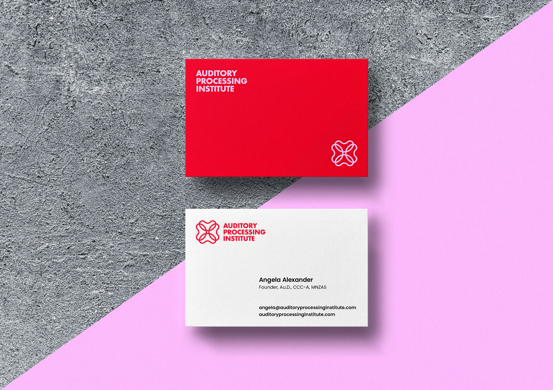
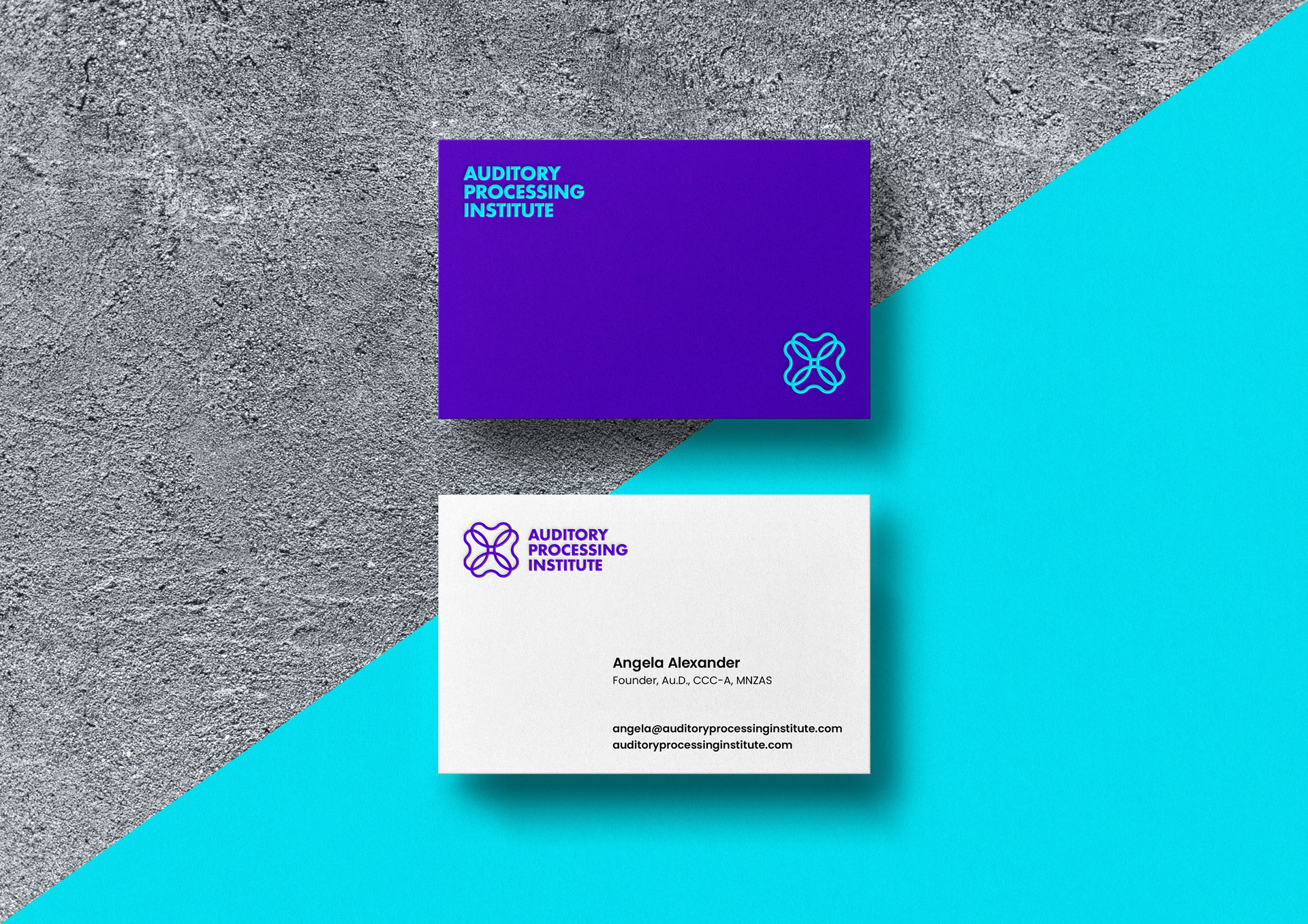
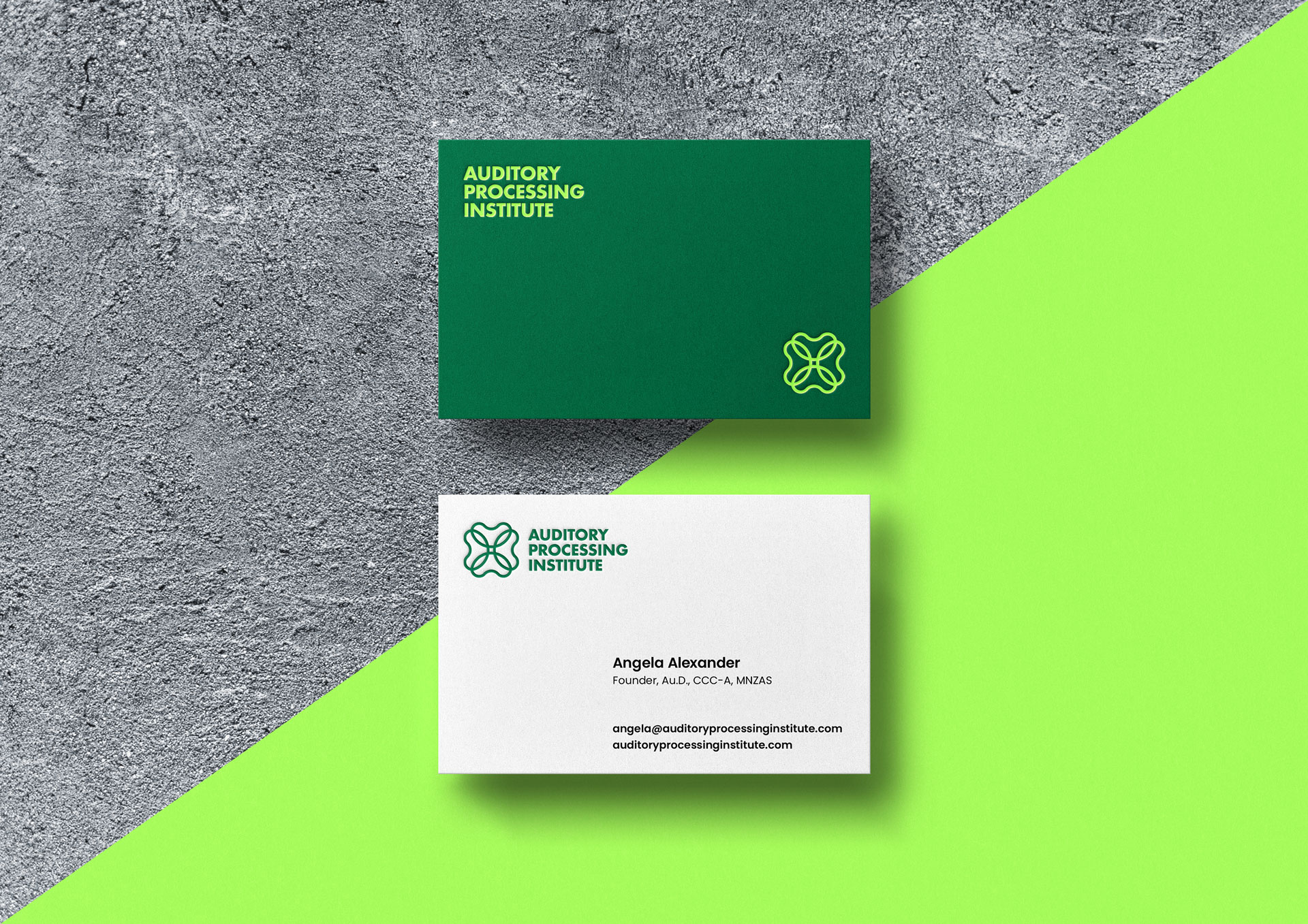
While the primary logo mark is presented in black for maximum versatility, it is highly recommended to utilize one of the eight core brand colours across various applications to reinforce the Auditory Processing Institute’s vibrant visual identity.
When applying the logo mark, consider the following best practices for colour and contrast:
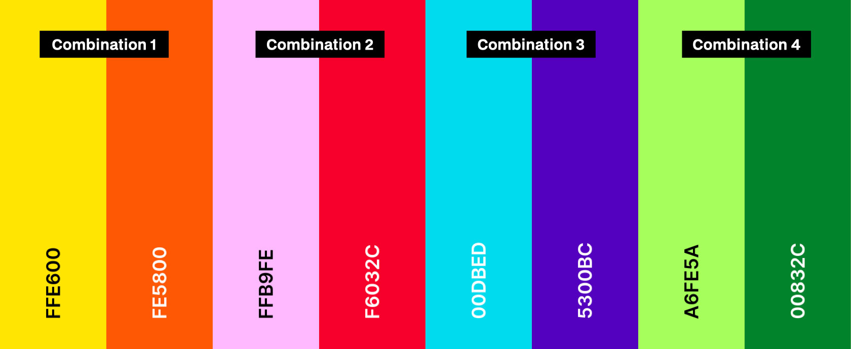
- Use darker shade versions of the logo mark (such as #5300BC or #00832C) on white or light backgrounds to ensure the logo remains clear and legible.
- Use lighter shade versions of the logo mark (such as #FFE600 or #A6FE5A) on black or dark backgrounds to maintain strong contrast and visibility.
- Whenever possible, select logo colours that complement or echo the surrounding palette in communications and collateral to build cohesion and recognisability.
- Avoid using mid-tones or colours too similar to the background, as this may reduce the logo’s impact or hinder accessibility.
- Refrain from applying gradients or effects to the logo mark, unless specifically approved for campaign or special use cases.
Using the full spectrum of brand colours within logo mark applications enhances brand energy, strengthens recall, and ensures the identity feels lively and approachable—ideal for both digital and print contexts.


By using complimentary colour pairs in the brand palette, a high degree of contrast is achieved that naturally draws attention and enhances legibility, making each logo application visually striking. Each of the eight colours is paired with its direct complement, allowing a vibrant version of the logo to be positioned over its complementary background colour. This deliberate pairing not only generates eye-catching contrast but also reinforces the dynamic and energetic personality of the brand. The use of these pairs respects colour theory principles by balancing light and dark tones, helping to maintain visual harmony while maximising impact. Overall, this approach ensures consistency across applications by aligning with the brand’s vibrant essence and guaranteeing accessibility and clarity in various uses and environments.


Poppins is a versatile, geometric sans-serif typeface known for its clean, modern, and approachable appearance. It features nearly monolinear strokes with consistent stroke widths, giving it a balanced and polished look. Designed by the Indian Type Foundry, Poppins supports both Latin and Devanagari scripts, making it highly multilingual. Its geometric shapes and rounded forms create a contemporary feel that works especially well for brand identities seeking a fresh, professional, yet friendly tone.
Poppins shines in headings, logos, and digital content, combining clarity with a subtle playfulness that ensures legibility while adding character. Its broad range of weights and styles offers flexibility in expressing different moods within a cohesive typographic system.

By tiling the brand symbol using various shape arrays, such as grids, offset rows, or radial motifs, and thoughtfully pairing them with our distinctive colour palette, we can generate a wide range of engaging patterns. These patterns can be adapted in scale and density, allowing for versatility across multiple marketing and product contexts.
Ultimately, these pattern options add depth and recognizability to the Auditory Processing Institute’s visual identity, providing a toolkit for brand expression that enhances everything from digital banners and event signage to merchandise like tote bags, notebooks, or even educational materials. By leveraging pattern, the brand remains both unified and adaptable across all points of engagement.


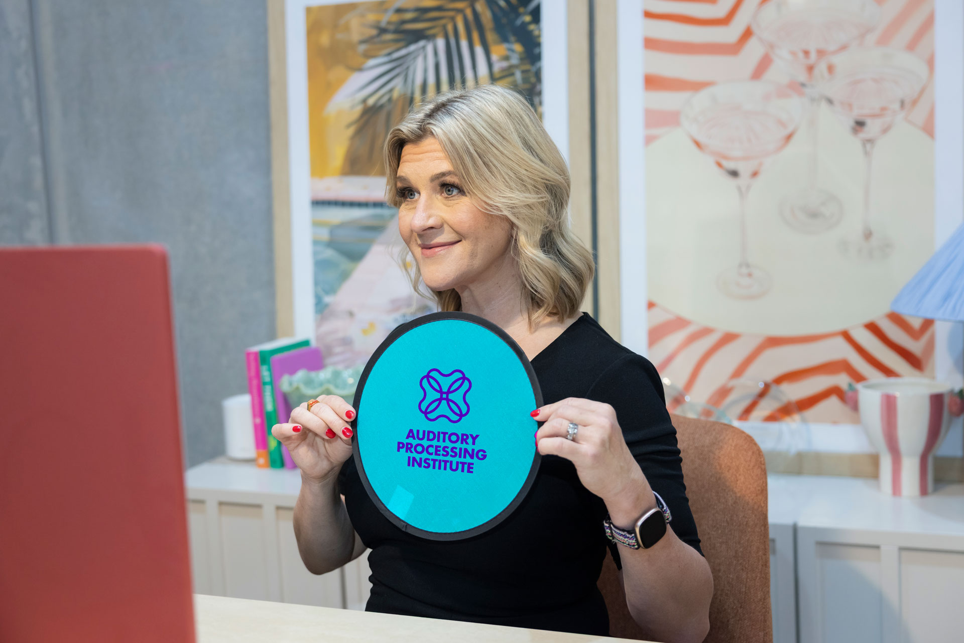
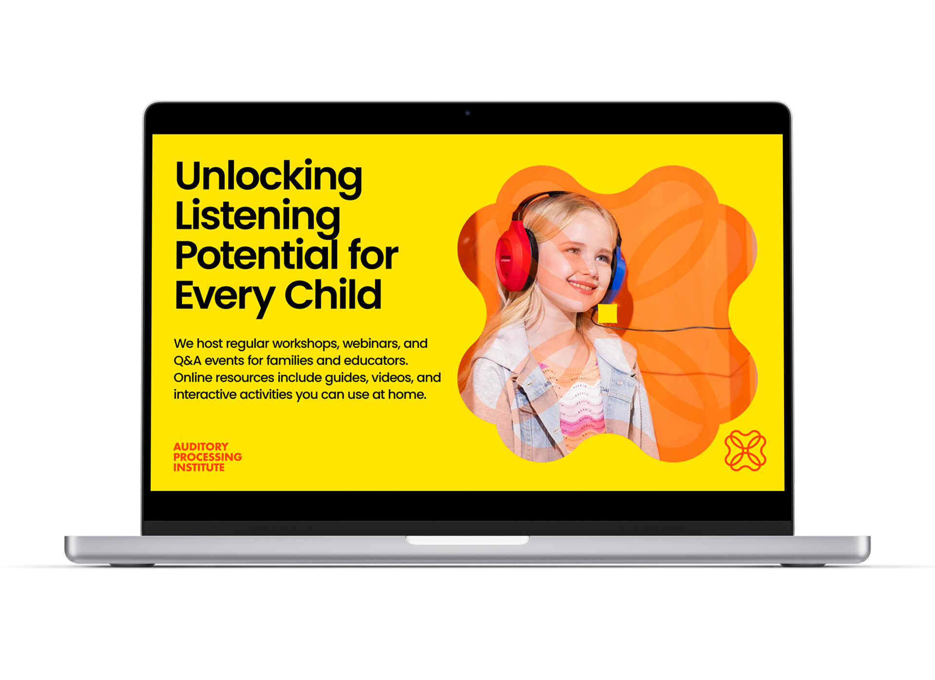
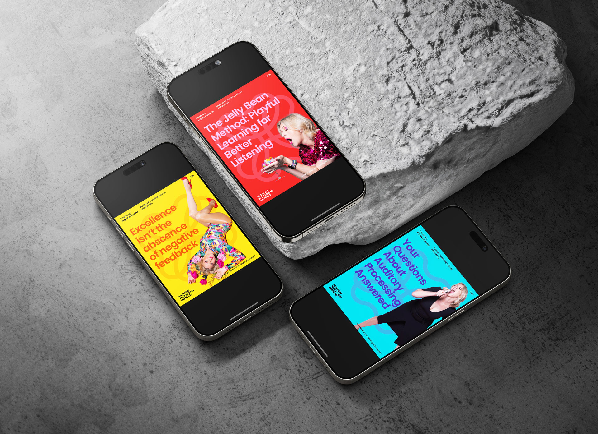
For the Auditory Processing Institute brand, our visual storytelling leans into vibrant, expressive photography that captures energy, authenticity, and individuality. The featured images from Angela Alexander’s photo shoot with Kate Whatman embody this spirit—celebrating bright, non-corporate colours, candid poses, and diverse backgrounds.
This approach aligns perfectly with our dynamic colour palette, creating a brand experience that is warm, engaging, and approachable. The photography feels distinctly human and modern, helping us stand apart from more traditional, corporate visuals.
We encourage the use of imagery that:
- Is vibrant and rich in colour
- Features relaxed, natural expression and movement
- Utilizes lively, authentic backgrounds rather than formal, staged settings
- Conveys warmth, openness, and genuine connection
This photographic style helps Auditory Processing Institute communicate positivity, approachability, and a forward-thinking attitude in everything we do.