Brandpage

A family of revolutionary-minded creators with the goal of making films about the impacting stories in the world of motorsport.

OUR STORY
Motorsport is changing.

Today, you need more than good results and speed on the racetrack to be successful.

Those with a strong following and community thrive, getting more opportunities and popularity in the paddock.

Upon this scenario, many turn to social media to build said community, creating and uploading content trying to grow their presence online.

However, many have the wrong approach.

Social media has become a place where people try to produce content to please an algorithm, which rewards content optimised for retention and engagement, not content made to please people.

This movement, which prioritises numbers and stats over artistic value or human emotions and connections is frequently called "Beastification" in the Creator community, as its leader is world-renowned YouTuber Jimmy "MrBeast" Donaldson.

The truth is that numbers in social media, such as followers and likes, have lost its meaning.

Jack Conte, creator and co-founder/CEO of Patreon:

"As a Creator on the internet today, I can get subscribers and I can get views [...] But what I've noticed is those communities degrade over time. They don't get energized over time, they get deenergized. It gets harder and harder to reach those people. I make a post, I reach 2% of my audience, I reach 1% of my audience...

I lose touch with those people and there's no way for me to find those real fans, those true fans, the small portion of my fans that drive everything."

The New Wave

Creators and audiences alike are growing tired of this style of content, though. They want to see something beautiful, something artistic, something emotional... Something made with humans in mind, not an algorithm.

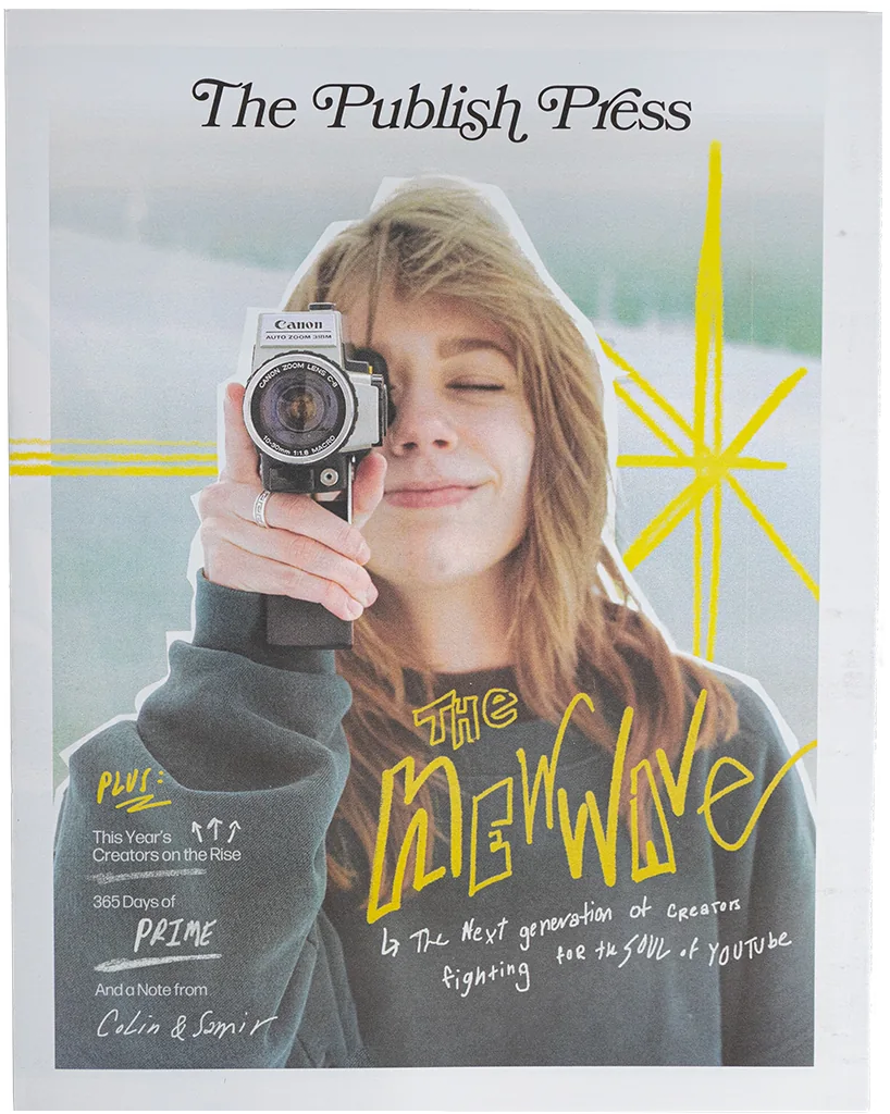
This is where the New Wave of creators surges. An artistic movement which, according to creator outlet The Publish Press, pretends to "rebel against the so-called “Beastification” [of social media] by shunning traditional metrics like retention and clickability in favor of an almost filmmaker-like focus on storytelling and deep personal truths."

People want to hear stories. And everyone has a story to tell.

New Wave creators tend to have significantly higher engagement metrics than other creators.

It isn't because it's optimised to obtain said engagement, but because their communities are so strong that they are willing to interact more with the creator.

These stronger communities are the ones that will truly support you in your journey. They are true, loyal fans.

Way more than a simple "follower". Way more than a number.

Our Manifesto

We dream of a world where "success" isn't measured in views, susbcribers or likes, but artistic output and viewer satisfaction.

Forget about editing for an algorithm to recommend your content. We should edit with the audience in mind. We should edit to have an emotional impact on people and create a loyal community.

Social media has become too artificial, when it should be used as a tool to be ourselves and show our true character while sharing our successes, failures, fears, dreams, motivations...

Let's make beautiful things. Let's be passionate about our work. Let's provide an outstanding attention to detail and dedication to our craft.

Let's build one-to-one relationships with our audience and strong communities that follow us and support us everywhere we go.

Let's produce the content that we want to make, not what an algorithm wants us to make.

Let's create movies uncovering the true stories behind motorsport.

Let's start a revolution. Let'sTrace.

OUR VALUES
The Three Meanings Of Trace

Let's TRACE the world of motorsports, uncovering its stories: to find someone or something that was lost.

Let's TRACE the stories and their progress or development: to discover the causes or origins of something by examining the way in which it has developed.

Let's TRACE said stories, staying loyal to the true facts: to copy a drawing or pattern, etc. by drawing over its lines.

Our Mission

We make films telling impacting stories about motorsport.

We prioritise making something beautiful that has emotional impact on our audience, content that satisfies them and leaves an impression.

We aspire to seek quality over anything else in our work, focusing on storytelling and filmmaking. We hope to make content that impacts and inspires our audience and stands out from the rest.

Our goal is to make the best content possible by putting effort, care, passion, love and great attention to detail into every step of the creative process.

Our Tone Of Voice

We are a family. We use plural forms to talk about ourselves, our work and our community. We are humble, honest, down-to-earth and kind, keeping a friendly, personal relationship with our audience.

However, we are still professional and thoughful despite having that relatable and authentic touch. Just like our stories, our emotions fluctuate and change depending on the situation.

Our Identity

Let's leave our trace in the world.

COLORS AND GRADIENTS
Main Colors

These colors will be used throughout all of our projects and work. Off-White will be preferably used for text over darker backgrounds.

Off-Black
hex:  #041C2C
rgb:  4 / 28 / 44
pantone:  296 C
Off-White
hex:  #F6F6F6
rgb:  246 / 246 / 246
cmyk:  0 / 0 / 0 / 5
Main Accent Gradient

Our brand's main accent gradient is a #009ABE to #01CE7E linear gradient with perceptual method. Its angle may vary depending on its use.

Accent 1
hex:  #009ABE
rgb:  0 / 154 / 190
pantone:  7703 C
Accent 2
hex:  #00A3B3
rgb:  0 / 163 / 179
pantone:  7710 C*
Accent 3
hex:  #00ABA9
rgb:  0 / 171 / 169
pantone:  326 C*
Accent 4
hex:  #01B49E
rgb:  1 / 180 / 158
pantone:  3268 C*
Accent 5
hex:  #01BD93
rgb:  1 / 189 / 147
pantone:  3275 C*
Accent 6
hex:  #01C589
rgb:  1 / 197 / 137
pantone:  3395 C*
Accent 7
hex:  #01CE7E
rgb:  1 / 206 / 126
pantone:  7479 C
Project-Specific Gradients

Certain projects may have specific gradients to suit a certain location, team, driver or mood. These project-specific gradients are linear with perspectual method. All gradients used in the same project should be the same, to keep consistency within the piece.

WAVING THE GREEN FLAG
Let's make some waves

To shock or upset people with something new or different. That's what we are here for.

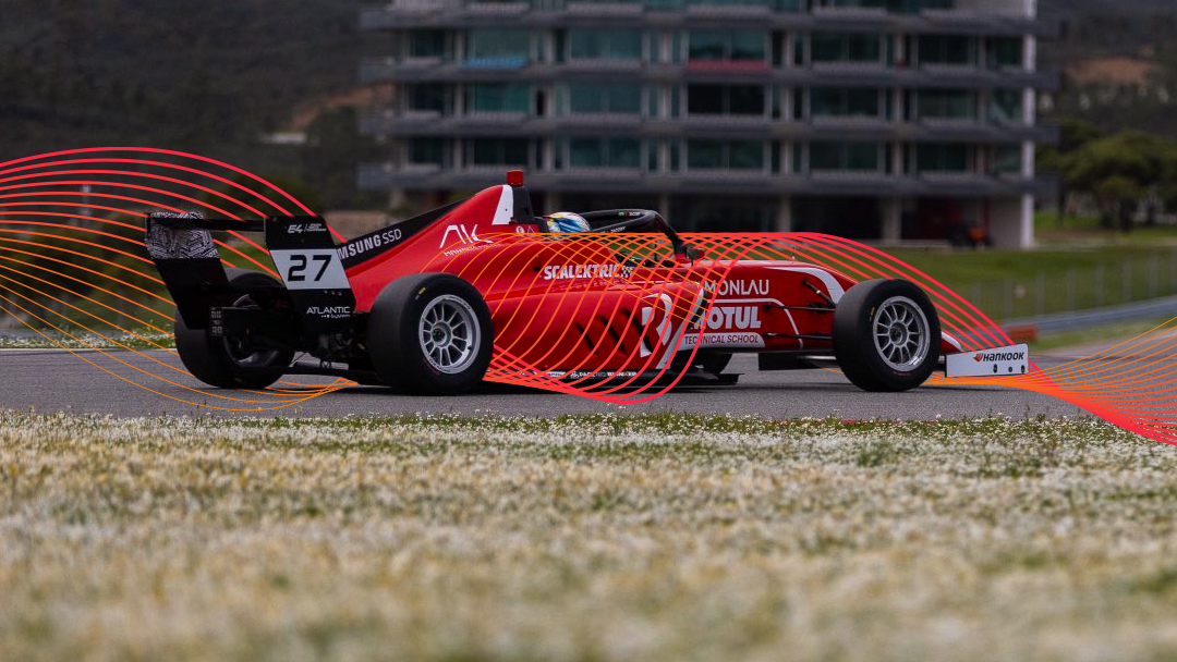
Waves are like our stories. They are not perfect, they have their quirks and turns. They are not linear, they flunctuate, they flow up and down like a rollercoaster.

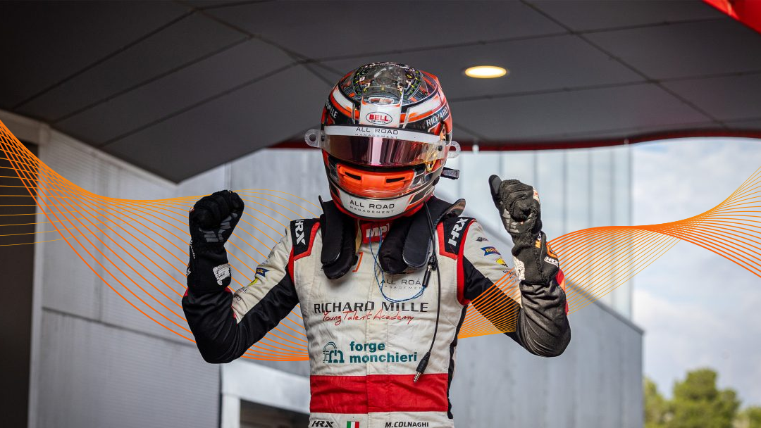
We represent this concept in our visual image through "Waves".

Waves are a 15-step blend of two curved lines that overlap each other, the first one being 4px wide and filled with the brightest color and the second being 0.5px wide and being filled with the darkest color.

Waves shall actively interact with the subjects in our work, as shown in the examples above, going over, under and around them and providing depth and uniqueness to our projects.

PRINT THE RACETRACK
Leave your print on the world

We leave our fingerprint in everything we touch. It's the trace that we leave behind everywhere we go.

Fingerprints are unique to us. They are our identity, our values, our experiences, our wins, our losses, our stories.

Our fingerprint is... us.

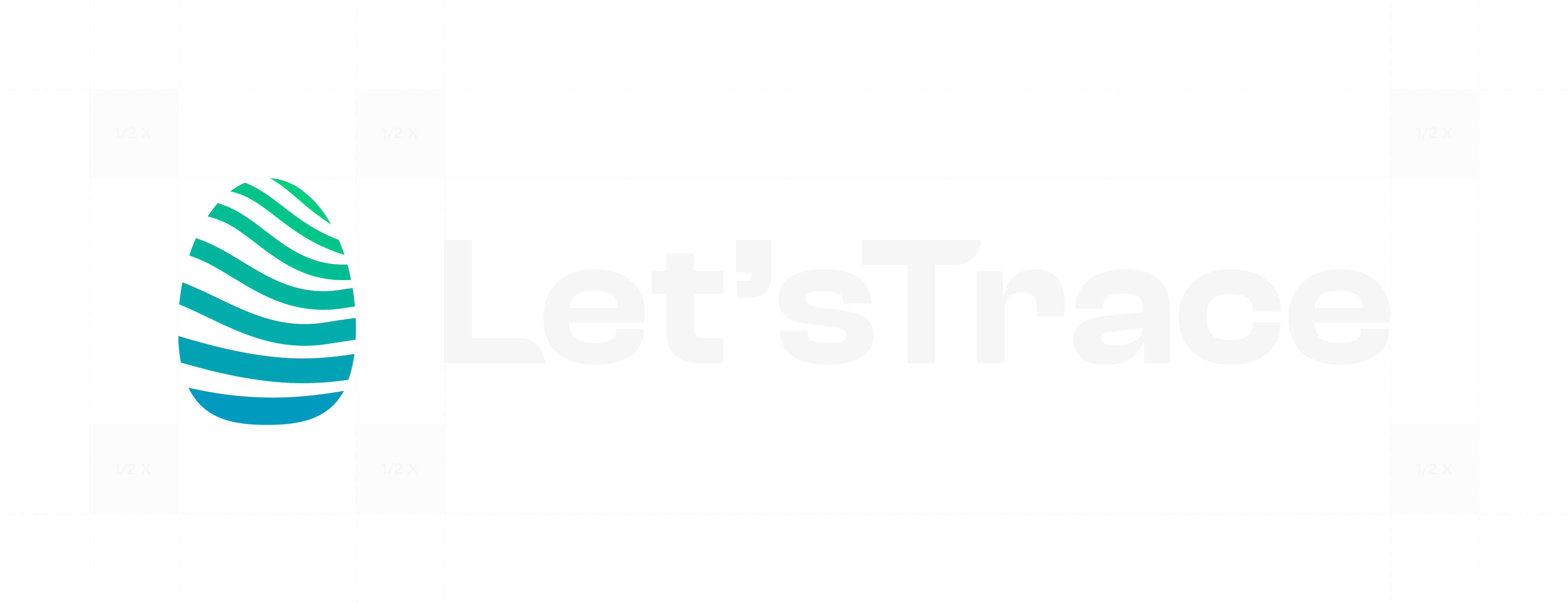
Our "Fingerprint" is made of seven curved lines with decreasing width, representing the Waves that are also a prominent part of our visual identity and brand.

These curved lines are solid-colored, with the colors in its normal variation serving as a nod to the Main Accent Gradient. The colors may be changed to a Project-Specific Gradient or to one of the two Main Colors of the brand, Off-White or Off-Black.

The logotype may be used with or without the "Let'sTrace" wordmark, but the Fingerprint logomark must always be present to represent us and our brand.


Because you always need to leave the space, we use 1/2 of the width of our Fingerprint as our X for the clear space.

BOXES, LABELS AND LANES
Box, box, box

"Boxes" are Off-Black filled rectangles with a 4px inside stroke, colored with the Main Accent Gradient or a Project-Specific Gradient. Their purpose is to improve legibility and increase the contrast between the text and other contents inside the Box and the background, without disrupting any of the two.

Boxes may have a layer mask of the background applied with 50% opacity and 10px of Gaussian Blur in order to achieve the desired effect and properly balance the foreground and the background.

Write your own label

Additionally, "Labels", made up of three different rectangles and a vertical line displaying different information as shown above, may also be used to include information such as championship standings, statistics or session results.

These Labels may be appearing by themselves or accompained with a Box, with the Label being inside.

In Labels, the first rectangle has 75% opacity and a 8px corner radius on the top/bottom left, the second has 50% opacity and the third has 33% opacity and a 8px corner radius on the top/bottom right. The vertical line, located between the first and second rectangles, is 4px wide, filled with a solid color.

Everyone's dream is driving in Victory Lane

Victory Lane separates the winners from the losers. Our "Lanes" separate content and other elements in our work to improve and enhance legibility, as well as providing our audience with an easy way to identify our work.

Lanes are lines filled with the Main Accent Gradient or a Project-Specific Gradient. They may be used at the very bottom of our social media posts, to quickly identify our work and provide the audience with a distinct element to recognise our work.

WELCOME TO THE GRID
Gridded and ready to go

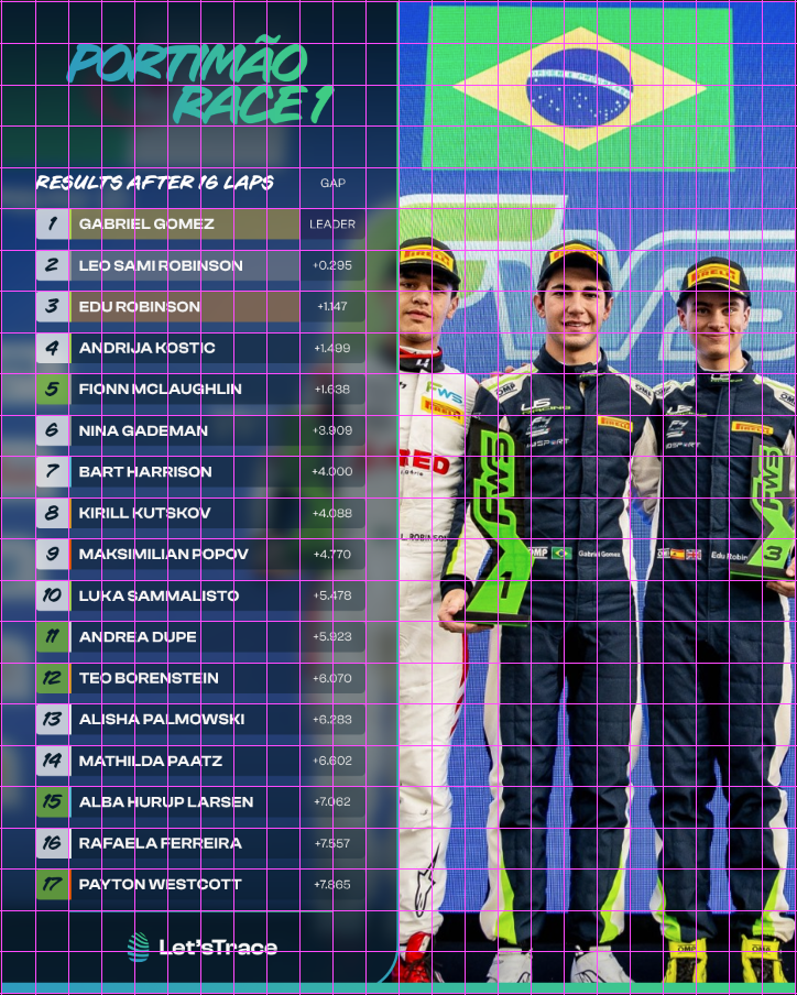
To enhance visual balance and keep our style unique and consistent, we use "Grids", formed of 24 horizontal guides and 24 vertical guides dividing our canvas, no matter its aspect ratio or dimensions.

Grids shall be used as a guide to help find the right spot to place and spread the different elements in the piece to keep our work visually appealing, but not as an strict rule to limit your creativity.

TYPING IN STYLE
Aggressive, yet unique and authentic

These are the attributes that describe the typefaces that we use throughout our work and projects, conveying the loud, exciting and fast side of racing without leaving aside its human and emotional aspects.

CC SIGN LANGUAGE - REGULAR ITALIC
ABCDEFGHIJKLMNOPQRSTUVWXYZ abcdefghijklmnopqrstuvwxyz 0123456789!@#$%^&*()?+

CC Sign Language is a handwritten-styled font, with an aggressive touch. In our brand, it will be used for attention-grabbing titles. This typeface shall only be used in all-caps, with tracking set to -75.

Clash Display - Semibold
ABCDEFGHIJKLMNOPQRSTUVWXYZ abcdefghijklmnopqrstuvwxyz 0123456789!@#$%^&*()?+

Clash Display is a stylish and visually impacting typeface. It shall be used for subtitles and subheadings with tracking set to +25.

Clash Grotesk - Medium
ABCDEFGHIJKLMNOPQRSTUVWXYZ abcdefghijklmnopqrstuvwxyz 0123456789!@#$%^&*()?+

Clash Grotesk is a more condensed version of Clash Display, perfect for pieces of text with a smaller size. This weight should be used to highlight body text, with tracking set to 0.

Clash Grotesk - Regular
ABCDEFGHIJKLMNOPQRSTUVWXYZ abcdefghijklmnopqrstuvwxyz 0123456789!@#$%^&*()?+

This lighter weight of Clash Grotesk shall be used for all non-highlighted body text across our work, with tracking set to 0.

BRANDING IN ACTION