Satori Advisory Brand Guidelines
Welcome to the world of Satori.


This document is your complete reference for everything needed to create assets for Satori Advisory. Whether you're designing a presentation, writing communications, building digital touchpoints, or producing any branded material — everything you need is here. These guidelines exist to ensure that every piece of work we put into the world carries the same clarity, intention, and quiet confidence that defines who we are. Consistency isn't just a design principle for us — it's an expression of our values.


Our Creative Territory


At the heart of the Satori brand lives a simple truth: the right guidance doesn't overwhelm — it clarifies. Our visual and verbal identity is built around the calm that arrives when complexity finally gives way to understanding. We don't speak loudly. We speak well. Advice, in our world, is more than instruction. It is experience made accessible, judgment applied with care, and insight offered in a way that actually lands. We are the steady presence that quiets the noise — grounded, human, and considered. When someone works with Satori, they don't just receive answers. They gain something rarer: the ease of knowing exactly what to do next. Every asset created under this brand should carry that feeling. Not busy, not loud — but clear, assured, and thoughtfully made.


How to Use These Guidelines


The pages that follow cover everything from our logo and color palette to typography, imagery direction, and beyond. Use them as both a reference and a compass. When in doubt, ask yourself: does this feel like Satori? Does it bring clarity? Does it put the person reading it at ease? If the answer is yes, you're on the right path.


The Satori team.

Drop Image
Wordmark

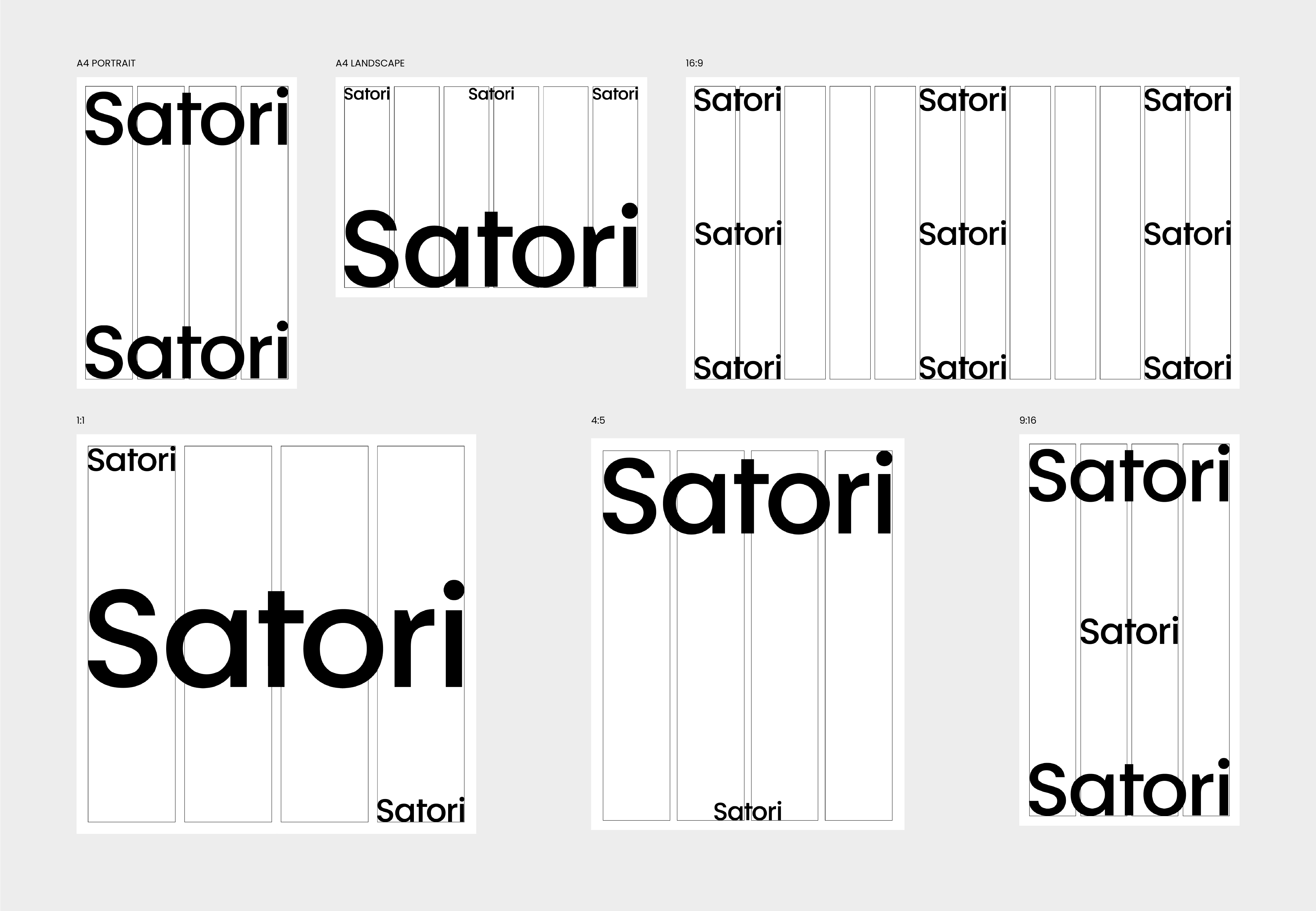
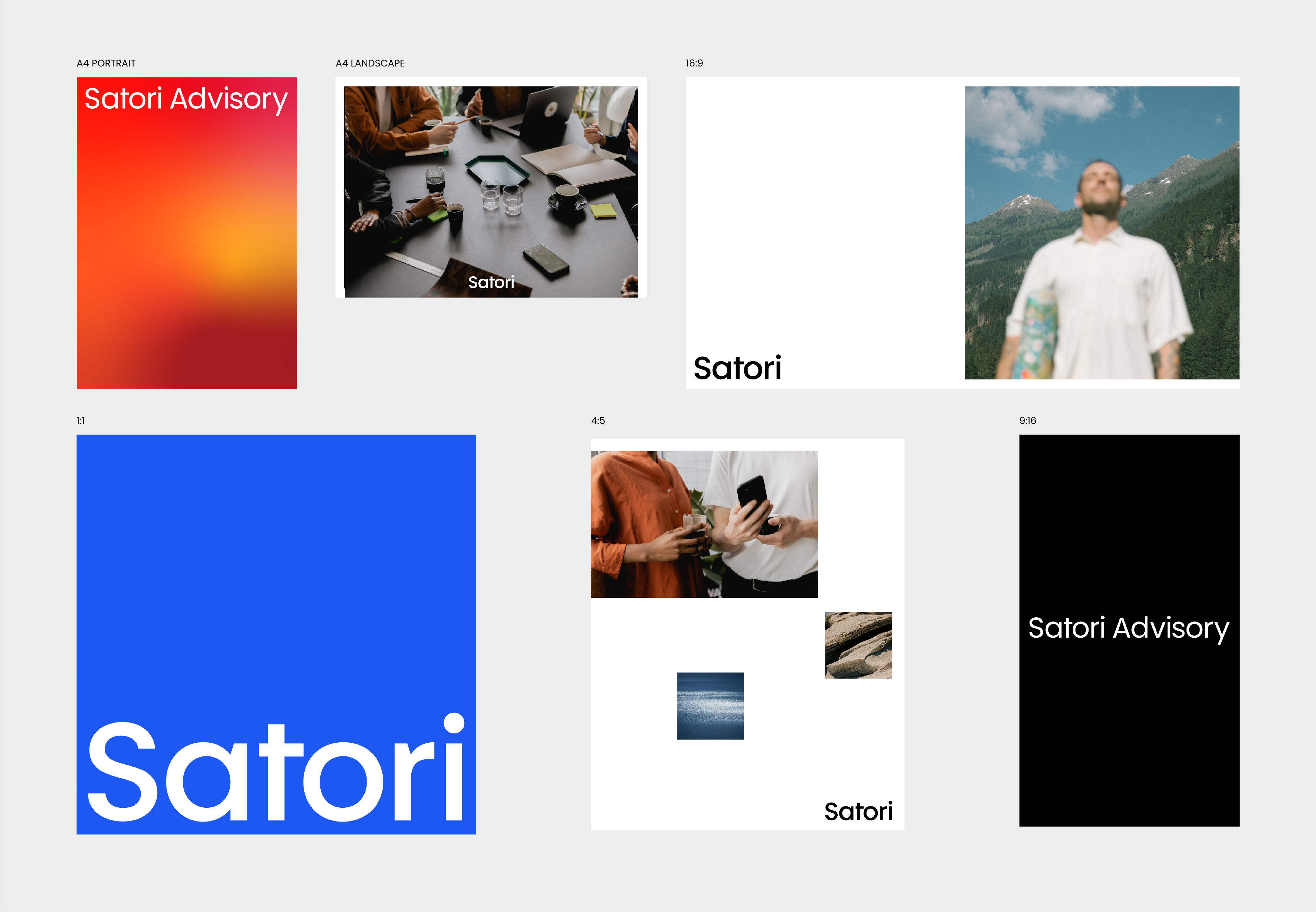
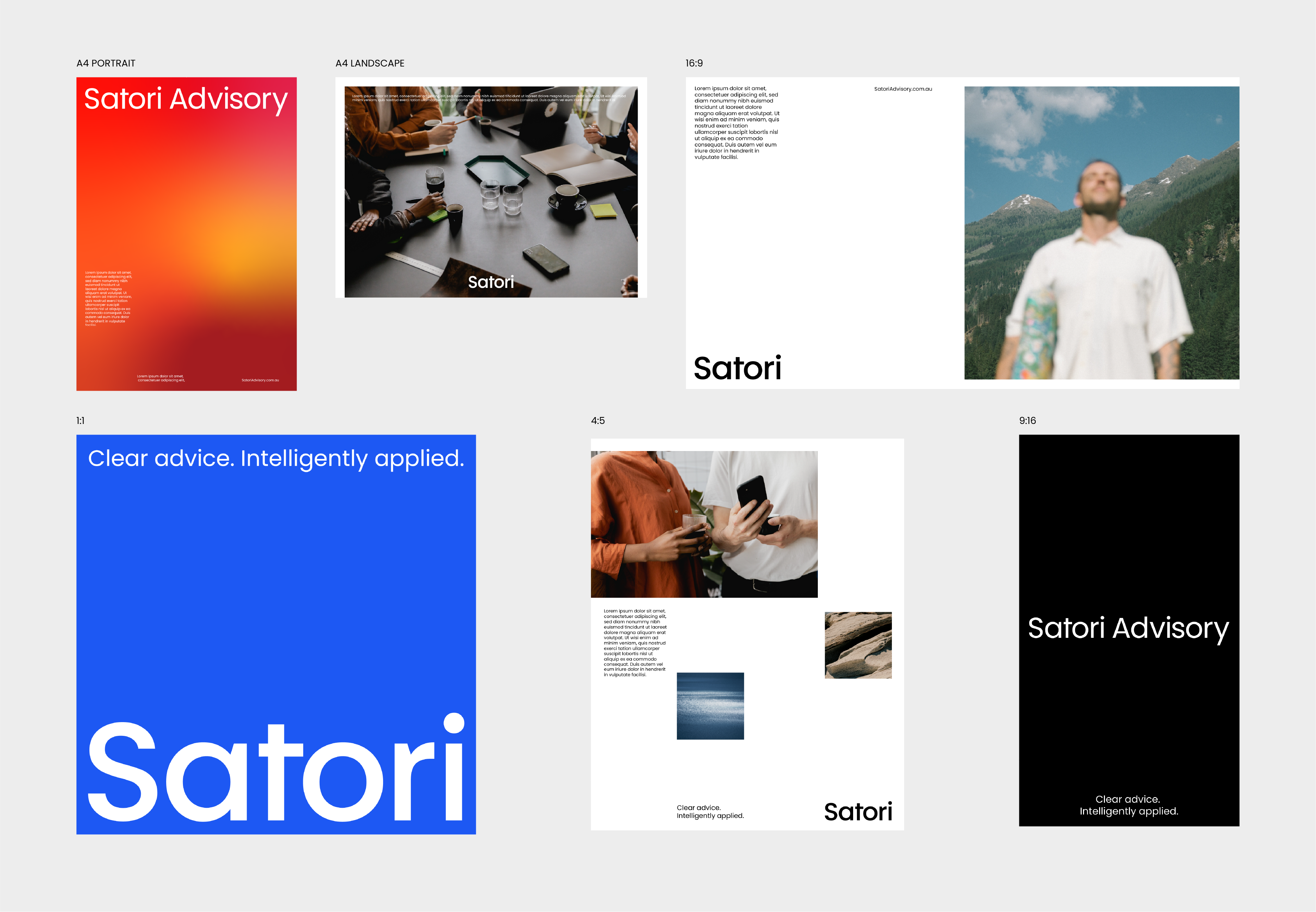
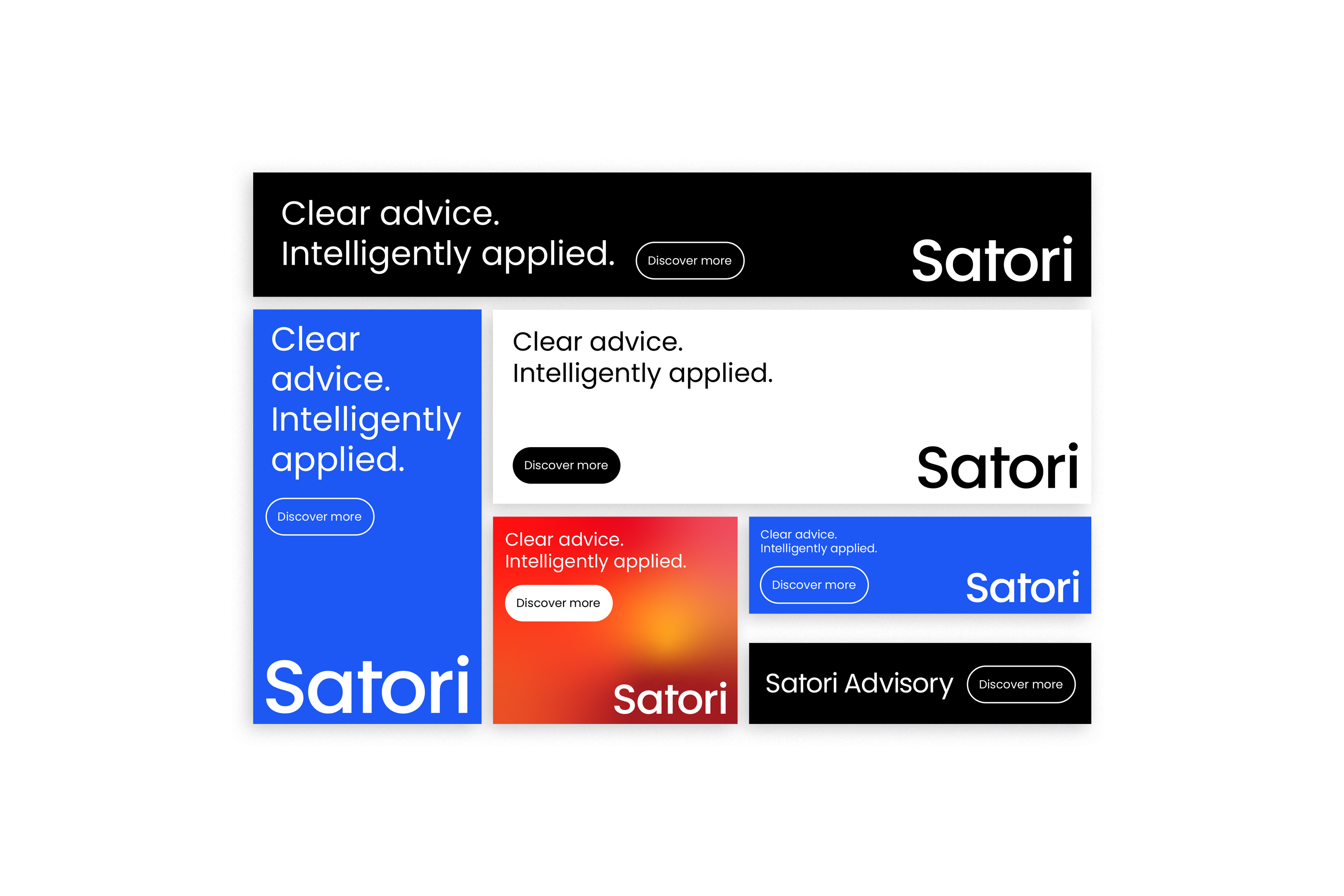
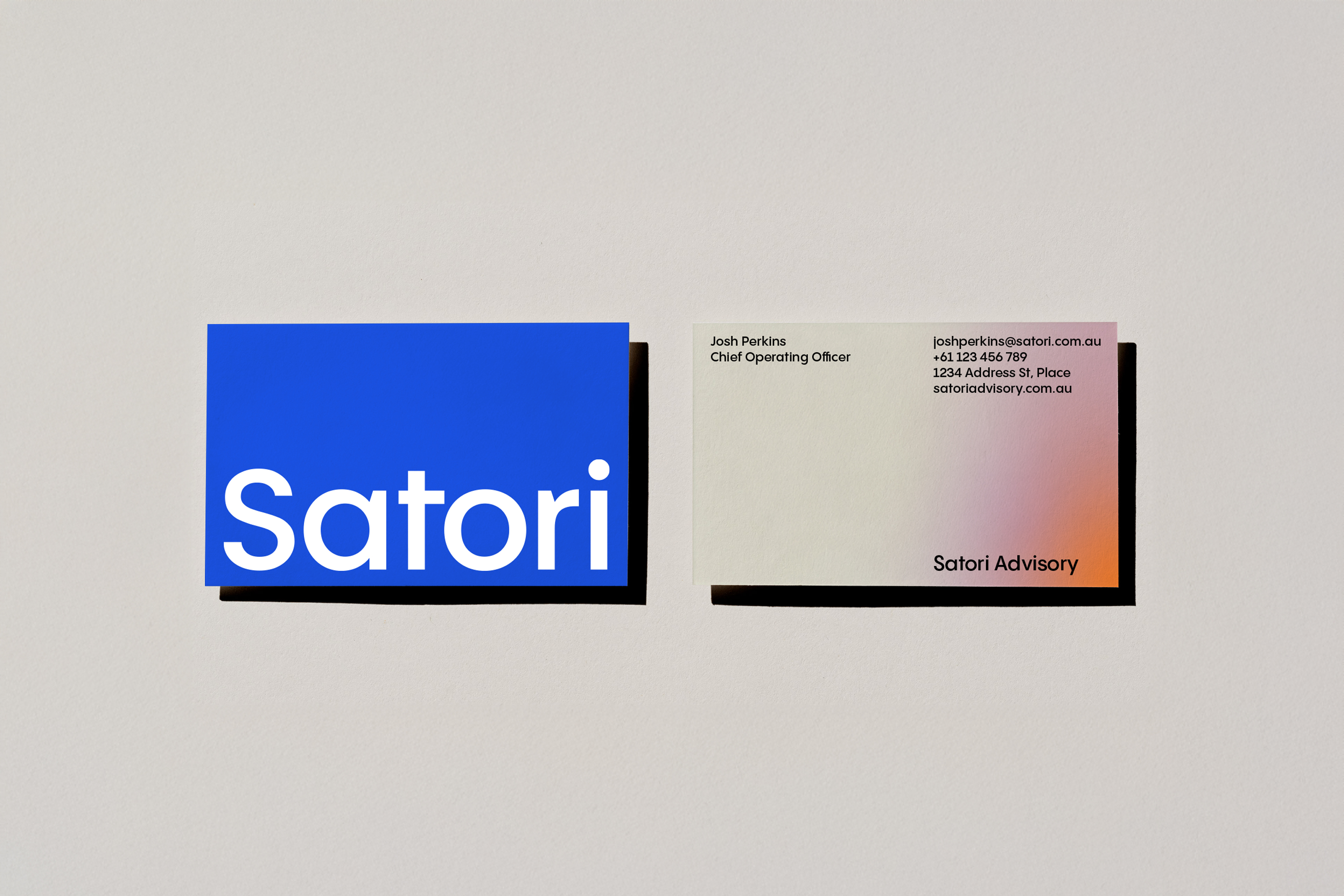
The Satori logo is a wordmark — nothing more, nothing less. Set in Poppins Semi-Bold, it carries quiet authority through its geometry and weight alone. No icon, no embellishment. The name does the work.


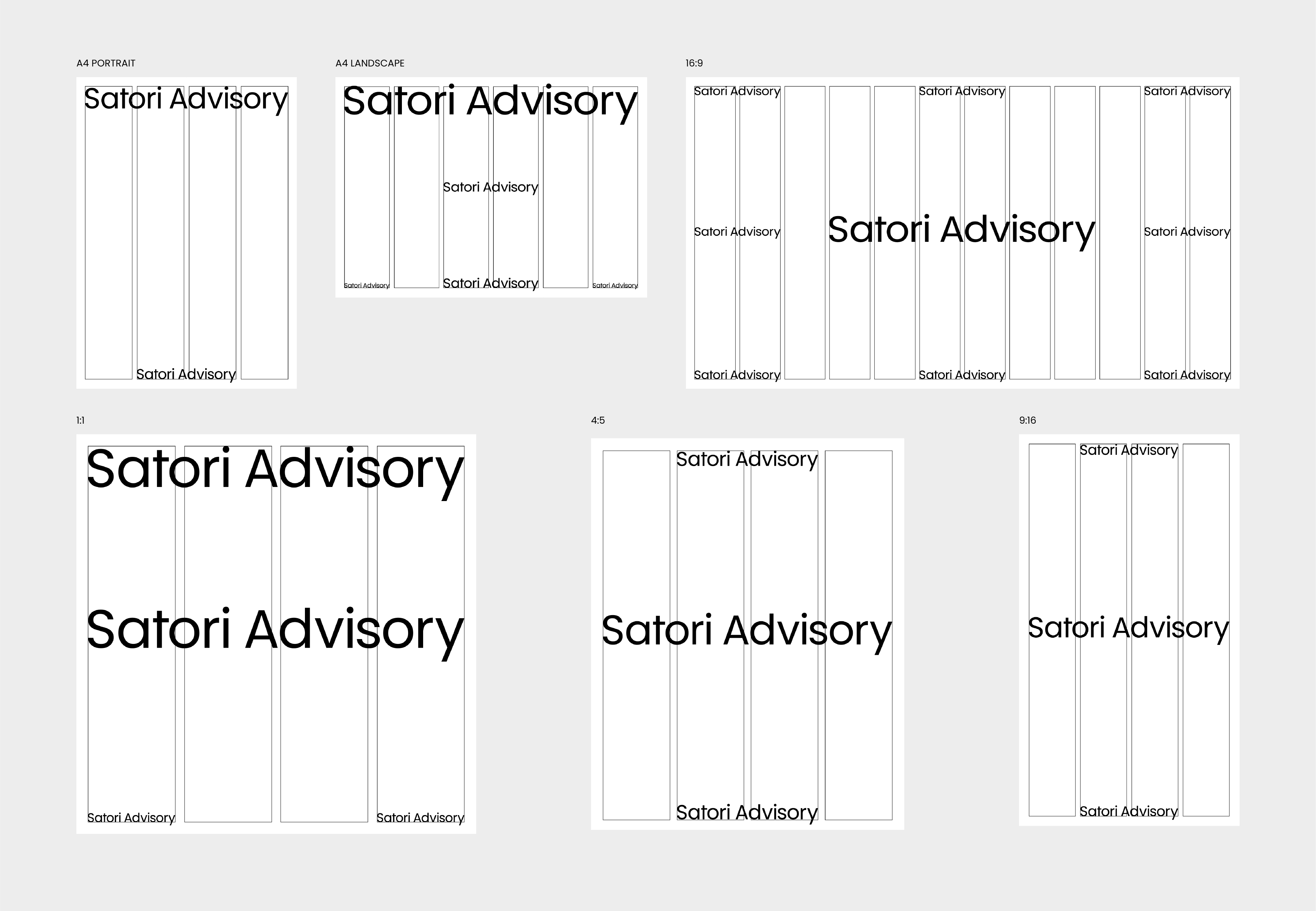
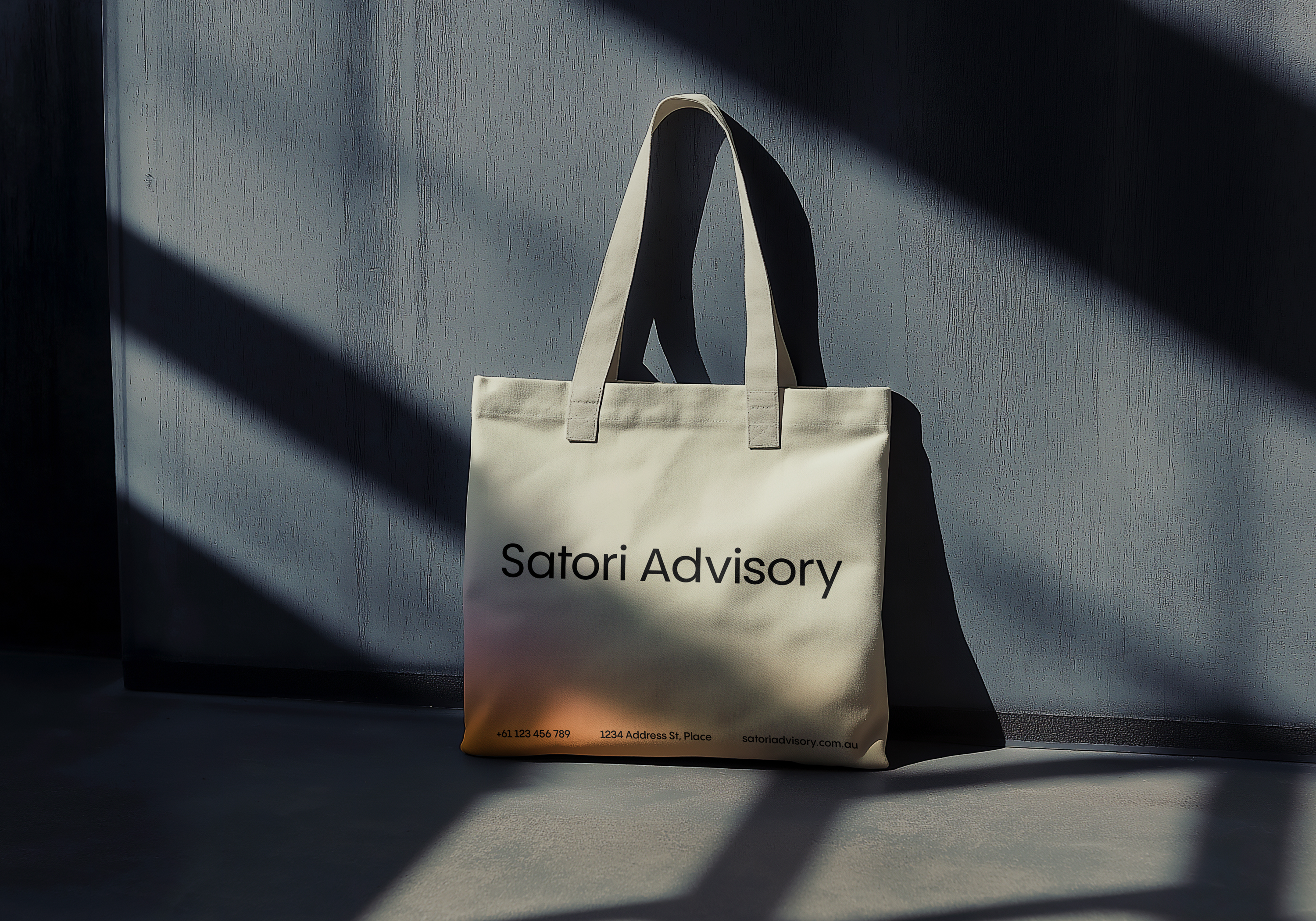
Two versions exist: the primary wordmark "Satori," used wherever the brand is well established, and the extended wordmark "Satori Advisory," used when the full name of the business needs to be present — in formal documents, introductory materials, or any context where the descriptor adds necessary clarity. In the extended version, "Advisory" appears in Poppins Regular, creating a natural hierarchy within the lockup without introducing a second typeface.


Always use the supplied logo files. Never attempt to recreate the wordmark by typing it in any application.

Colour Versions

The logo is available in three approved colour combinations, each suited to different backgrounds. Black on white or Sand for light contexts. White on Black or Calm Blue for dark and bold applications. No other colour combinations are permitted — the logo should never appear in any colour outside of these three pairings, and never be placed on a background that compromises its legibility or presence.

Drop Image
Wordmark Extended
What Not To Do

Do not stretch, condense, rotate, or skew the logo. Do not apply gradients, shadows, or outlines to it. Do not place it on busy backgrounds or low-contrast surfaces. Do not use the wordmark at a size where it becomes illegible. The logo earns its authority through restraint — treat it accordingly.

Drop Image
Colors
Our Palette

The Satori colour palette is built around four tones, each carrying its own weight and purpose. Together they reflect the brand's core territory: calm, considered, and clear.

Calm
hex:  #1C58F5
rgb:  28 / 88 / 245
cmyk:  100 / 80 / 0 / 0
Sand
hex:  #D0CCBF
rgb:  208 / 204 / 191
cmyk:  20 / 15 / 25 / 0
Satori Black
hex:  #000000
rgb:  0 / 0 / 0
cmyk:  60 / 40 / 40 / 100
Satori White
hex:  #FFFFFF
rgb:  255 / 255 / 255
cmyk:  0 / 0 / 0 / 0
Drop Image
Gradients
What They Are

Satori's gradient library is a set of bespoke, luminous colour fields designed for use as backgrounds, textures, and atmospheric visual elements. They are not decorative flourishes — they are a core part of the brand's visual language, expressing the emotional quality at the heart of Satori: the feeling of complexity giving way to calm.


Each gradient has been carefully crafted to feel considered and cinematic. They shift softly between tones — warm reds and deep crimsons, sand and blush, ice blue and soft pink, ocean blues and teals, dark navy and light, warm stone and peach. They evoke depth, atmosphere, and quiet movement.


Gradients are available as downloadable files for use as full-bleed backgrounds in presentations, digital communications, printed materials, and social content. They work best when given room — scaled large and allowed to fill a space rather than cropped tightly or tiled.


When placing text or the logo over a gradient, always ensure sufficient contrast. White or black text only — no colour type over gradient backgrounds. Test legibility before finalising any asset.


Gradients should be used with intention, not habit. Not every piece of communication needs one. When they appear, they should feel like a considered choice — a moment of atmosphere in an otherwise clean and structured system.

What Not To Do

Do not stretch or distort the gradient files in ways that create visible banding or compression artefacts. Do not combine multiple gradients in a single layout. Do not apply gradients directly to the logo or typography. And do not attempt to recreate the gradients from scratch — always use the approved files to ensure colour accuracy and consistency.

Drop Image
Typography
Our Typeface

Satori uses a single typeface across all brand communications: Poppins, designed by the Indian Type Foundry. A geometric sans-serif with warmth and precision in equal measure, Poppins reflects exactly what Satori stands for — structure that never feels cold, clarity that never feels sterile.


It is available freely via Google Fonts, making it accessible to anyone working on Satori materials without the need for licensing.

Primary Typeface
Aa
Poppins Regular
Google Fonts by Indian Type Foundry, Jonny Pinhorn, Ninad Kale
Aa Bb Cc Dd Ee Ff Gg Hh Ii Jj Kk Ll Mm Nn Oo Pp Qq Rr Ss Tt Uu Vv Ww Xx Yy Zz 0123456789@#%^&*()?+
Secondary Typeface
Aa
Poppins Semi-Bold
Google Fonts by Indian Type Foundry, Jonny Pinhorn, Ninad Kale
Aa Bb Cc Dd Ee Ff Gg Hh Ii Jj Kk Ll Mm Nn Oo Pp Qq Rr Ss Tt Uu Vv Ww Xx Yy Zz 0123456789@#%^&*()?+
Typographic Principles

Set type with generous spacing. Avoid cramped layouts and tight leading. Favour left-aligned text for readability. Use sentence case for most copy — all caps can be used sparingly for labels or short navigational elements, but should never be the default. Let the type breathe, and it will do exactly what it needs to do.

Drop Image
Grid System
Step 1: Grid setup

The Satori grid is the foundation of every asset. It is built on two values: X, the outer margin, and ½X, the gutter between columns. These scale proportionally across all six formats — A4 Portrait (4 columns), A4 Landscape (5 columns), 16:9 (12 columns), 1:1, 4:5, and 9:16 (4 columns each). All content — type, imagery, logo — must align to this structure.

Step 2: Wordmark placement

The wordmark always aligns to the left grid margin and anchors to the top or bottom of the layout. It can be used at two scales: small as a functional identifier, large as a graphic statement. Both are valid. The grid governs size and position — nothing is placed by eye.

Step 3: Wordmark extended placement

The same rules apply to the "Satori Advisory" lockup. It always sits on a single line, aligned to the left margin, at the top or bottom of the canvas. Never separate "Satori" and "Advisory" or stack them. At large scale, the lockup can span the full content width of the format.

Step 4: Framing

Visual blocks — photography, colour fields, or gradients — are sized and positioned within the grid before any other content is placed. Edges align to column boundaries. Framing establishes the proportional logic of the layout; everything else builds on top of it.

Step 5: Composition

Colour fields, gradients, and photography are brought together within the framed layout. Backgrounds are full-bleed. Photography sits within column boundaries. Space is used deliberately — empty areas are part of the design. The wordmark follows its placement rules throughout.

Step 6: Delivery

The finished asset carries all live content: headlines, body copy, tagline, and contact details — all in Poppins, on the grid, in approved colours. Before sign-off, verify every element of the system has been followed. Consistency is what makes the brand trustworthy.

Drop Image
Gallery
Brand in Use

This section shows the Satori brand system working in the real world. The mockups here are not hypothetical — they are demonstrations of what the system produces when every step is followed with care.


Use this gallery as a reference point and a standard. Before finalising any asset, ask whether it belongs here. If it does, you're on the right track.

Image & Mockup Disclaimer

The photography and mockup imagery featured throughout these brand guidelines are used for internal reference and presentation purposes only. They are not licensed for commercial use, reproduction, or public distribution of any kind.


These assets must not be used in any client-facing materials, marketing communications, social media, advertising, or any other external application. They exist solely to demonstrate the Satori brand system in context and should be treated accordingly.


When producing live assets for commercial use, all photography and visual content must be sourced through appropriate licensed channels or original production. If you are unsure whether an image is cleared for use, do not use it until confirmed.


Brand guidelines exist for one reason: to make sure that everything Satori puts into the world feels like Satori. Not approximately. Not almost. Exactly.


The system in these pages is not a set of restrictions — it is a shared language. One that anyone contributing to the brand can speak fluently, regardless of their role or the asset they are making. When the language is consistent, the brand becomes recognisable. When the brand is recognisable, trust follows. And trust is what Satori is built on.


So use these guidelines generously. Return to them often. And when something feels off, come back to the principles at the centre of everything: clarity, intention, and the quiet confidence of knowing exactly what to do next.


That is Satori. Make it well.