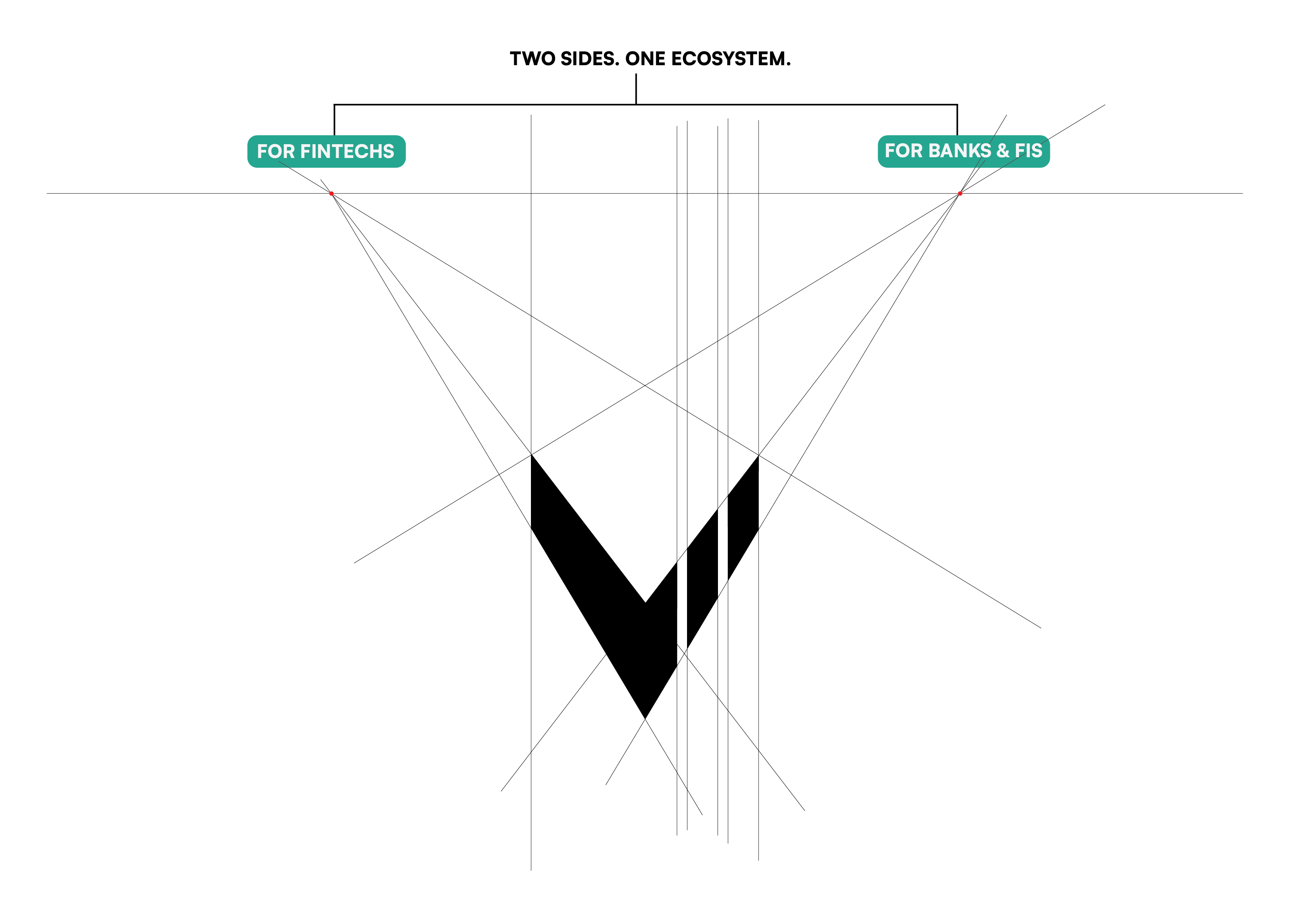
The idea here is to use the analogy of the two-point perspective drawing technique as the foundation of the logo design. It also aligns with the idea of two sides—one ecosystem. In two-point perspective, two vanishing points are needed to represent the two visible sides of a cube. By connecting all the lines to these vanishing points, the cube takes proper form in perspective. Similarly, this reflects the company’s vision and how invisible construction lines bridge these two sides into one unified entity.
Vuescale Logo exploration
Drop Image
Drop Image
Logo concept
One Mark. Two Horizons.
Drop Image
Logotype
Main Logotype

Main Logotype Alternate
Dark Logotype

White Logotype
Drop Image
Logomark
Main Logomark
White Logomark
Black Logomark
Drop Image
Colors
Crypto Mint
hex: #01EBB4
rgb: 1 / 235 / 180
Lunar Drift
hex: #F3F5F7
rgb: 243 / 245 / 247
Orbit Dust
hex: #7A7F99
rgb: 122 / 127 / 153
Dark Matter
hex: #191921
rgb: 25 / 25 / 33
Drop Image
Typography
Fraunces
ABCDEFGHIJKLMNOPQRSTUVWXYZ
abcdefghijklmnopqrstuvwxyz
0123456789!@#$%^&*()?+
Jost
Google Fonts by Owen Earl
ABCDEFGHIJKLMNOPQRSTUVWXYZ
abcdefghijklmnopqrstuvwxyz
0123456789!@#$%^&*()?+
Jost
Google Fonts by Owen Earl
Aa Bb Cc Dd Ee Ff Gg Hh Ii Jj Kk Ll Mm Nn Oo Pp Qq Rr Ss Tt Uu Vv Ww Xx Yy Zz
0123456789@#%^&*()?+
Drop Image
Brand Applications


We connect fintech vision to institutional scale
An ecosystem built on shared outcomes
VueScale partners with knowledge leaders, government agencies, and professional services firms to amplify institutional impact.

Innovation is accelerating. Institutional adoption is not.
The next wave of fintech penetration won’t come from building more apps. It will come from making existing innovation work inside institutions that demand trust, compliance, and proven commercial models.
VueScale
VueScale
VueScale