The primary logo represents the overall KEN JY brand.
As the most visible and recognisable symbol of the brand, it allows us to present our identity consistently across all communications and media.
Whenever possible, use this preferred Primary Logo lock-up configuration.


The following information outlines the core visual elements that make up the KEN JY Logo Display Guidelines.
Follow this guideline as closely as possible in order to correctly apply the Logos in a clear and consistent way across all platforms.


The KEN JY brand should be primarily represented by the color palette shown here.
This color chart includes CMYK, RGB, Hex values, and Pantone swatch codes for the color palette. Take care to ensure accurate color reproduction is applied to every reproduction.
For print applications, use CMYK or Pantone values. For web/screen applications, use RGB or Hex values.
Our brand logo should not be represented by any color that is not specified here.


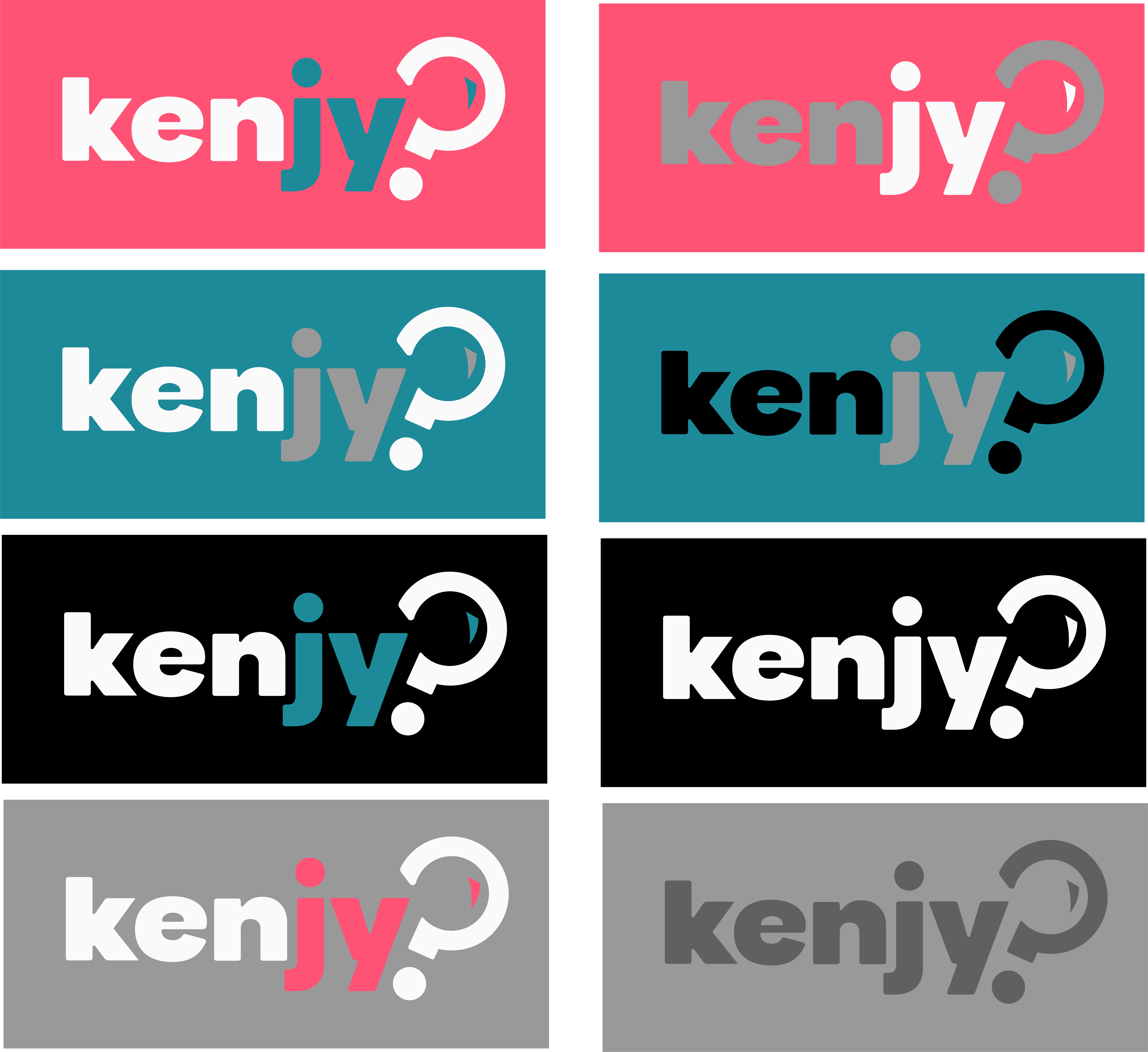
The various logo options were developed with specific design purposes and visual strategies in mind. Each variation has been carefully curated to ensure optimal legibility and brand impact across different contexts.
To protect the visual integrity and consistency of the brand, the logos may under no circumstances be used in any color combinations other than those officially provided. No modifications to the approved color palette are permitted.
THE EXAMPLES BELOW MEANT TO INDICATE HOW NOT TO DISPLAY THE LOGOS

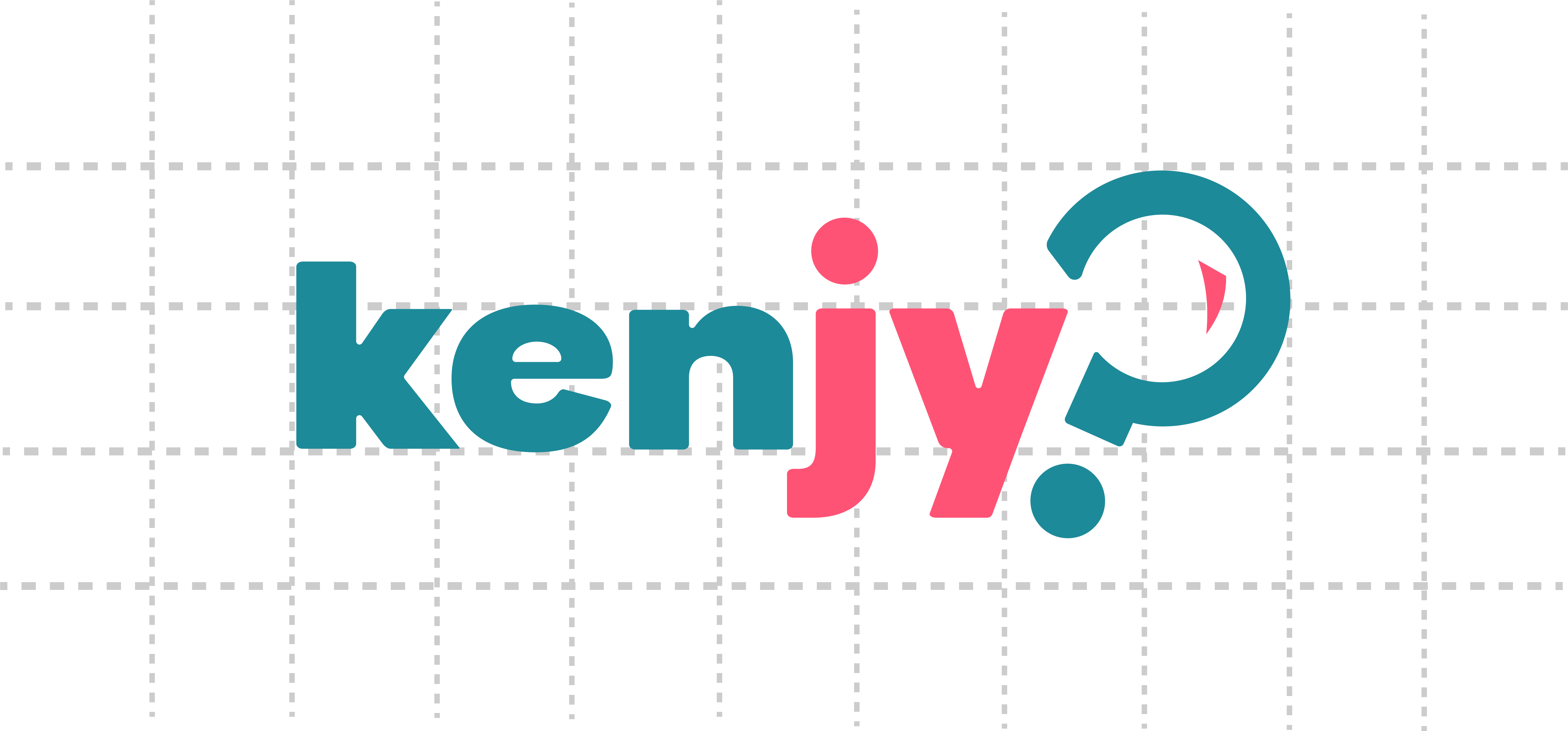
Clear space or negative space is the area that surrounds the logos that is completely clear of any other graphical element.
Clear space helps the logo stand out from the rest of the elements and ensures legibility even at small sizes.
There is no fixed measurement to use, but in general the more clear space around the logo the better

