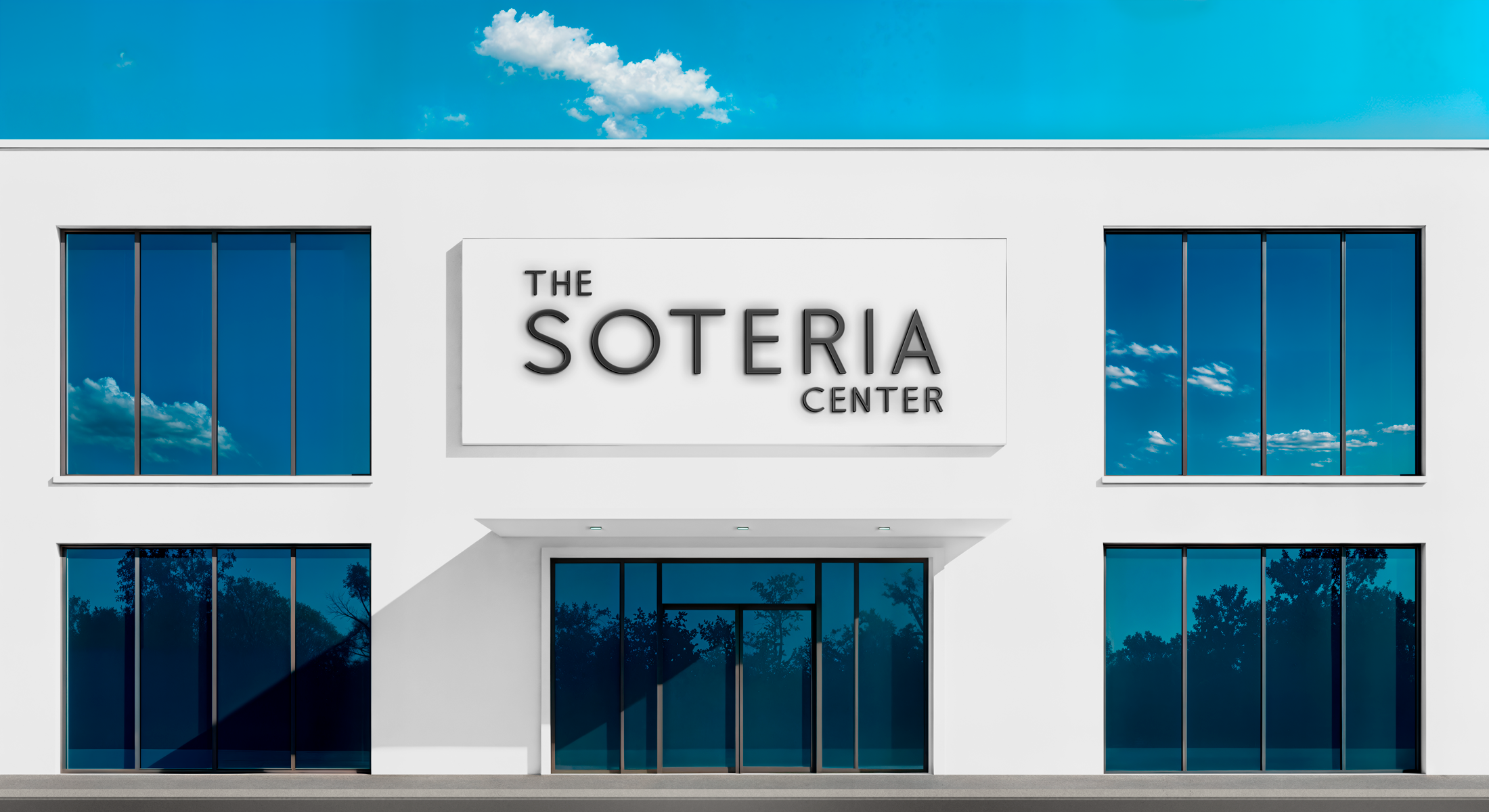
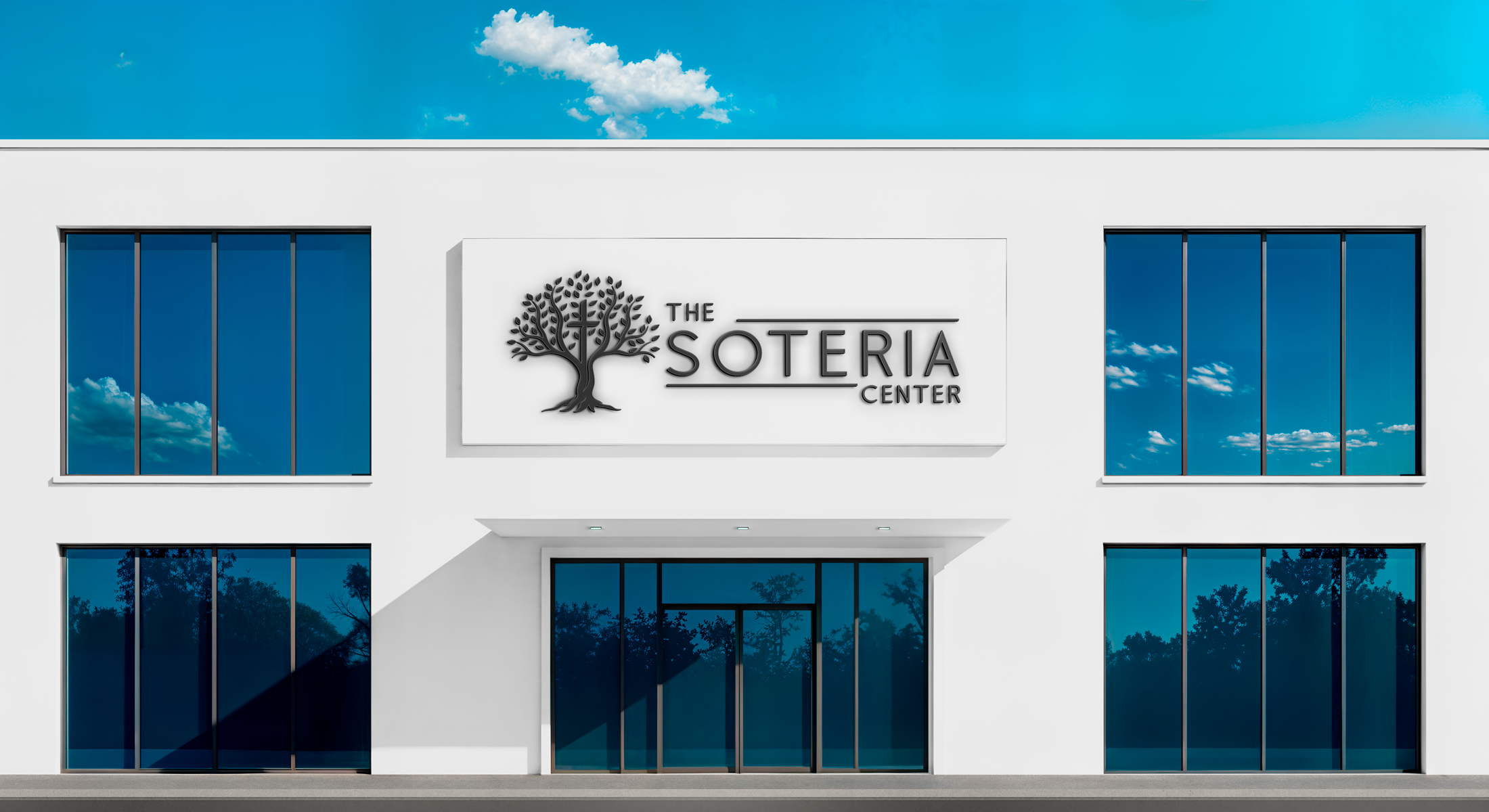
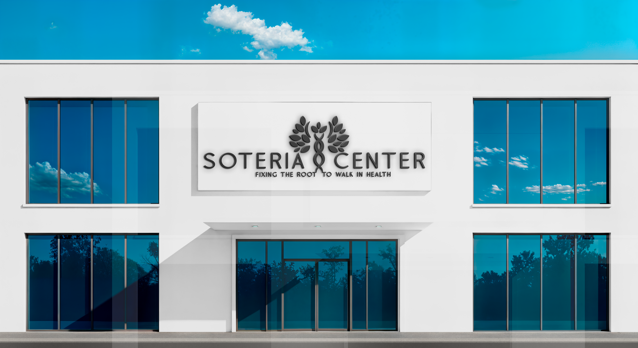
Welcome to The Soteria Center Branding Preview
The Soteria Center is a place of peace, restoration, and true healing—where faith and functional medicine come together to uncover root causes and restore whole-body wellness. This logo collection is designed to reflect that mission, using calming colors, thoughtful typography, and meaningful design elements that inspire trust, care, and spiritual connection.
The visual identity draws from a rich, earthy palette—tones like Patina, Edamame, Matterhorn, Ceramic, Sugar Mint, and Oil Bronze—chosen to represent growth, life, and natural renewal. These grounded colors help communicate the Center’s approach to whole health and lasting transformation.
We invite you to explore the logo variations below. Each design presents a unique expression of your values, and your feedback will help shape the final mark that will carry The Soteria Center into its next chapter.