BRAND TOOLKIT

The following information outlines the core visual elements that make up the brand identity and visual design system. Follow this brand guideline as closely as possible in order to correctly apply the brand assets in a clear and consistent way across all platforms.

Drop Image
Primary Logos
Logo Clear Space

Logo Clear Space

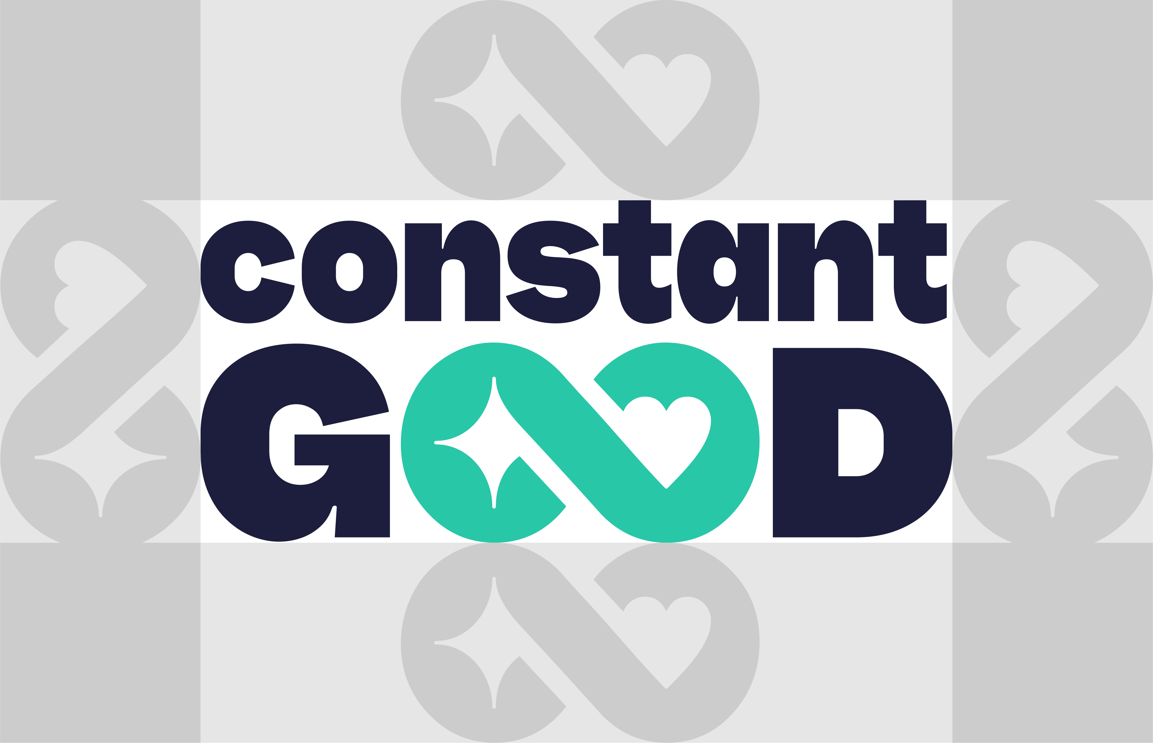
The Constant Good logo should always have enough breathing room to stay clear and recognisable. As a rule of thumb, use the height of the infinity symbol within the logo to define the clear space on all sides. This space ensures no text, images, or design elements interfere with the logo’s visibility or impact.


The rules don't apply when adding secondary text underneath i.e. Location names.

Drop Image
Logomark

Symbolism

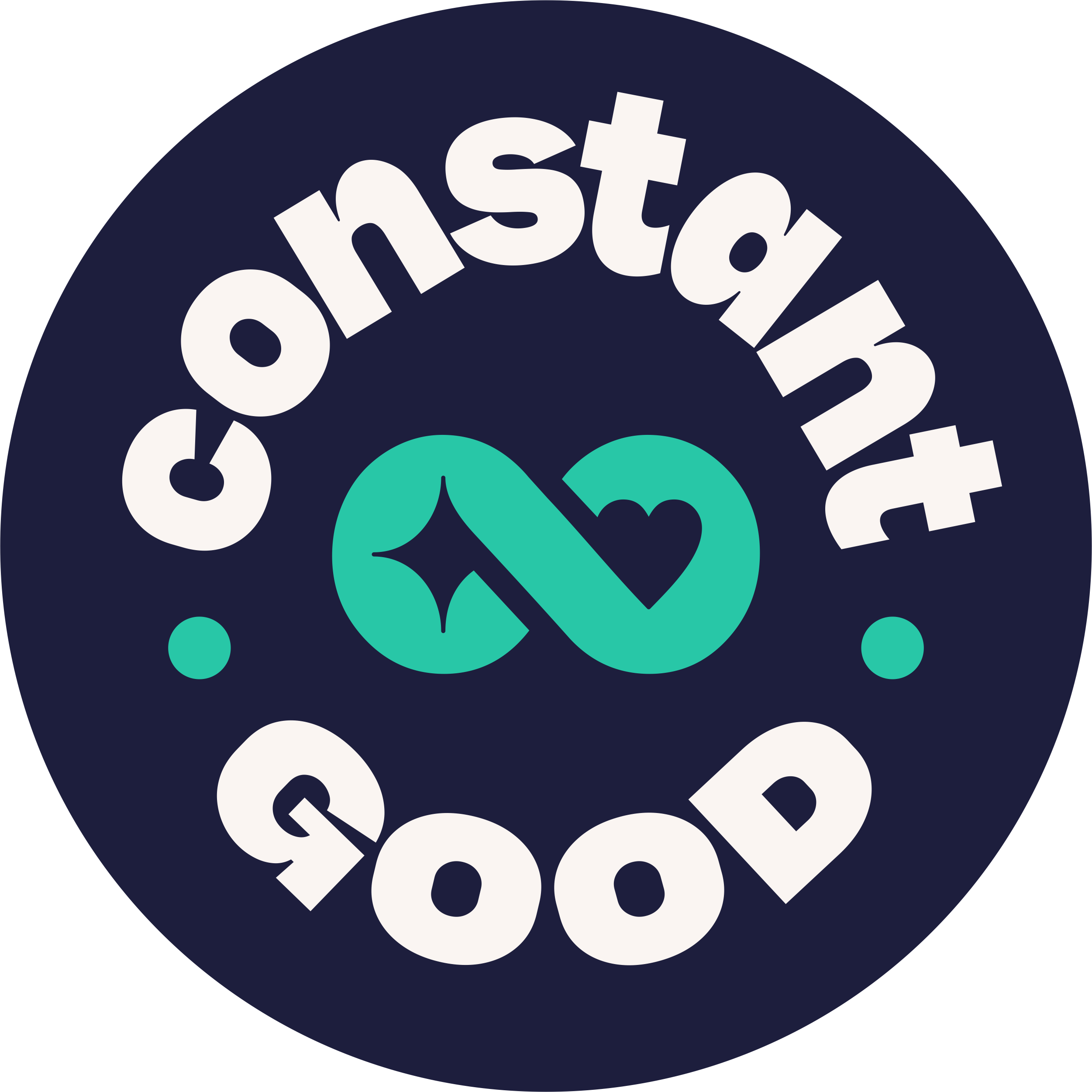
The Constant Good symbol combines two powerful ideas: sparking change and acts of giving. The star represents a spark, the beginning of something new, a moment of inspiration that leads to action. The heart embodies compassion, generosity, and the lasting impact of doing good. Together they form an infinity loop, symbolising the ongoing cycle of hope and kindness that Constant Good strives to create. It’s a reminder that even the smallest spark of good can grow, connect, and continue to make a difference without end.

Drop Image
Secondary Logos

Location Lockup

For location-specific branding, the Constant Good logo can include a regional lockup beneath the main logo. This version uses Gabarito Bold for the location name, written in uppercase. The letter spacing should be adjusted manually to ensure visual balance depending on the length of the location name.

Drop Image
Alternative Assets

Purpose

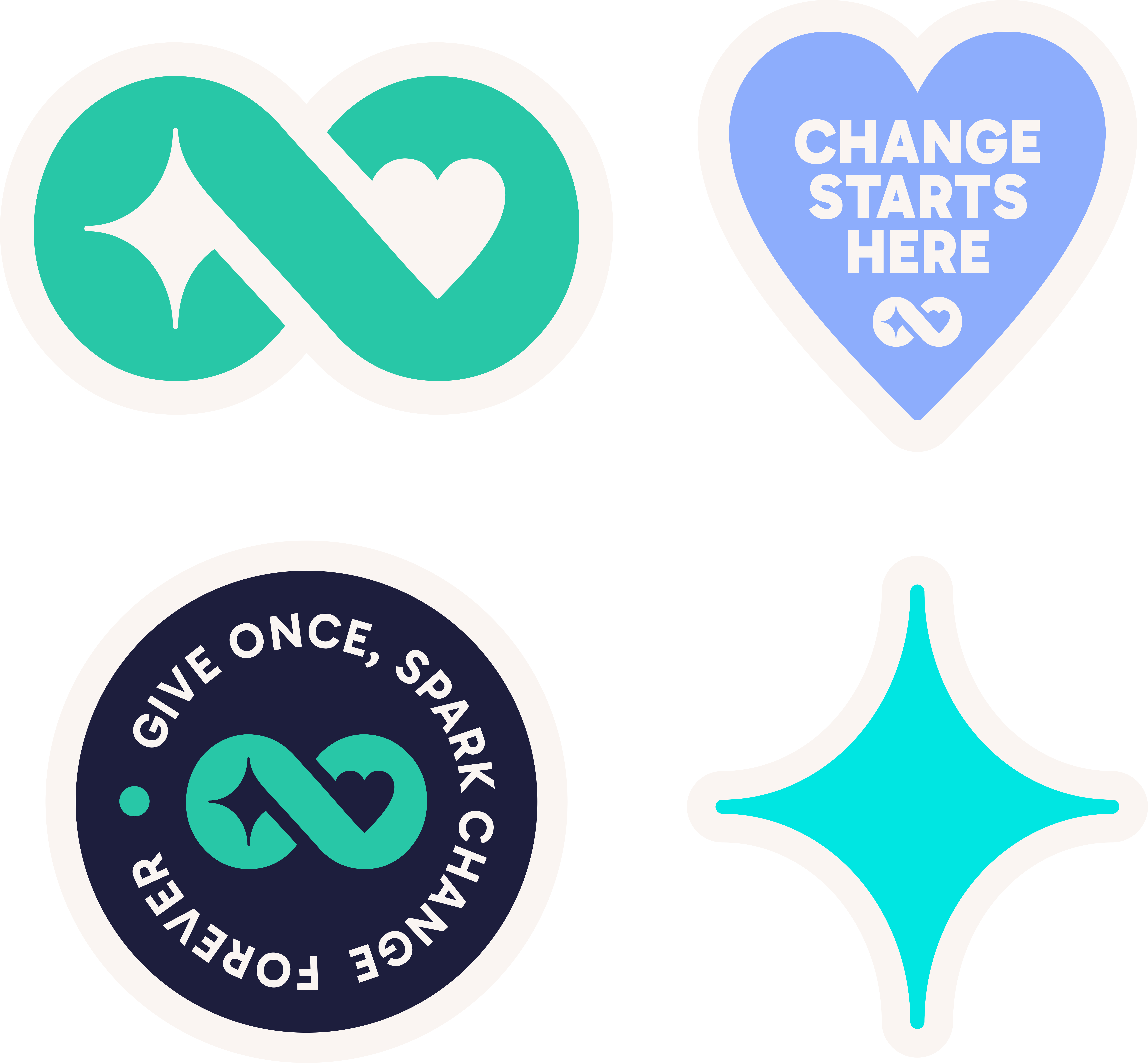
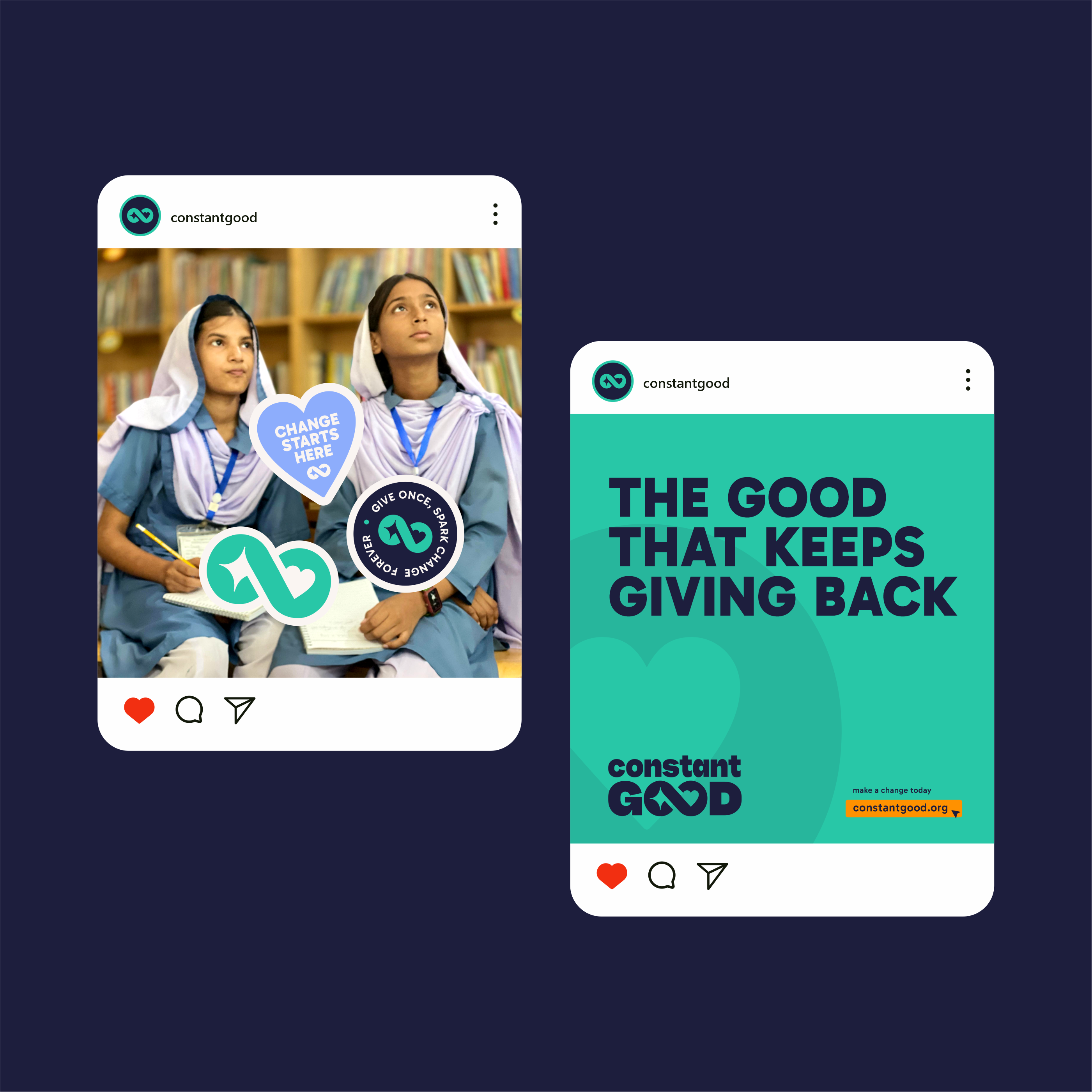
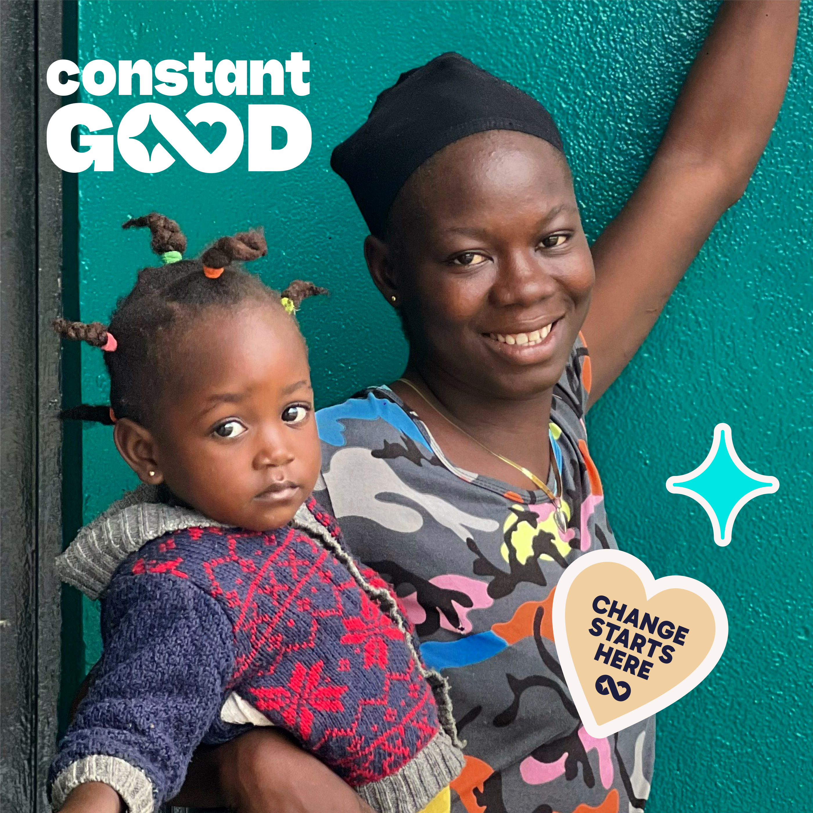
These graphic elements are designed to serve as versatile visual accents across all digital and physical brand assets, drawing attention to key messages and enhancing visual appeal. They should be used to embellish photos, act as digital stickers for social media engagement, or be printed as physical incentives. When applied, these graphics should always be placed to complement the primary content without overpowering it, maintaining clarity, and reinforcing the brand's commitment to continuous, positive change.

Drop Image
Colors
Constant Teal- Primary
hex:  #28C7A7
rgb:  40 / 199 / 167
25%
Warm White - Primary
hex:  #FAF5F2
rgb:  250 / 245 / 242
20%
Deep Blue - Primary
hex:  #1D1E3D
rgb:  29 / 30 / 61
20%
Endless Cyan - Secondary
hex:  #00E6E2
rgb:  0 / 230 / 226
10%
Kind Lilac - Secondary
hex:  #8DADFC
rgb:  141 / 173 / 252
10%
Natural Sand - Secondary
hex:  #F0D0A1
rgb:  240 / 208 / 161
10%
Thaakat Yellow - Accent
hex:  #FF9100
rgb:  255 / 145 / 0
5%
Drop Image
Typography
Primary Typeface
Aa
Gabarito
Google Fonts by Naipe Foundry, Leandro Assis, Álvaro Franca, Felipe Casaprima
ABCDEFGHIJKLMNOPQRSTUVWXYZ abcdefghijklmnopqrstuvwxyz 0123456789!@#$%^&*()?+

Font use

Our brand utilizes the Gabarito font family, a modern, highly legible sans-serif typeface available via Google Fonts, ensuring consistency across all digital and print platforms. The intentional variation in weight helps establish clear hierarchy and guides the user's eye efficiently.

Primary Headings (H1, Hero Copy)

We use Gabarito Black for maximum impact and visibility. This weight should be reserved for the largest titles, primary navigation, and essential hero statements where powerful emphasis is required.

Secondary Headings (H2, H3, Buttons)

We use Gabarito Bold for subheaders, smaller section titles, and call-to-action buttons. This weight provides necessary contrast and prominence without competing with the primary headers.

Body Text & Standard Copy

We use Gabarito Regular for all extended reading material, paragraph text, captions, and fine print. This weight is optimized for long-form legibility and a clean, professional appearance.

Drop Image
Brand In Action
Thank you