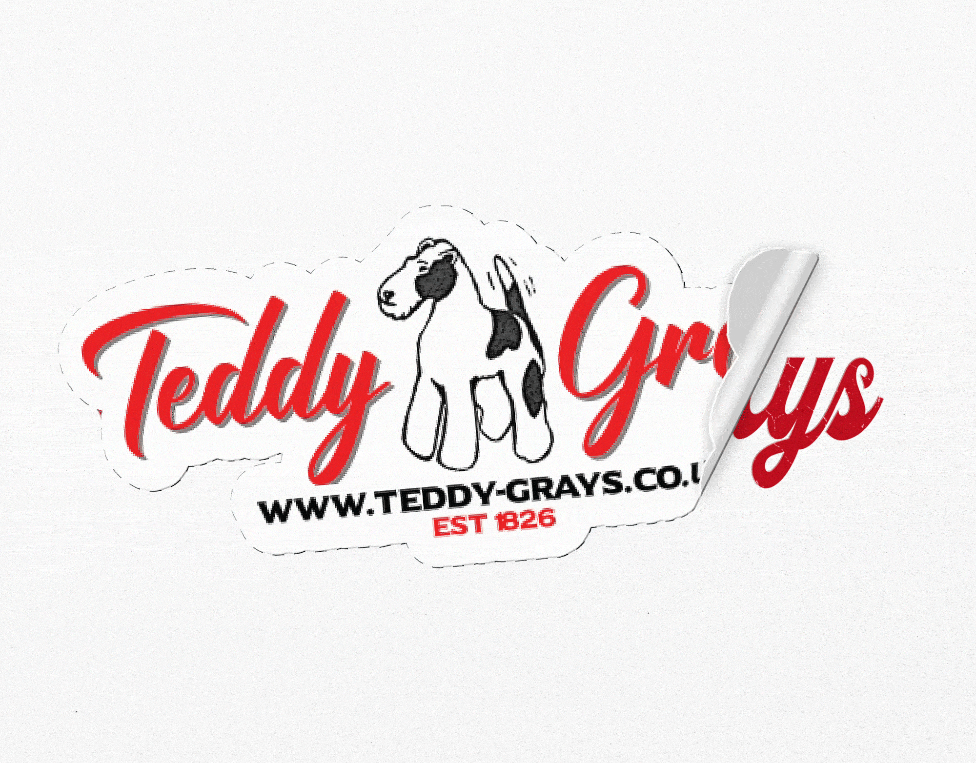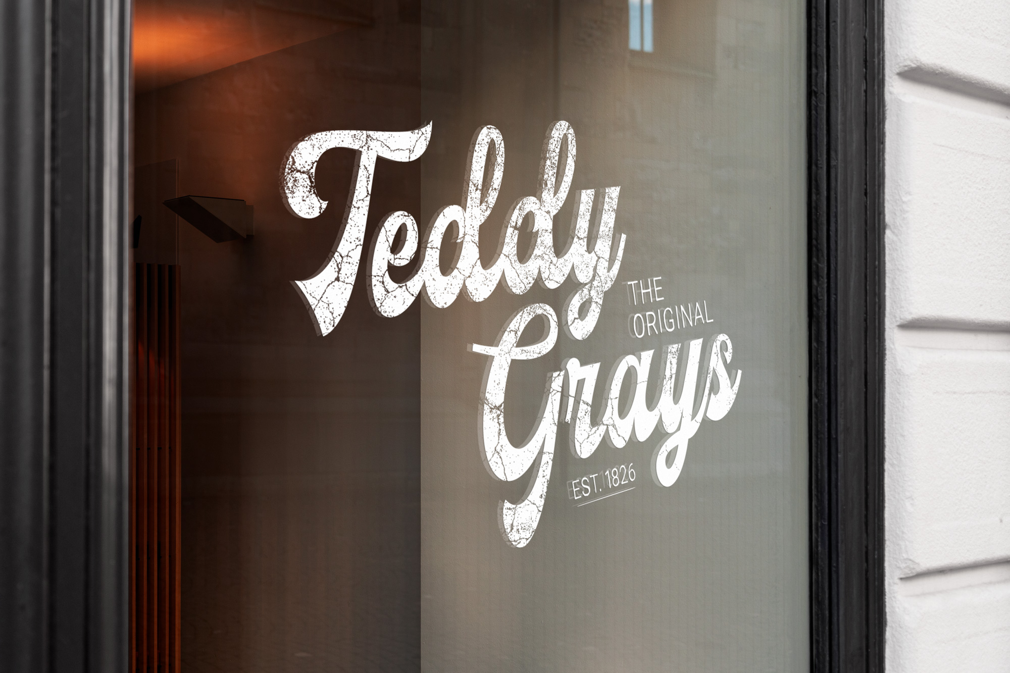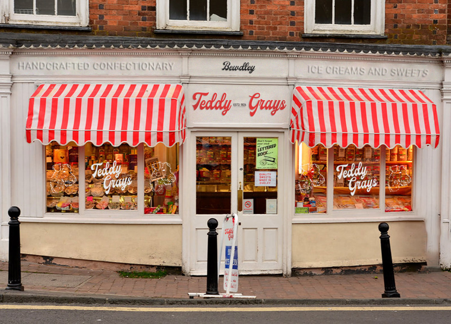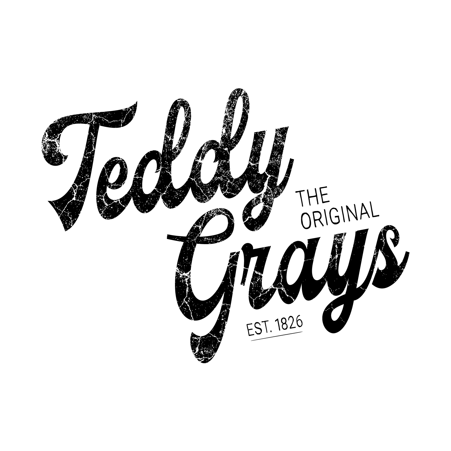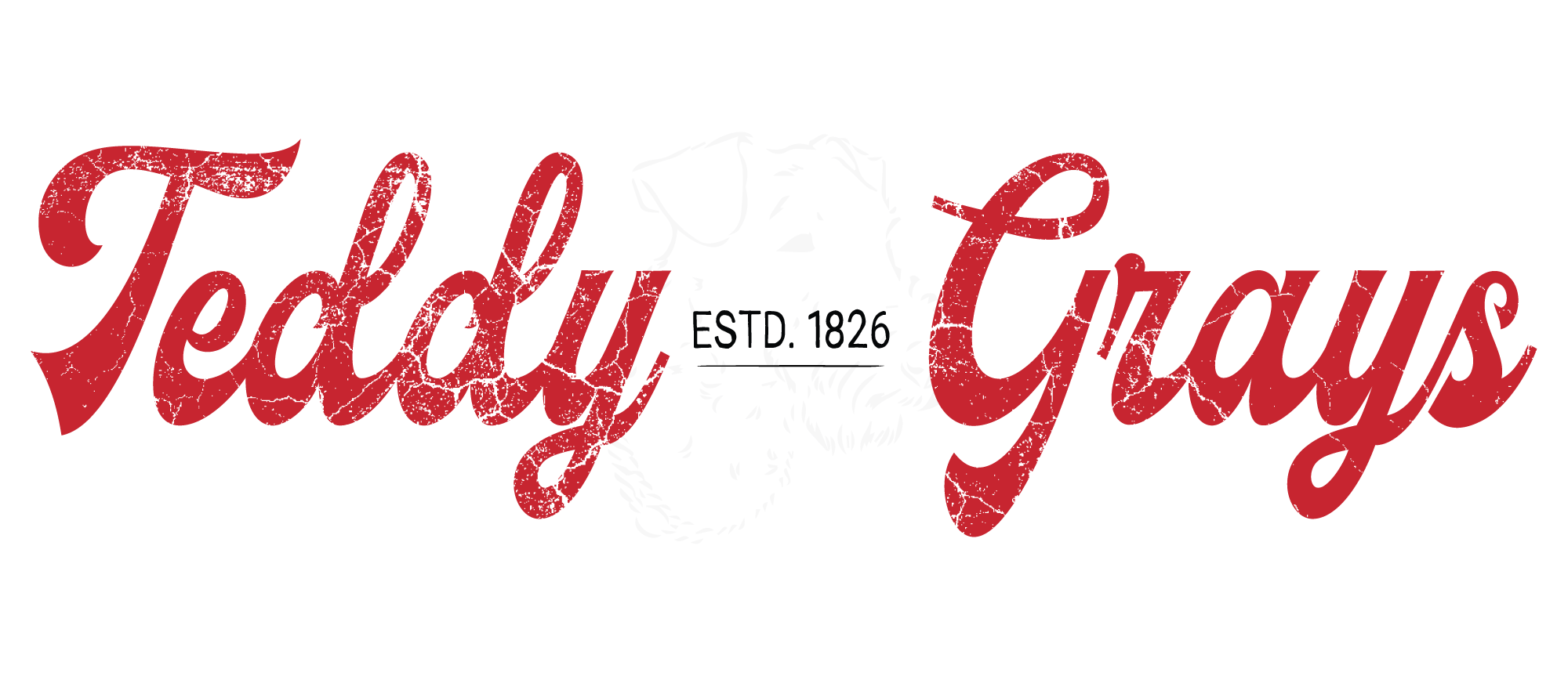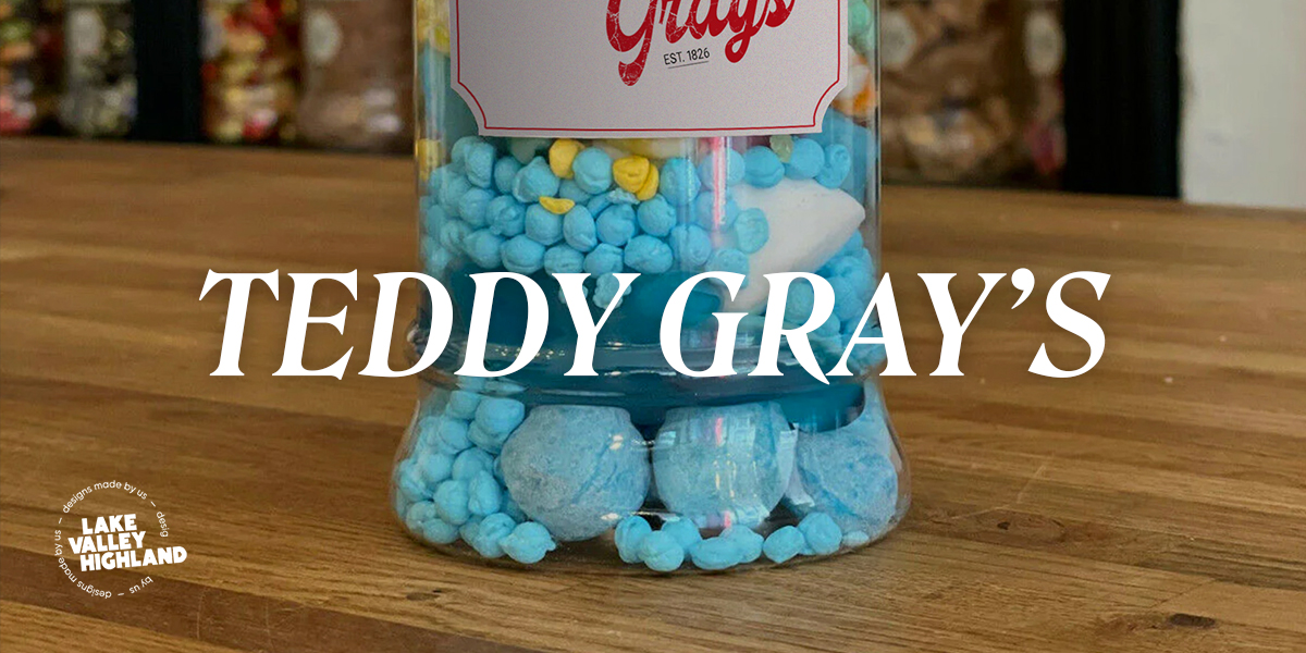


The challenge for this project was to modernise Teddy Gray’s visual identity while preserving the brand's legacy. The new design embraces the brand’s deep connection to its roots in the industrial Black Country, represented by its use of nostalgic, textured typography and a bold, vibrant red color. By reintroducing these historical elements in a fresh, contemporary way, the brand’s identity remains both timeless and relevant.
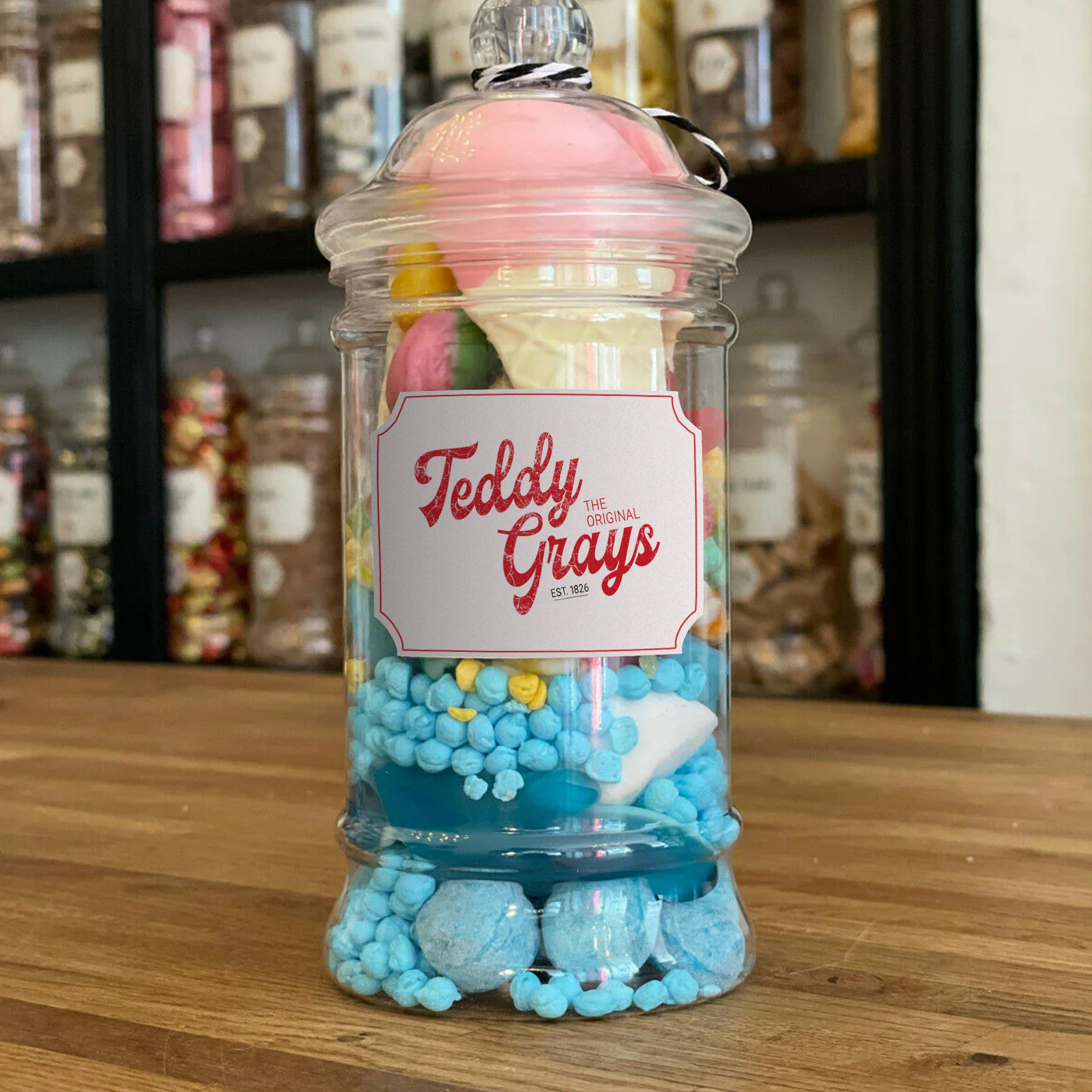
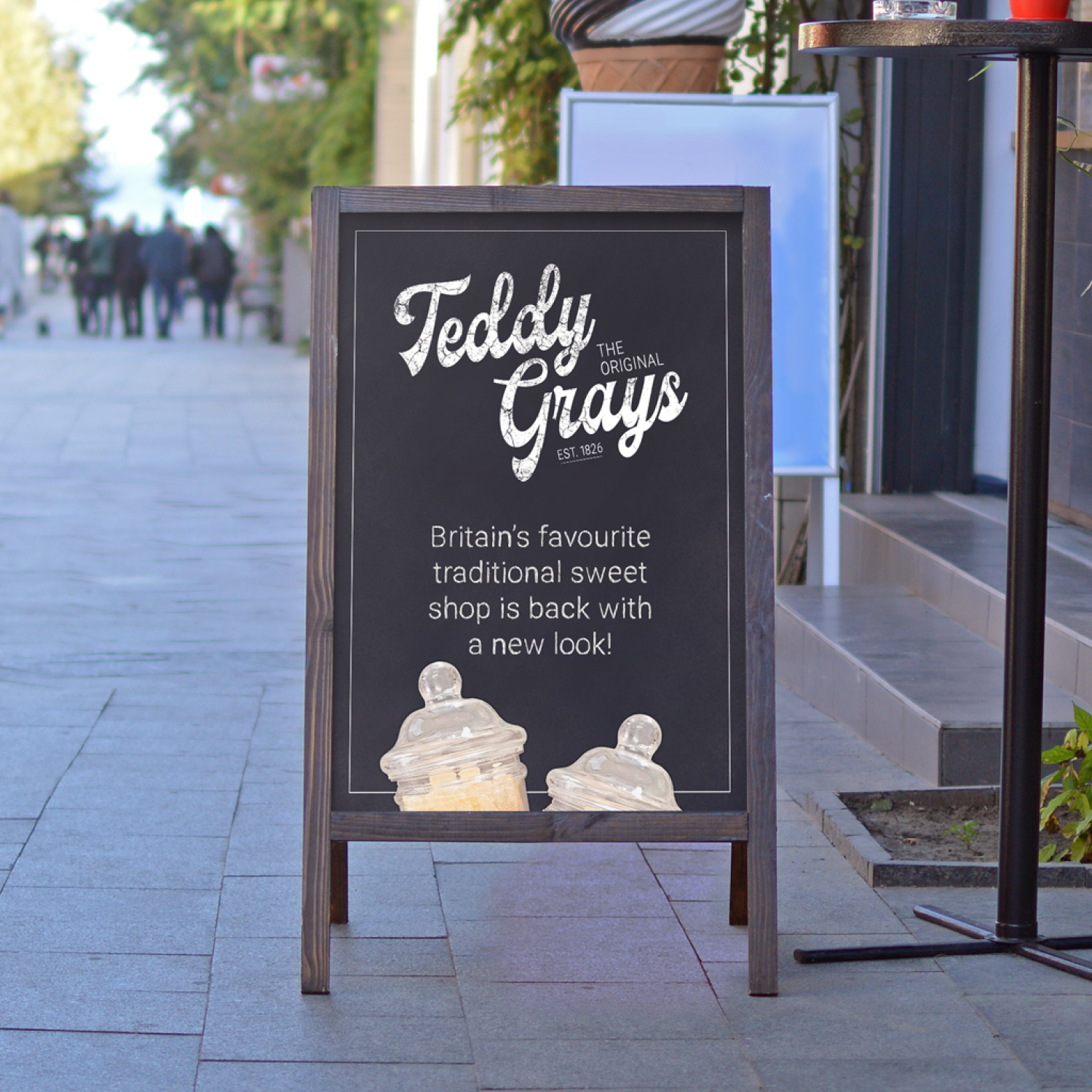
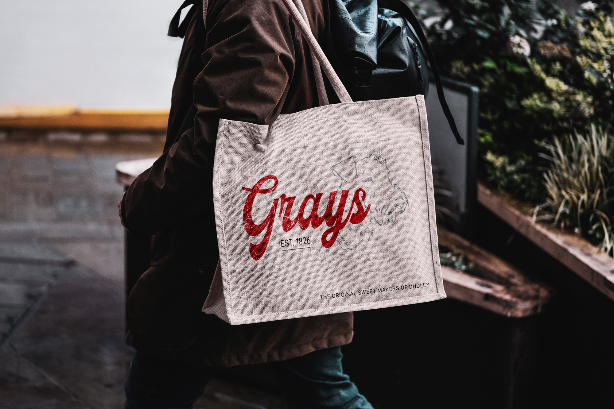
Through the revamped design, we’ve strengthened Teddy Gray’s narrative as “The Original Sweet Makers of Dudley". In applications like tote bags and packaging, the refreshed logo shines with its retro-modern vibe. The design is versatile enough to work across various mediums, from physical products to digital spaces. It evokes a sense of nostalgia for long-time customers and invites newer generations to engage with the brand, keeping the heart of Teddy Gray’s alive while looking toward the future.