Phantom Pops

STEPH AND BEN Brandpage
The following information outlines the core visual elements that make up the STEPH AND BEN brand identity and visual design system. Follow this brand guideline as closely as possible in order to correctly apply the brand assets in a clear and consistent way across all platforms.
Drop Image
Logo
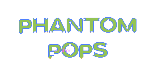
Main Logo
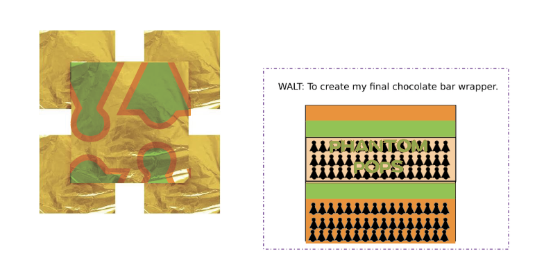
Logo with Color 1 Background

Logo with Color 2 Background

Drop Image
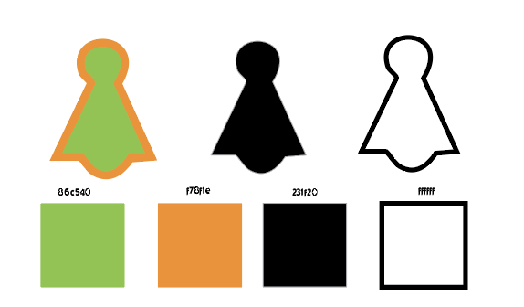
Colors
Color 1
hex: #86C540
rgb: 134 / 197 / 64
Color 2
hex: #F78F1E
rgb: 247 / 143 / 30
Color 3
hex: #231F20
rgb: 35 / 31 / 32
Color 4
hex: #FFFFFF
rgb: 255 / 255 / 255
Color 5
hex: #FFFFFF
rgb: 255 / 255 / 255
Drop Image
Typography
Primary Typeface
Cutcrnerswisscheses
ABCDEFGHIJKLMNOPQRSTUVWXYZ
abcdefghijklmnopqrstuvwxyz
0123456789!@#$%^&*()?+
Secondary Typeface
Gilroy
By Vladimir Tinkov
ABCDEFGHIJKLMNOPQRSTUVWXYZ
abcdefghijklmnopqrstuvwxyz
0123456789!@#$%^&*()?+
The text cutcrnerswisschess was a text that I made for this project it is inspired by fangs biting aliens and ghosts the A represent this all which have chosen, to use as the logo it is also reminisce of the snap chat ghost and can inspire people to pick up their camera whilst trick or treating which would create further publicity for the chocolate. The o and q of this type face represents a child which can be seen Eatting candy in the Q.