Pittsburgh Steelers
Pittsburgh Steelers
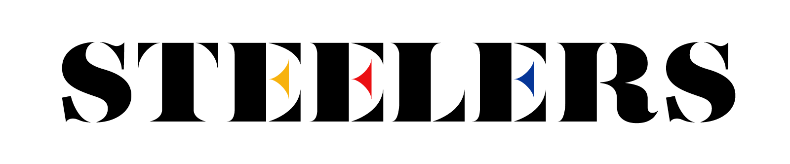
The Pittsburgh Steelers logo is iconic, unique, and stable enough for an update for the future. Follow along on my logo update journey for the Pittsburgh Steelers.
Goal: Simplify the Pittsburgh Steelers logo so it’s more legible
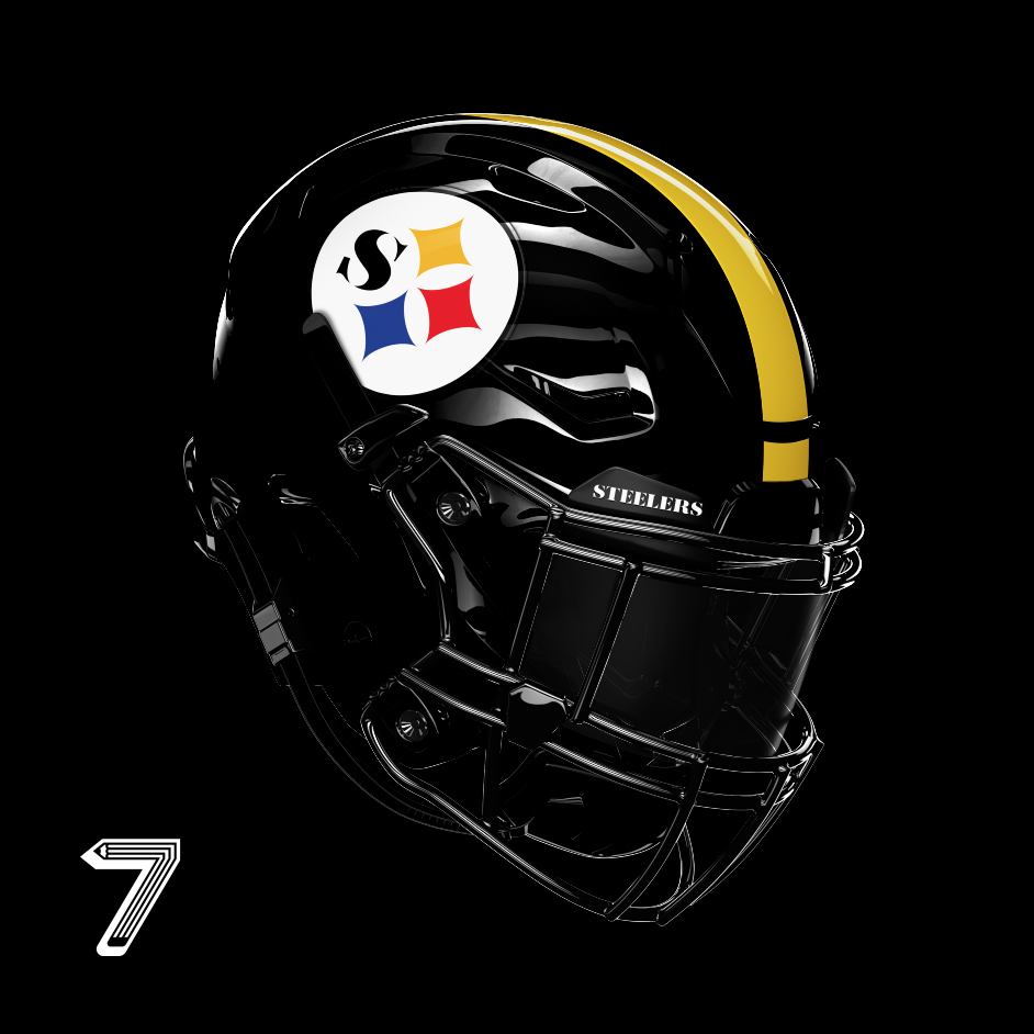
Steelers helmet

Drop Image
Logo Scale and History
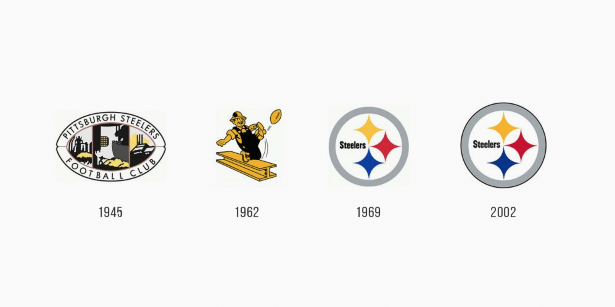
Pittsburgh Steelers logo over the years
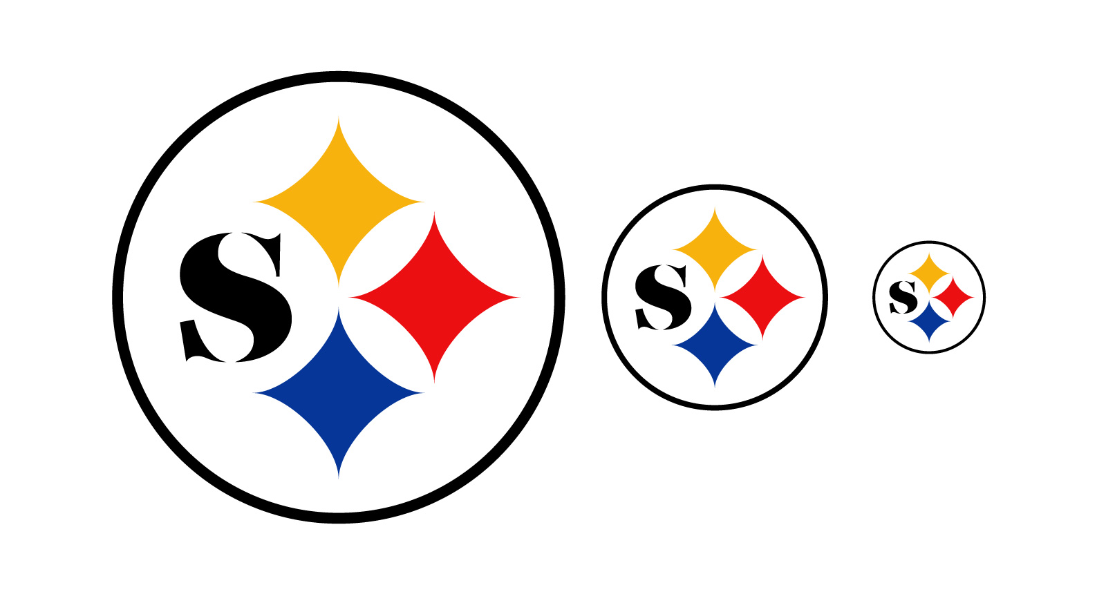
Current logo at scale
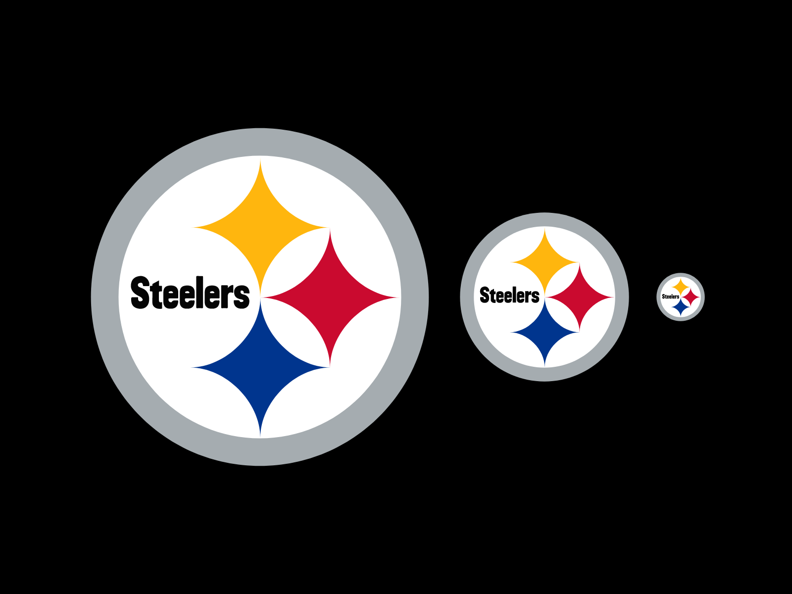
❌ Viewing the logo in multiple sizes shows legibility in the big areas, but once it gets smaller the letterforms start to bleed together and become illegible.

An 8-letter work set in one half of a circle??? We can do better.

Drop Image
Logo Simplification Steps
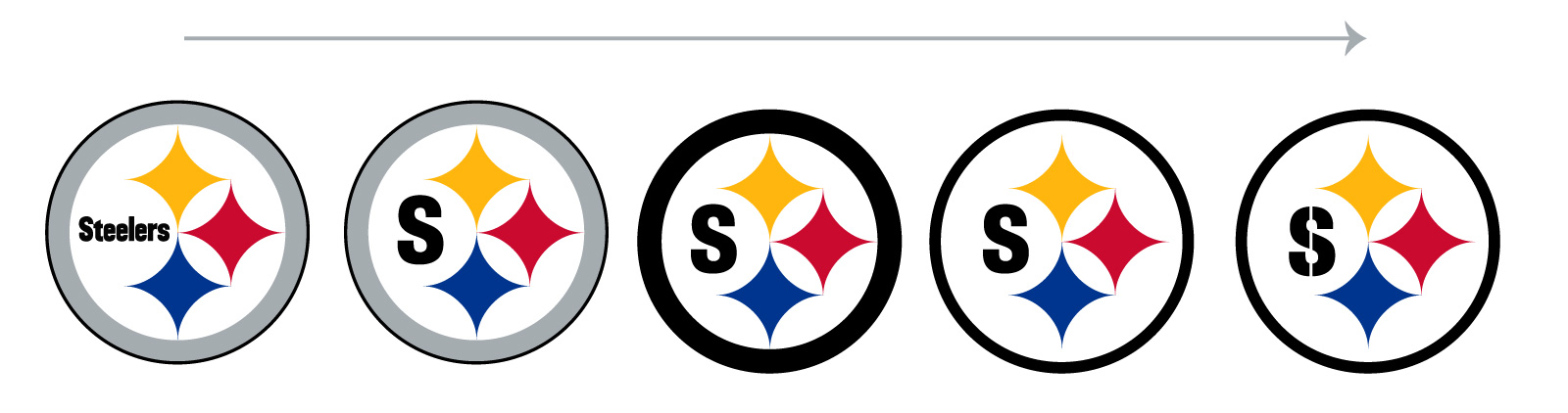
By simplifying the color and winnowing down to just an “s”, this mark is getting somewhere.

Drop Image
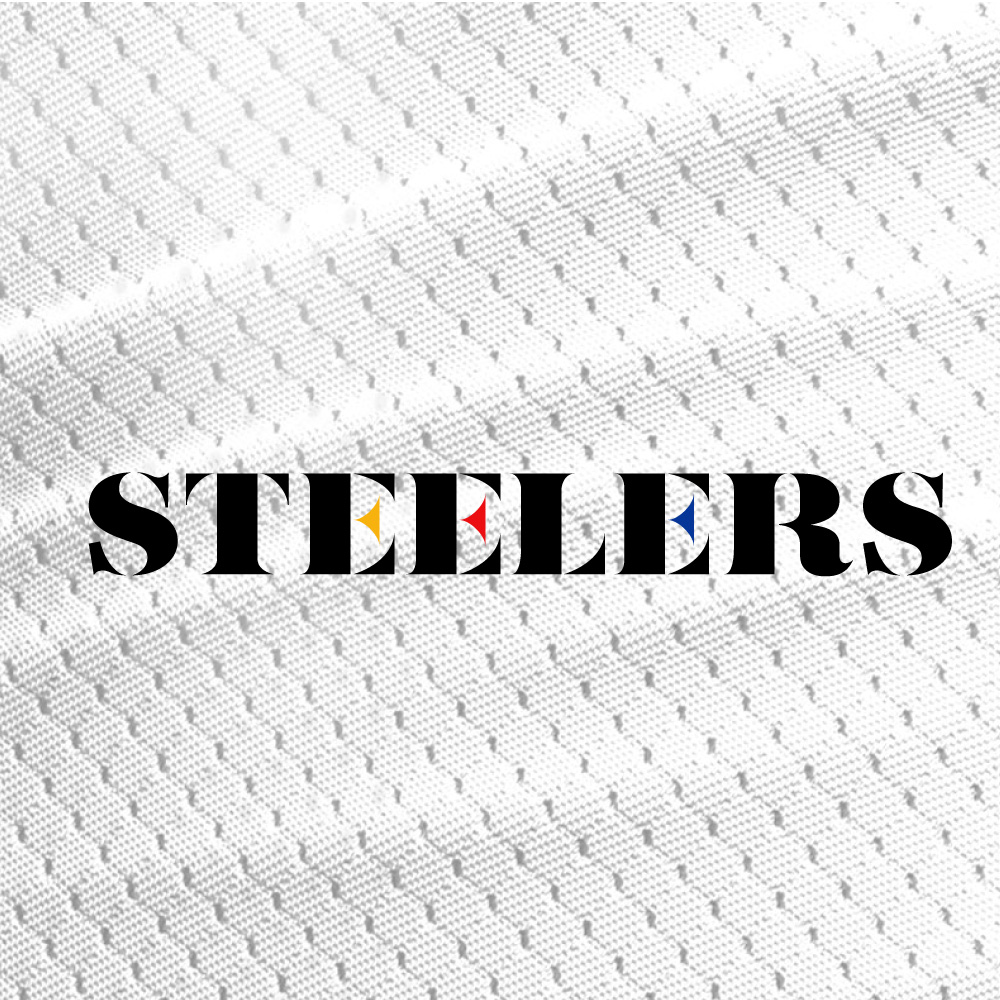
“S” Evolution & Logotype
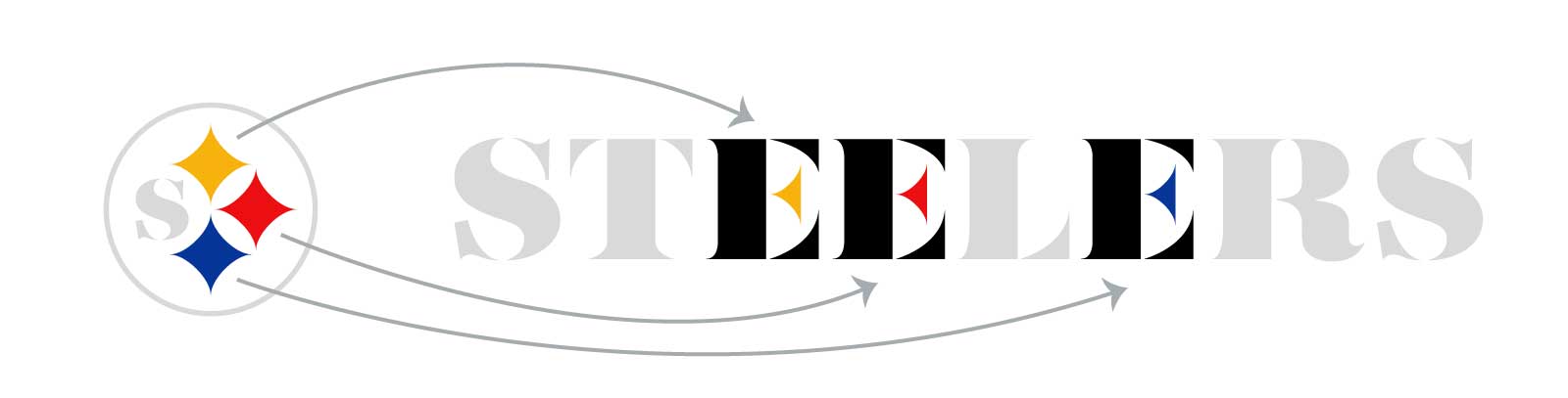
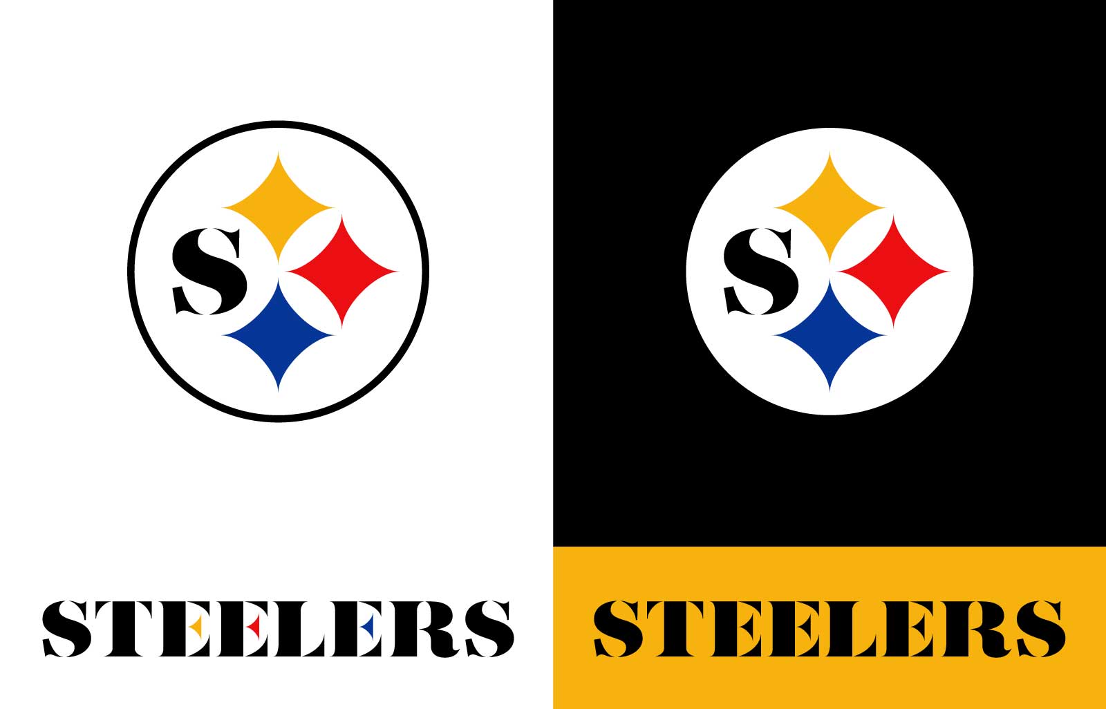
✨ This inspiration for this logotype were the three stars in the primary Steelers logo. ✨

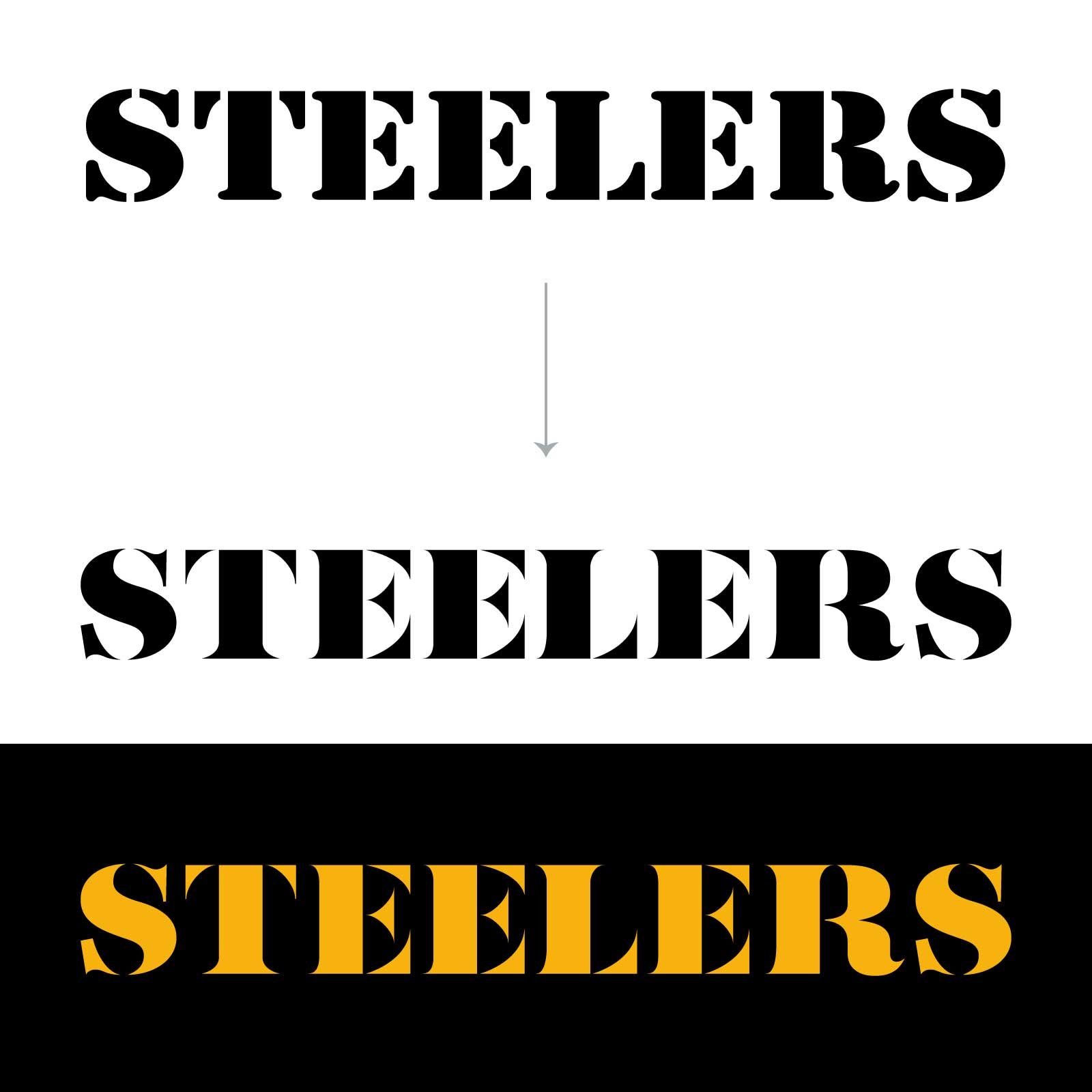
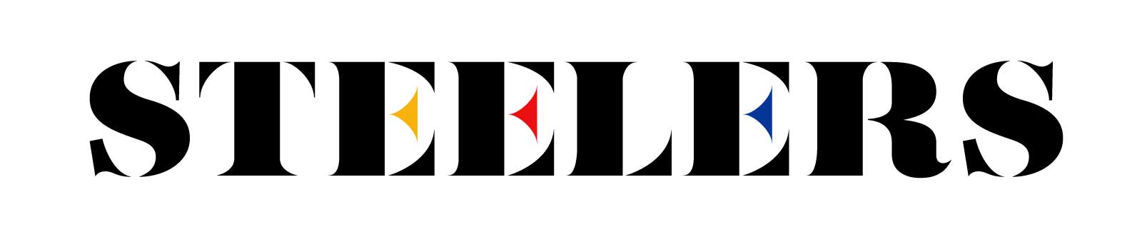
The cross bars of the “E” are actually those same stars but cut in half. With that treatment it was fitting to bring the three star colors over to the three “E”s in the logotype.

Drop Image
Logo Refresh at Scale

Drop Image
Color
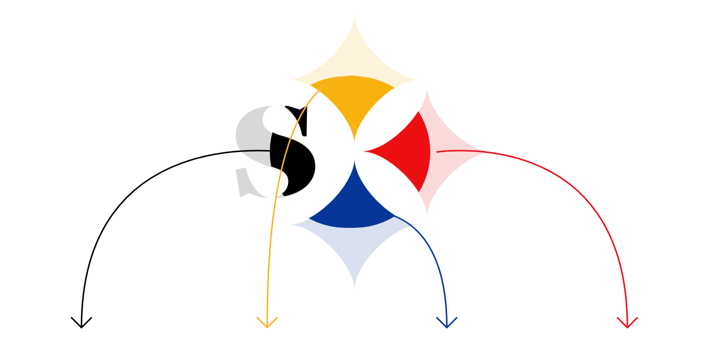
Black
hex: #000000
rgb: 0 / 0 / 0
Yellow
hex: #F7B20E
rgb: 247 / 178 / 14
Blue
hex: #063698
rgb: 6 / 54 / 152
Red
hex: #EB0F12
rgb: 235 / 15 / 18
Drop Image
Logo Set

Drop Image
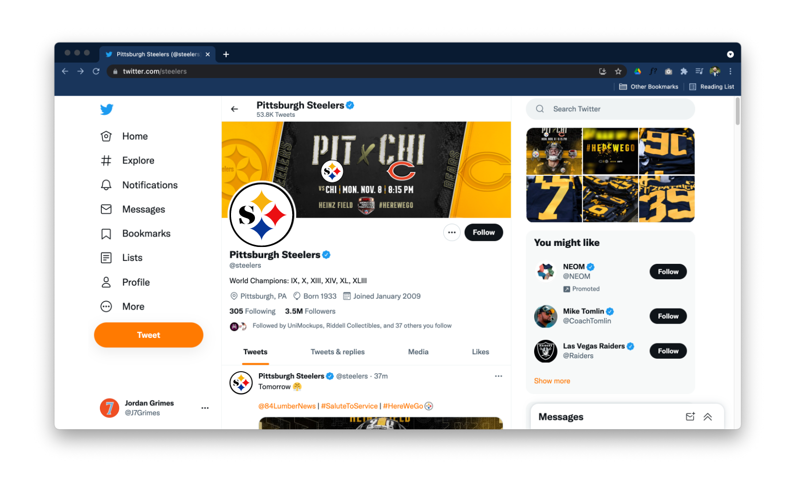
Social Media

Drop Image
Jersey
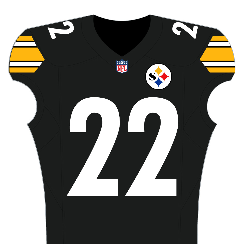

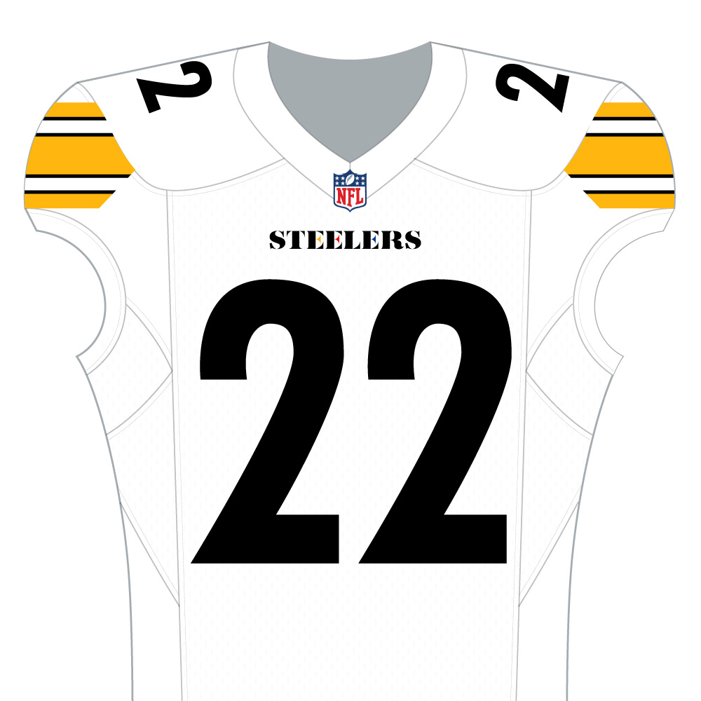

Thanks!
For more information check out my YouTube Channel: Design with Grimes - Pittsburgh Steelers. Find the video link in the footer below (Steelers).