Circular Coworking
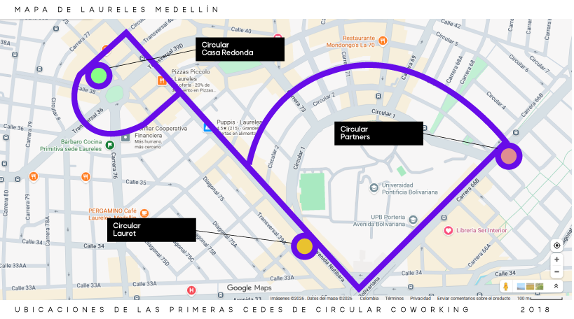
A brand born from movement!
The Circular logo is born from movement: the back-and-forth of coworkers biking between locations, the circular streets of the Laureles neighborhood, and the routes connecting our founding houses. We took the lines of Medellín’s map and turned them into a brand that breathes city, culture, and community.
In short, the visual result of all that: biking, rolling, moving, evolving. A living identity defined not by rigid borders, but by the collective energy flowing between members, locations, and streets. It is Circular in both shape and purpose.
Drop Image
Logo
Main Logo
Logo with Color 2 Background
Logo with Color 1 Background
Drop Image
Colors
Drop Image
Typography
Primary Typeface
Aa
Raleway
Google Fonts by Matt McInerney, Pablo Impallari, Rodrigo Fuenzalida
ABCDEFGHIJKLMNOPQRSTUVWXYZ
abcdefghijklmnopqrstuvwxyz
0123456789!@#$%^&*()?+
Secondary Typeface
Aa
Raleway
Google Fonts by Matt McInerney, Pablo Impallari, Rodrigo Fuenzalida
ABCDEFGHIJKLMNOPQRSTUVWXYZ
abcdefghijklmnopqrstuvwxyz
0123456789!@#$%^&*()?+