This is the palette suggested for the Identity.
Copy of maigari market

BRAND IDENTITY
BY FATTUSUDAN STUDIO
COLOR
BLACK
hex: #000000
rgb: 0 / 0 / 0
cmyk: 0 / 0 / 0 / 0
50%
WHITE
hex: #FFFFFF
rgb: 255 / 255 / 255
cmyk: 0 / 0 / 0 / 0
Drop Image
TYPHOGRAPHY
Primary Font: Poppins Bold — For headlines Secondary Font: Poppins Regular — For body text
POPPINS
Google Fonts by Indian Type Foundry, Jonny Pinhorn, Ninad Kale
ABCDEFGHIJKLMNOPQRSTUVWXYZ
abcdefghijklmnopqrstuvwxyz
0123456789!@#$%^&*()?+
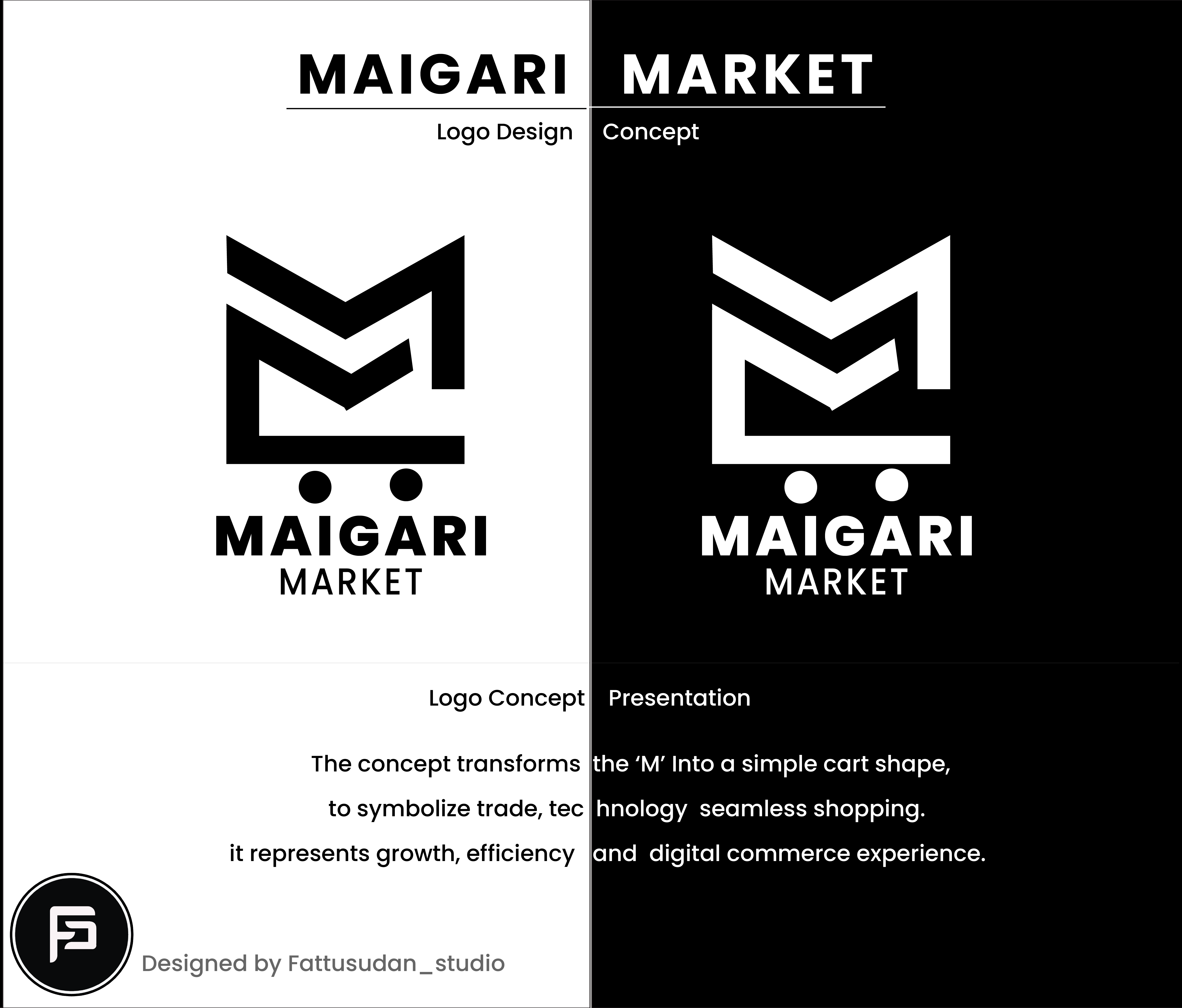
THE LOGO
This is the final logo design, along with the variations for the different flavor indicators.


LOGO COLOR VARIANTS
The logo also works in the following color formats, as needed.
. Correct Usage: Show black-on-white and white-on-black versions.
. Incorrect Usage: Show examples (blurred, stretched, or recolored).


Drop Image
Logo Spacing & Scale
Maintain clear space equal to the width of the letter “M” around the logo.
Minimum display size for print: 20 mm; for screen: 80 px.
Add small visual diagrams to make it easy to understand.
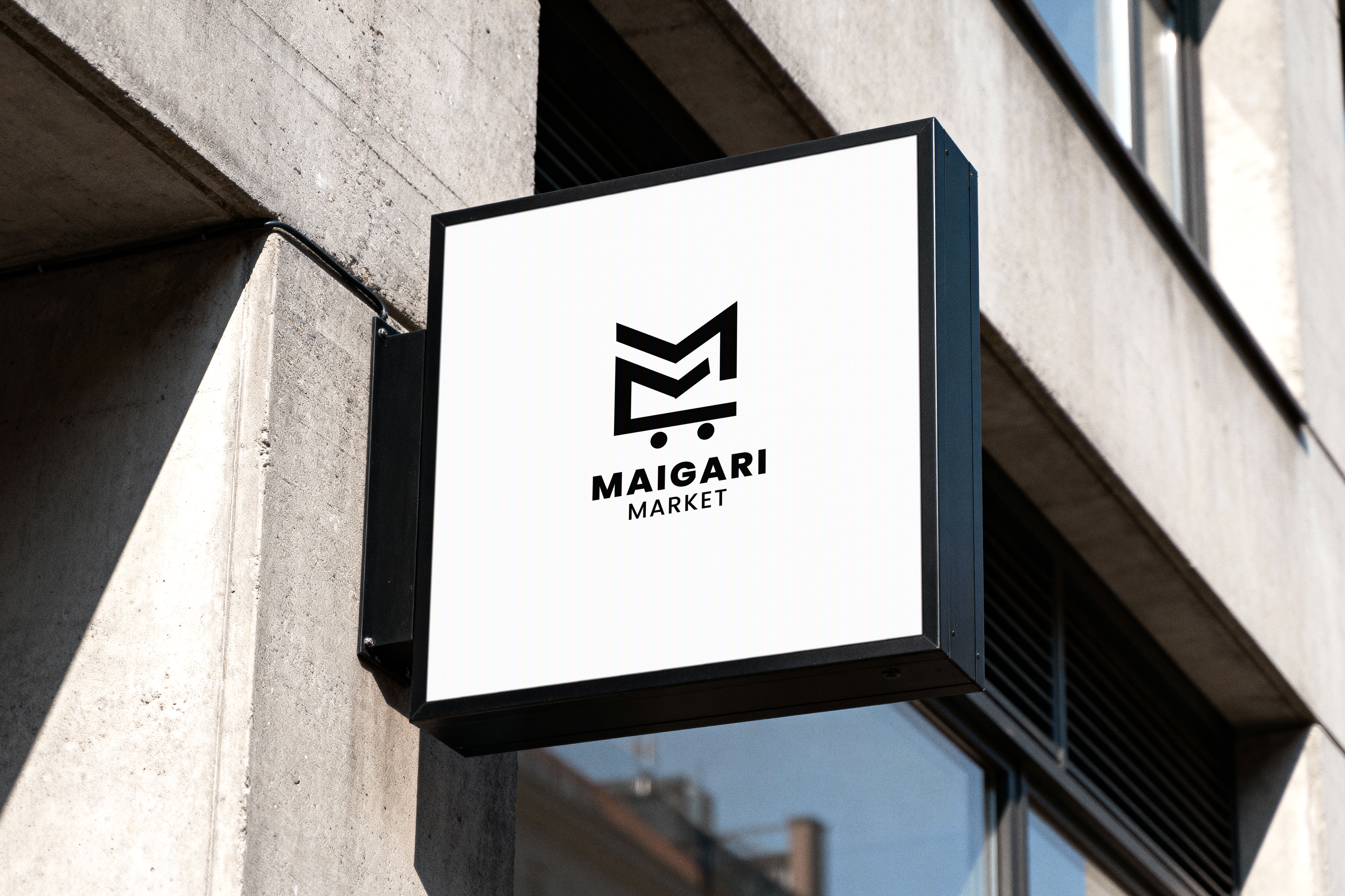
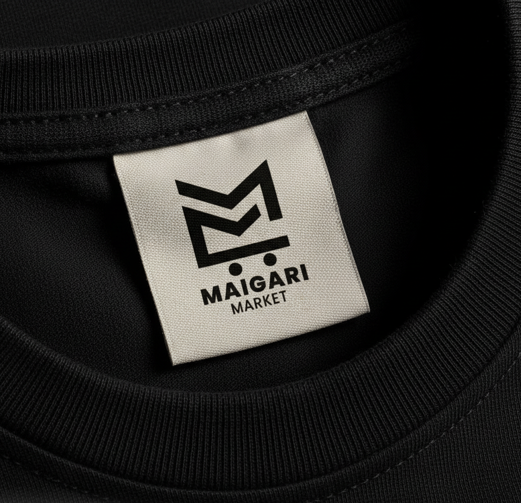
MOCKUPS AND PACKAGE DESIGN
This are the various mockups and package designs for the different products.
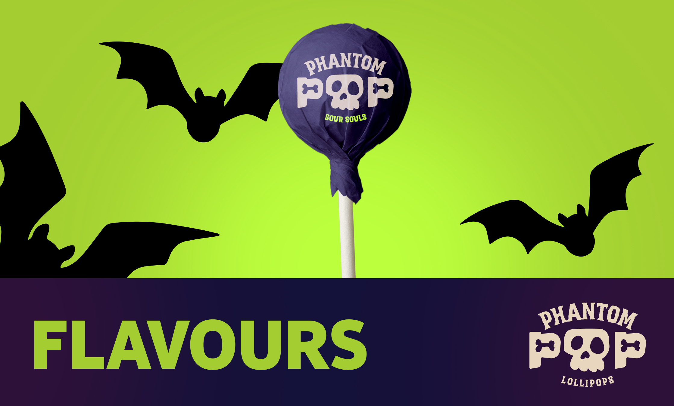
Phantom Pop
Phantom Pop
Phantom Pop