The following information outlines the core visual elements that make up the brand identity and visual design system. Follow this brand guideline as closely as possible in order to correctly apply the brand assets in a clear and consistent way across all platforms

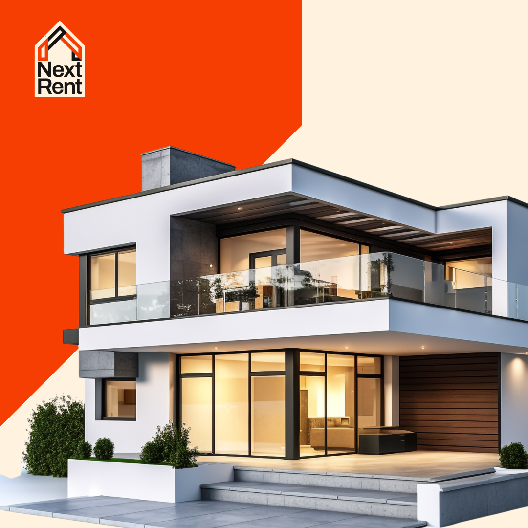
Next Rent exists to remove the friction from traditional renting. It simplifies the rental application process through a user-friendly platform, helping people find homes that fit their lifestyles without the long-term commitment of ownership.
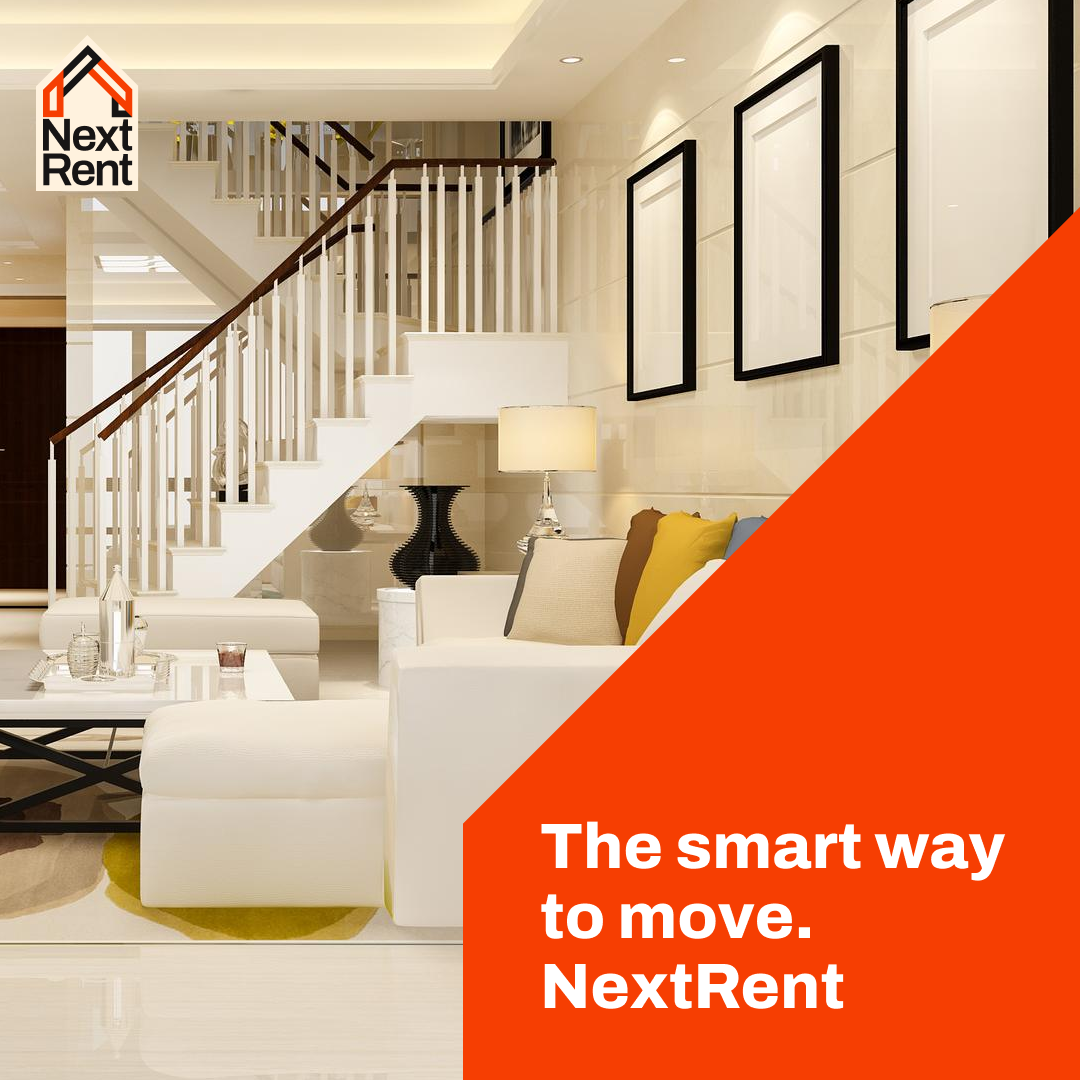
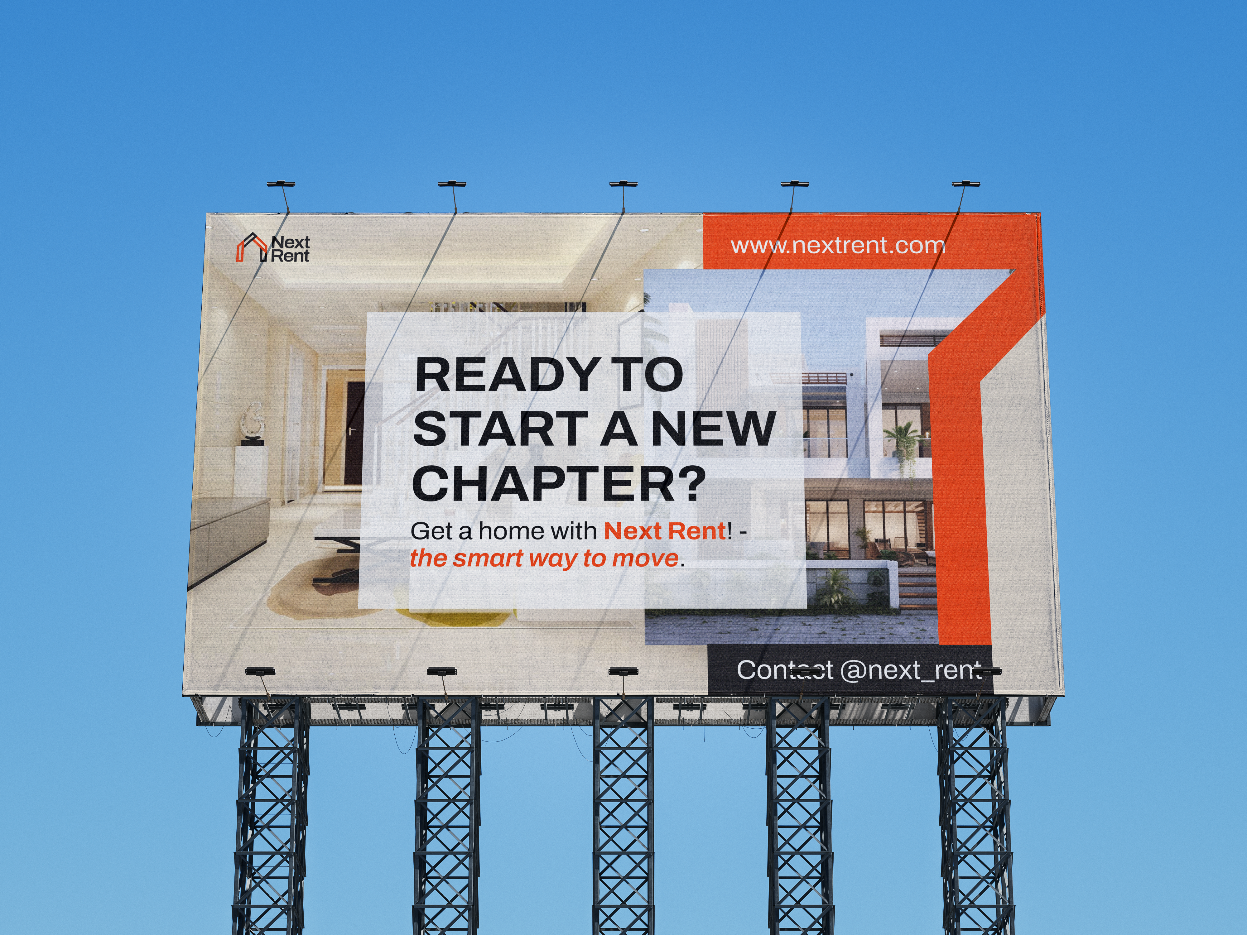
Whether someone’s relocating, in-between places, or just wants flexibility, Next Rent offers a smart, streamlined path to finding "their kind of home.
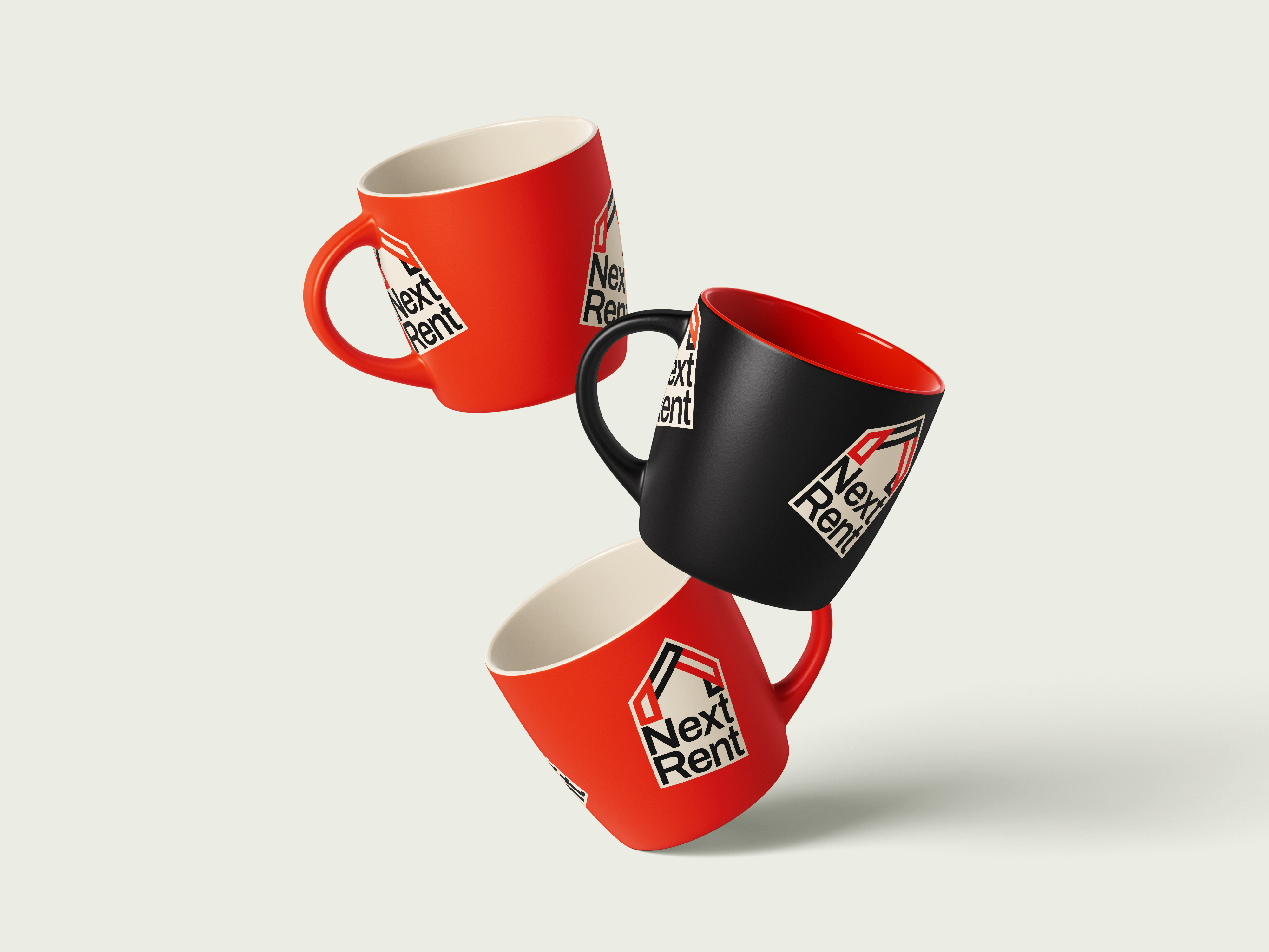
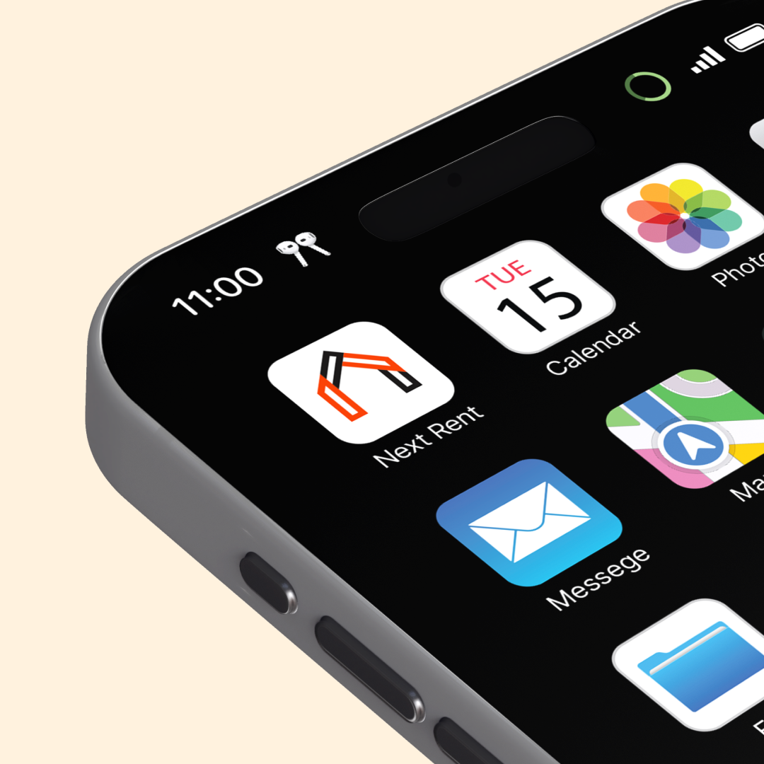
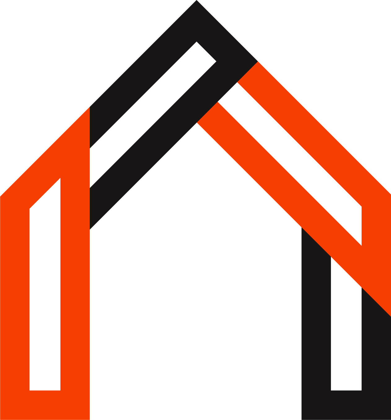
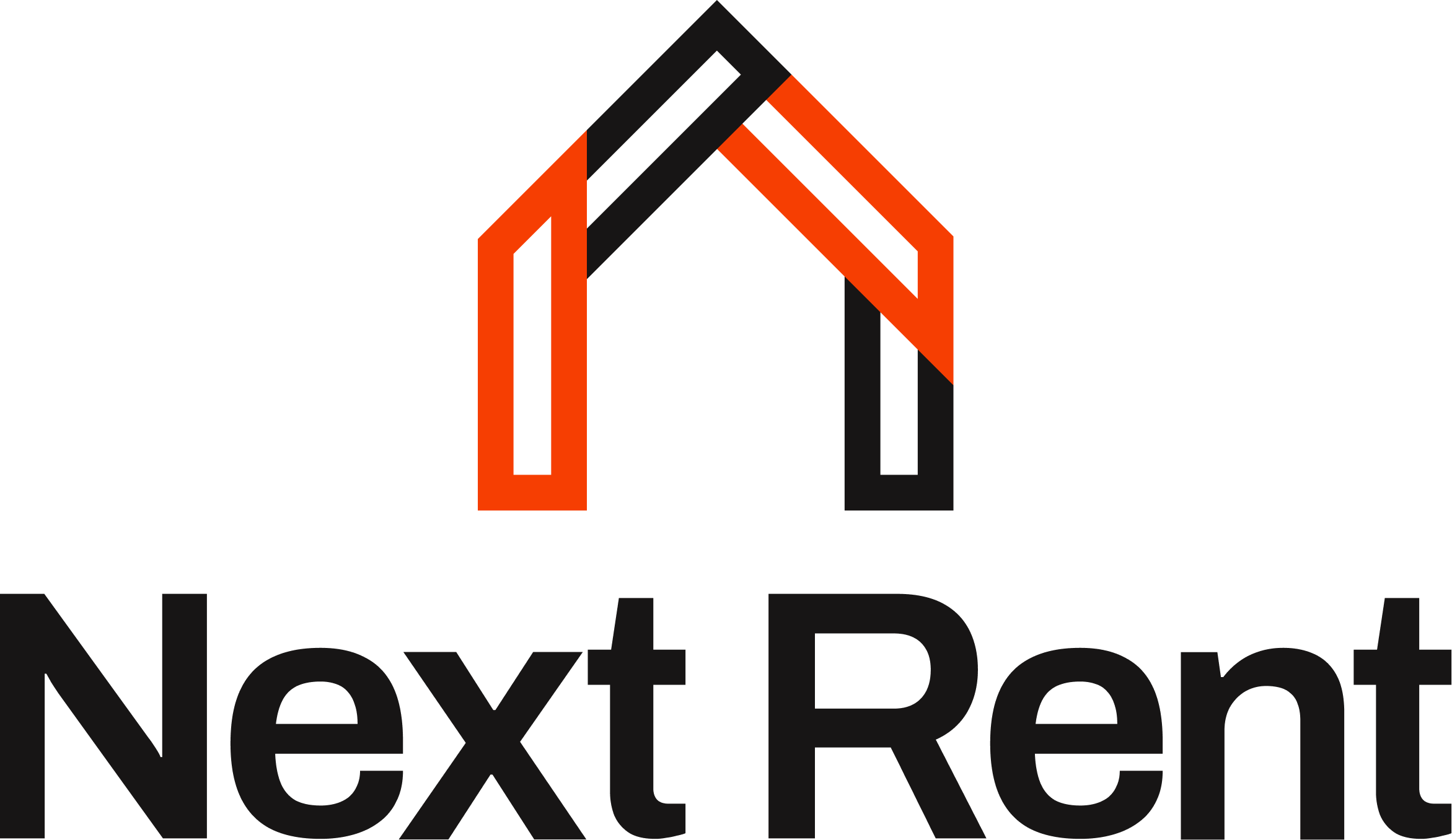
The brand identity for Next Rent was designed to reflect simplicity, warmth, and modern ease, capturing the essence of a rental experience that’s both flexible and accessible. The logo uses clean, structured forms that subtly reference housing, movement, and connection, while the warm color palette evokes a sense of comfort and trust. Rounded, modern typography reinforces clarity and approachability, mirroring the brand’s user-friendly promise.
Every element from the visuals to the tone of voice works together to position Next Rent as a supportive, forward-thinking solution for today’s renters looking for their kind of home, without the usual stress.