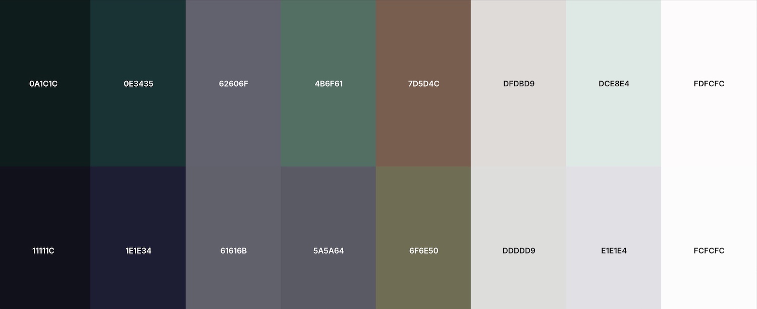
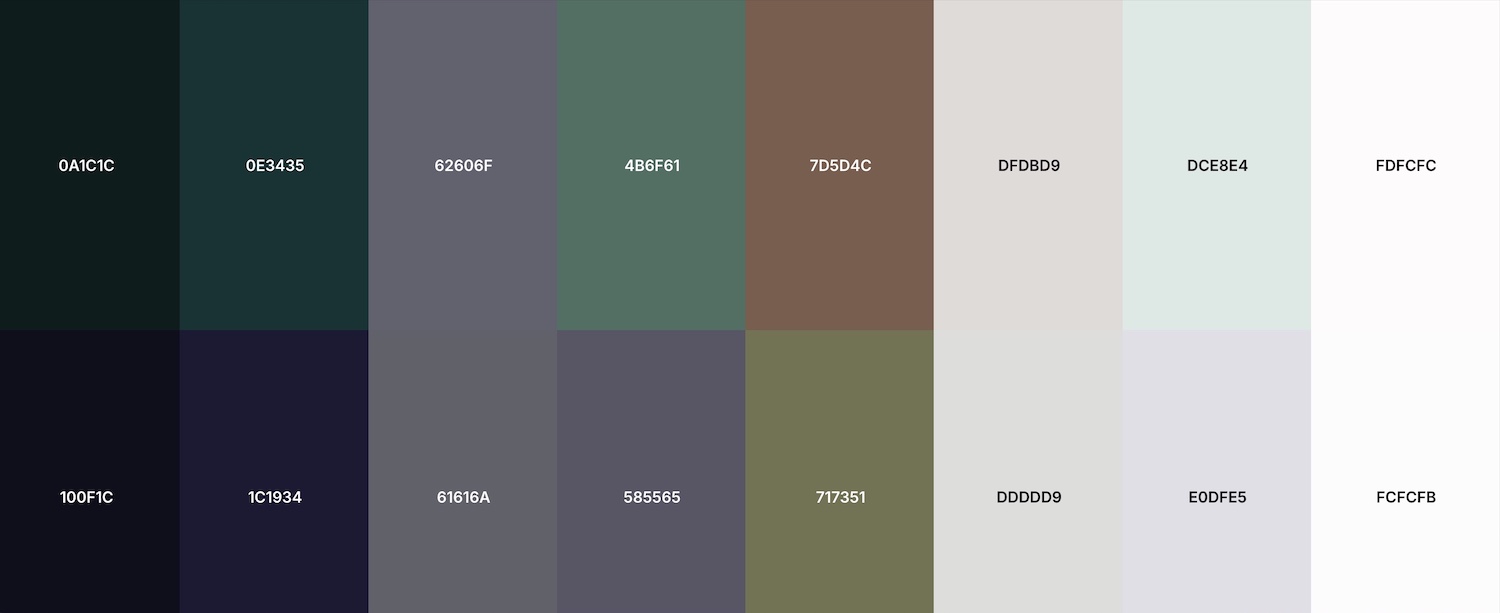
Background : #0A1C1C
Foreground : #FDFCFC
Ratio Level : AAA


Consistently pairing colour with typography, iconography, photography, and illustration can greatly improve brand recognition and perception. These guidelines outline how to use colour across all touch points.
Any time text or buttons are placed over colour, we must ensure we’re meeting minimum accessibility contrast requirements. By using these predefined colour pairs, we can make sure that Benson Flooring is accessible and meets brand standards for all.
The Web Content Accessibility Guidelines (WCAG), which are a series of recommendations for making the web more accessible, defines two levels of colour contrast ratio: AA (minimum contrast) and AAA (enhanced contrast).
Background : #0A1C1C
Foreground : #FDFCFC
Ratio Level : AAA
Background : #0A1C1C
Foreground : #DCE8E4
Ratio Level : AAA
Background : #0A1C1C
Foreground : #DFDBD9
Ratio Level : AAA
Background : #0E3435
Foreground : #FDFCFC
Ratio Level : AAA
Background : #0E3435
Foreground : #DCE8E4
Ratio Level : AAA
Background : #0E3435
Foreground : #DFDBD9
Ratio Level : AAA
Background : #62606F
Foreground : #FDFCFC
Ratio Level : AA
Background : #62606F
Foreground : #DCE8E4
Ratio Level : AA
Background : #4B6F61
Foreground : #FDFCFC
Ratio Level : AA
Background : #7D5D4C
Foreground : #FDFCFC
Ratio Level : AA
Background : #7D5D4C
Foreground : #DCE8E4
Ratio Level : AA
Background : #DFDBD9
Foreground : #0E3435
Ratio Level : AAA
Background : #DFDBD9
Foreground : #0A1C1C
Ratio Level : AAA
Background : #DCE8E4
Foreground : #7D5D4C
Ratio Level : AA
Background : #DCE8E4
Foreground : #62606F
Ratio Level : AA
Background : #DCE8E4
Foreground : #0E3435
Ratio Level : AAA
Background : #DCE8E4
Foreground : #0A1C1C
Ratio Level : AAA
Background : #FDFCFC
Foreground : #7D5D4C
Ratio Level : AA
Background : #FDFCFC
Foreground : #4B6F61
Ratio Level : AA
Background : #FDFCFC
Foreground : #62606F
Ratio Level : AA
Background : #FDFCFC
Foreground : #0E3435
Ratio Level : AAA
Background : #FDFCFC
Foreground : #0A1C1C
Ratio Level : AAA
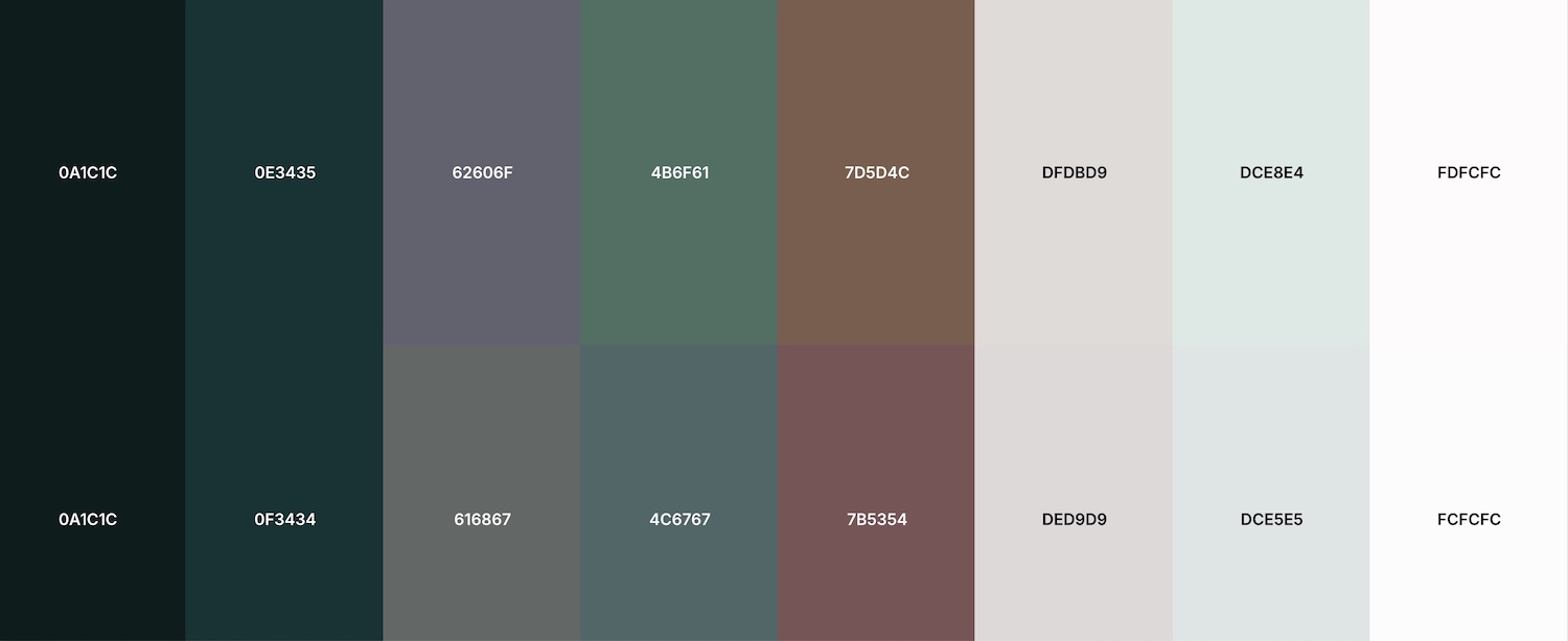
Protanopia is a severe form of red-green colour blindness where the retina lacks functional red cones (L-cones), causing an inability to perceive red light. It makes reds appear beige/grey and dark, while confusing red/green and blue/purple shades.
Deuteranopia, or "green-blindness," is a common red-green color vision deficiency caused by the absence of functional green cones in the retina, affecting about 1% of Caucasian males. Symptoms include confusing reds with greens, seeing colours as murky browns/yellows, and poor brightness perception.
Tritanopia is a rare form of blue-yellow colour blindness caused by the absence or deficiency of short-wavelength (blue) cone photoreceptors in the eye. It causes confusion between blue/green and yellow/violet colours, often making the world appear in shades of red, pink, and turquoise.
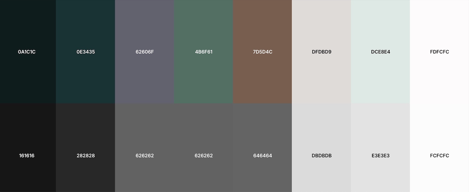
Achromatopsia is a rare inherited retinal condition affecting 1 in 30,000–40,000 people, characterised by the inability to perceive colour, extreme light sensitivity (photophobia), low visual acuity, and involuntary eye movements (nystagmus). It is caused by non-functional cone photoreceptors, leaving only rod vision (black, white, and shades of grey).
Raleway is an elegant sans-serif typeface family. Initially designed by Matt McInerney as a single thin weight, it was expanded into a 9 weight family by Pablo Impallari and Rodrigo Fuenzalida in 2012 and iKerned by Igino Marini. A thorough review and italic was added in 2016.
It is a display face and the download features both old style and lining numerals, standard and discretionary ligatures, a pretty complete set of diacritics, as well as a stylistic alternate inspired by more geometric sans-serif typefaces than its neo-grotesque inspired default character set.
Urbanist is a low-contrast, geometric sans-serif inspired by Modernist typography and design. The project was launched by Corey Hu in 2020 with 9 weights and accompanying italics. Conceived from elementary shapes, Urbanist's neutrality makes it a versatile display font for print and digital mediums.
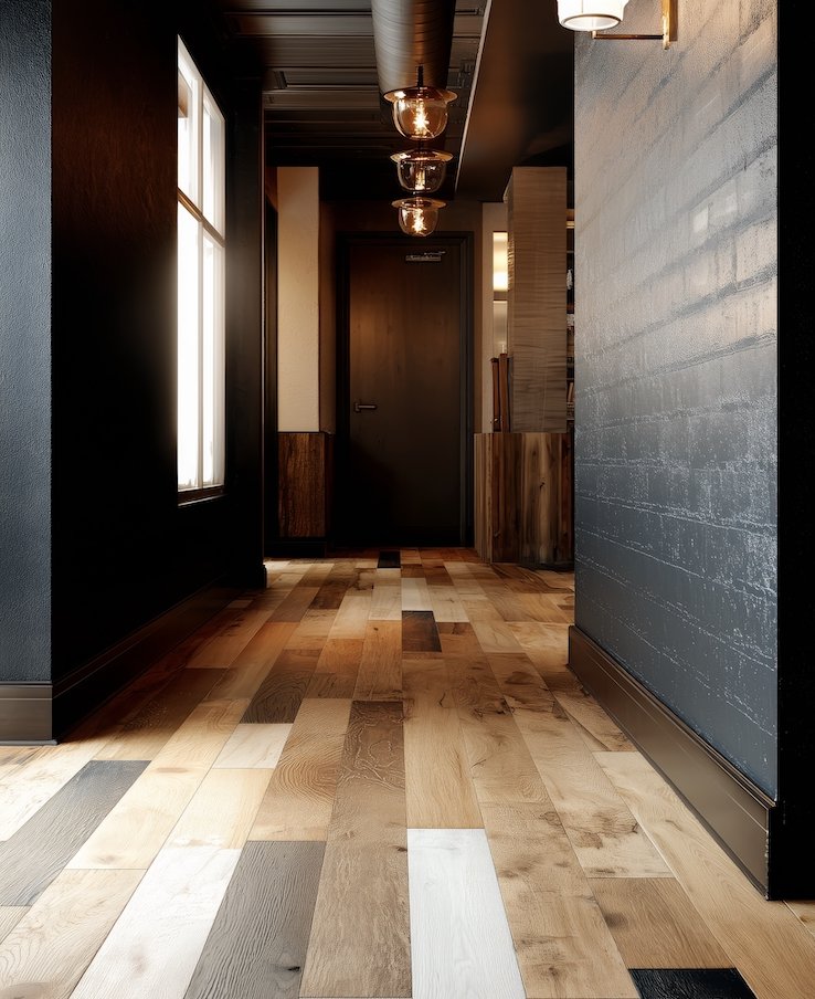
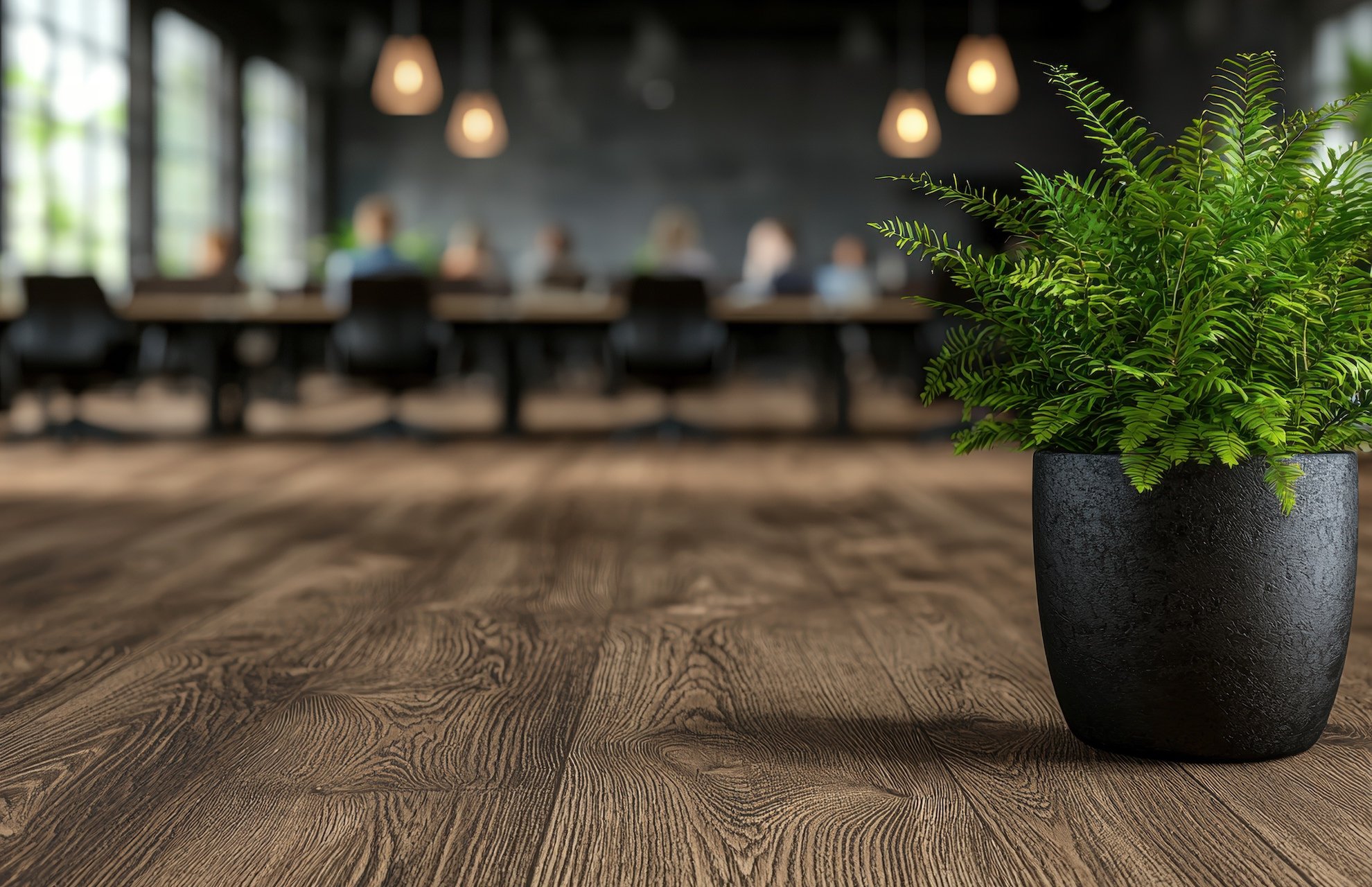
Brand value is achieved by how others feel about Benson Flooring; however, brand identity begins with what they see. It is important to gain trust by being transparent and using images that tell a story with real examples of work carried out. People who connect and relate to what they see in an image are more likely to become brand supporters.
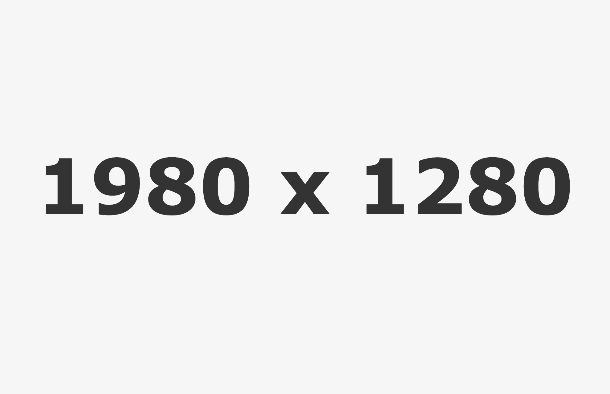
For the website their are the following image types:
Each image type has its own required dimensions to fit in with the website design, which are detailed below.
All landscape images on the website must have a width of 1980 pixels and a height of 1280 pixels.
All portrait images on the website must have a width of 900 pixels and a height of 1112 pixels.