
The following information outlines the core visual elements that make up the brand identity and visual design system. Follow this brand guideline as closely as possible in order to correctly apply the brand assets in a clear and consistent way across all platforms.


The Nichino aesthetic is defined by high-energy, high-clarity visuals that capture real moments. Use bright, natural lighting and saturated colors to make subjects pop, ensuring every photo feels vibrant and lived-in rather than filtered or moody. Focus the composition on dynamic action or a clear, relatable subject, avoiding stiff poses or "perfect" studio shots. Strictly avoid dark, heavy presets, artificial borders, or rigid framing; the goal is an open, authentic, and approachable feel that stays grounded in reality.
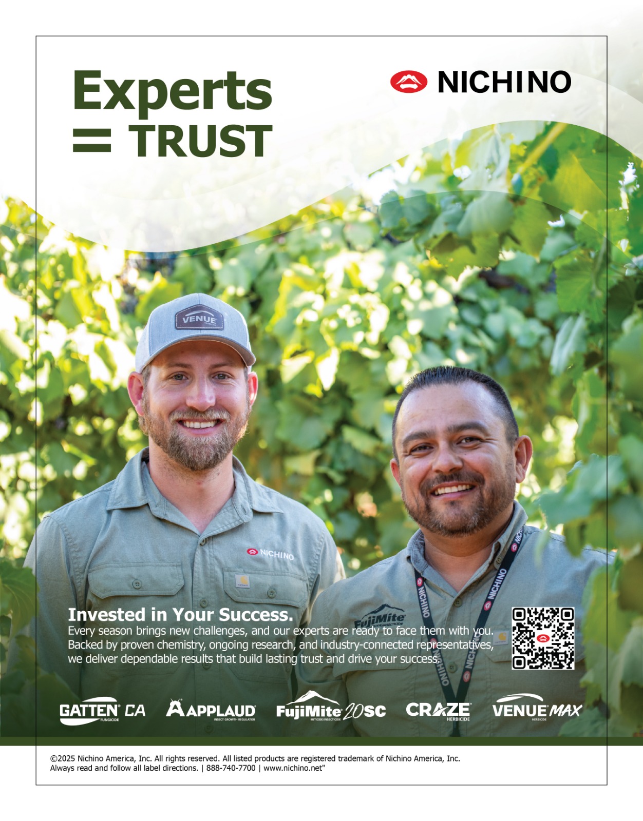


Our voice is defined by the intersection of technical expertise and operational grit. We speak from the edge of the field. We are the partners who "do our homework" so the grower can lead with certainty.
Grounded & Practical: We prioritize "boots on the ground" reality over corporate theory.
Authoritative & Secure: We provide peace of mind through proven research and proprietary technology.
Direct & Transparent: We offer honest, data-driven opinions because that is what a true teammate does.
Proactive: As "students of the game," we identify and resolve challenges before they impact the farmer.
Establish Certainty.
Focus on reliability, crop expertise, and the "peace of mind" that comes from a partner who understands the stakes of their legacy.
Demonstrate Utility.
Use technical, direct language. Highlight ease of program integration and the reliability of our proprietary tech-to-market pipeline.Industry
Position Leadership.
Emphasize our round around approach to US Agriculture—balancing cutting-edge research with the traditional values that feed humanity.