The Full Logo can be used with the ‘Property Services’ baseline where the context is needed, but otherwise, the Primary version should be preferred.


Brick & Fern believes in challenging traditional norms in the home construction industry - by championing female leadership and creating sustainable solutions that promote growth and empowerment.


The Secondary logo is available to use when the Primary or Full are not required, or already in use nearby.
The Secondary logo can also be used when needed at a smaller scale than allows for the Primary logo.
The regular and italics version can be used interchangeably depending on the space available and the context.


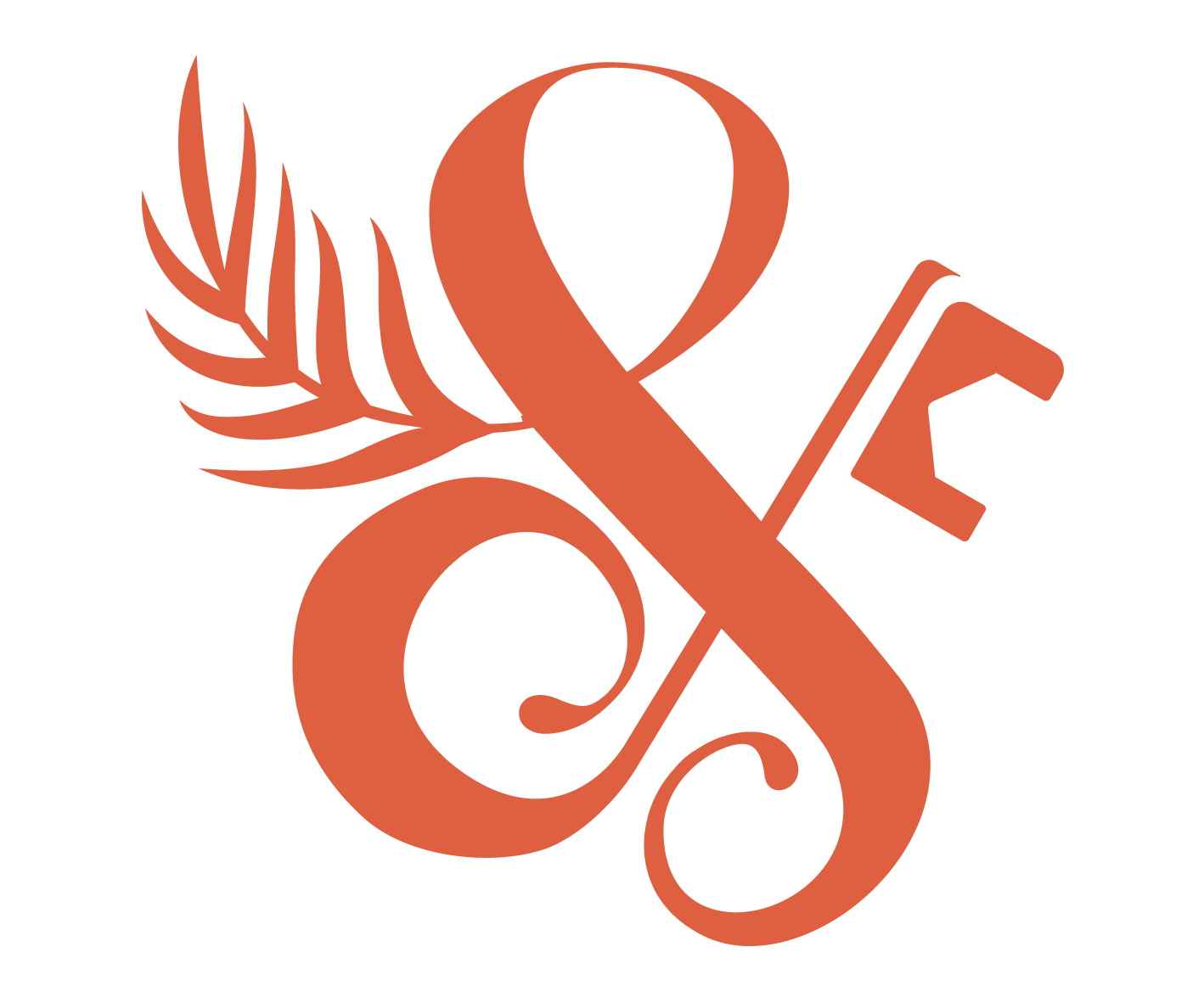
The Brick & Fern ampersand is used on its own as the Brand Mark. Symbolising key pillars of the brand - growth and renewal in the fern and the houes shaped key representing the safety of home.
The ampersand can be used at the smallest scales, and when a full logo is not required but a touch of brand consistency is.